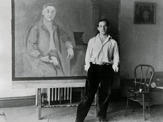
MoMA on a Saturday? I wasn't so sure I was up to weekend crowds. Alexis, my daughter and I had been wanting to see the much talked about Wm. de Kooning Restrospective since it opened in Sept. She and I often explore musems and galleries together, but this week, my son Brett, uncharacteristically offered to join us...so Saturday it had to be. The Museum of Modern Art exhibit is the largest retrospective of deKooning’s work. de Kooning, an Abstract Expressionist, is considered among the most important and prolific of the 20th century. The show spans his early work after arriving in NY from the Netherlands in 1926 through his more recognized abstract paintings in the 80’s. An exhibition of this breadth gives the opportunity to follow an artist as they evolve and transition from one stage to another. Since the exhibit opened, I have read and talked about it. Exhibitions of this significance inspire those from the art and design worlds, from interiors to fashion. I’ve discussed de Kooning’s work with several painters I presently work with. Each artist has their unique style; Anne Raymond's nature-inspired color studies. Tracy Burtz's beautifully executed figurative women and Janet Mait's bold color statements. Each spoke about how this exhibit was inspiring to them, how wonderful it is to see the colors and compositions of de Kooning's original works.
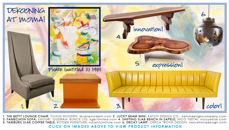
Interiorconnector, a site for "haute home furnishings", wrote that, "de Kooning's work not only incites us to experiment more with color and shape in our homes, but the paintings themselves inspire us to go bolder with the artwork we purchase", and goes on to make recommendations for art and furnishings that will provide a touch of de Kooning's "spirit and attitude".
The perspective of my two children and the conversation added yet another dimension to the art, as we walked the exhibit. Alexis commented on this still life, done when he was just 14 years old. The composition is similar to those done by all young art students, including herself, and today would be part of a college portfolio.

In the early abstracted works, he often mixed figurative imagery and abstraction, mixing both within one composition.
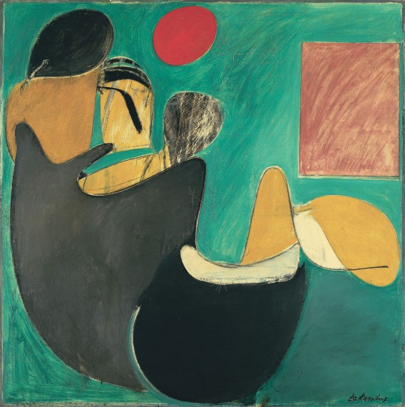
The black and white compositions in the late 40’’s were the first of his exploration of little or no color. de Kooning played with color, as well as the compositons, putting many elements into many of these paintings. “I’m not interested in ‘abstracting’ or taking things out or reducing painting,” de Kooning said in a 1951 New York Times interview. “I paint this way because I can keep putting more things in it: drama, anger, pain, love, a figure, a horse, my ideas about space.”
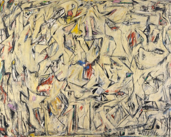
de Kooning returned to figure paintings, mostly women, at different times, painting them both figuratively and abstract throughout his career. Brett, not having the patience to read the wall tags, went to his phone as he’s accustomed to, to deKooning’s Wikipedia page to read and learn about the artist and his art. He wanted the facts - he was Dutch, 1907-1997. At auction, Pink Lady sold at Sotheby’s in 1987 for $3.6 million, the value of his works have increased. Steven A. Cohen recently bought Woman lll from David Geffen for $137 million.
In the mid-50s, he painted abstracted urban and pastoral landscapes. Once outside of the city, these paintings were lighter, warmer, more color...both strong and pastel. We drive on the Merritt Parkway often, so to see what deKooning reduced the familiar landscape to led us to a good discussion about form and color.
The same thing with L.I. - there were several Montauk paintings in the 40s and again later on when de Kooning, along with Jackson Pollock, Lee Krasner and other Abstract Expressionsists lived and worked in the Springs in East Hampton
We walked the galleries talking about the different period of his life, color, and the changes in de Kooning’s work as he transitioned from a loft on West 22nd st in 1937 drawing figuratively.
to a studio in the Springs on L.I. in the 80’s surrounded by bold and colorful and accomplished abstract canvases.
We ended our visit in the Architecture and Design Exhibit, where there was something for each of us. Alexis, an art director at a digital agency, was interested in the Gotham exhibit - a visual display and description of one of the most successful new typefaces, created in 2000 by Jonathan Hoefler and Tobias Frere-Jones. The font is inspired by NYC urban signage. It was the font used in President Obama's 2008 Presidential campaign and also the identity of the new One World Trade Center.
and Brett found new folding chairs to add some modern style to his tailgates at the NY Jets football games, Meeting Chairs by Lauence Humier.
and for me, it was a great day finally seeing the de Kooning Retrospective and walking through MoMA with my two kids on a Saturday afternoon.


