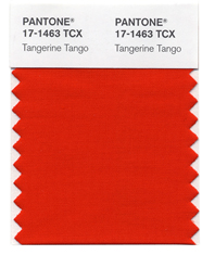
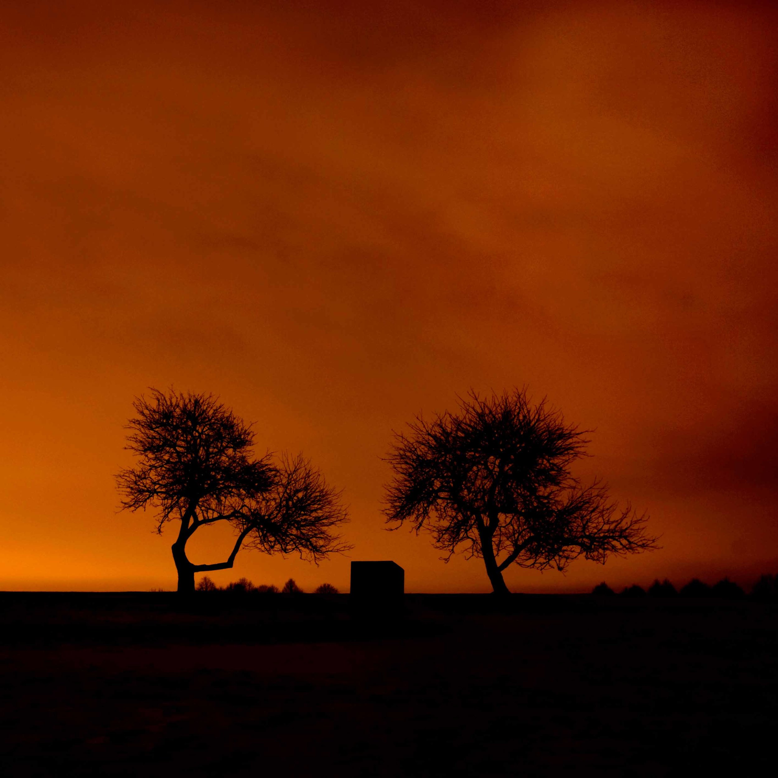
 Last week, Pantone, Inc. announced that Tangerine Tango #17-1463 will be “The Color of the Year 2012”. This was big news and cause for lots of review and discussion in the design worlds.
“Sophisticated but at the same time dramatic and seductive, Tangerine Tango is an orange with a lot of depth to it,” said Leatrice Eiseman, executive director of the Pantone Color Institute®. This robust color was descibed as a “spirited reddish orange”, and will “provide the energy boost we need to recharge and move forward”.
Eiseman continued, “Reminiscent of the radiant shadings of a sunset, Tangerine Tango marries the vivaciousness and adrenaline rush of red with the friendliness and warmth of yellow, to form a high-visibility, magnetic hue that emanates heat and energy.”Pantone Inc, the NJ company, began as a source for printing guidelines. It has evolved to create standardized color palettes for a number of industries, including graphics, fashion textiles and interior design. PMS, the Pantone Matching System, enables color to be consistent across industries, from paints, to printing ink to textiles to lipsticks.The selection of a particular color is a thoughtful process. Pantone “literally combs the world looking for color influences....including the entertainment industry, art, artists, technology, sports and socio-economic conditions..” The color chosen will subsequently impact many industries and individuals.Oranges and reds are warm colors associated with nature, with daylight or sunset. Color Theorists describe the usual strong reactions to orange, more so than other colors, it's a “love it or hate it” color. It radiates warmth and energy. Bonnie Edelman’s photograph, Campo Sunset, comes to mind with the description of the energy of the red hues.
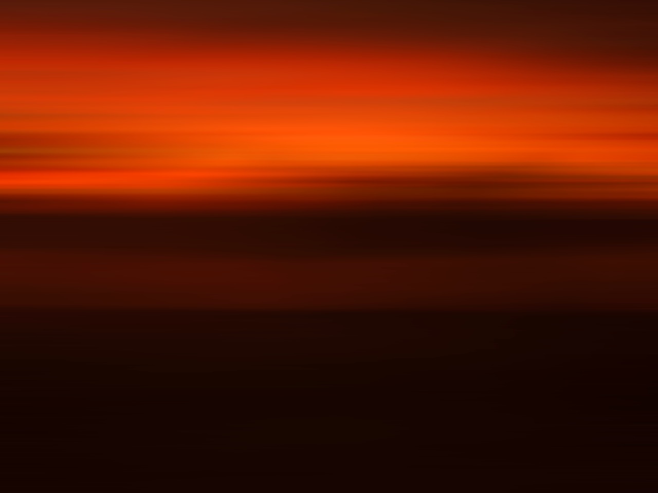
and Golden Campo is on the other side of the spectrum, the warmth of yellow.
When I was a textile stylist, creating colors and patterns for fabrics for men’s clothing, I eagerly awaited the trend reports, forecasting the colors of the season to incorporate into our seasonal fabrics. This is true for stylists and designers across creative fields. The result is a consistent theme for the seasons, and it starts here - with the selected colors by Pantone.
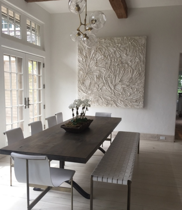
According to Apartment Therapy, Tangerine Tango, “.... is a highly-usable color for interiors. It's very easy to incorporate into a room as an accent, although the full wall treatment is absolutely an option for those willing to take the plunge.”. It has always been a good color for interiors, it works as a standout accessory against neutrals. Apartment Therapy showed these examples, from a complete orange wall, to a bold orange sofa in a neutral room.
and acessories, a way to introduce a small accent of the warm color to any room
- Apartment Therapy
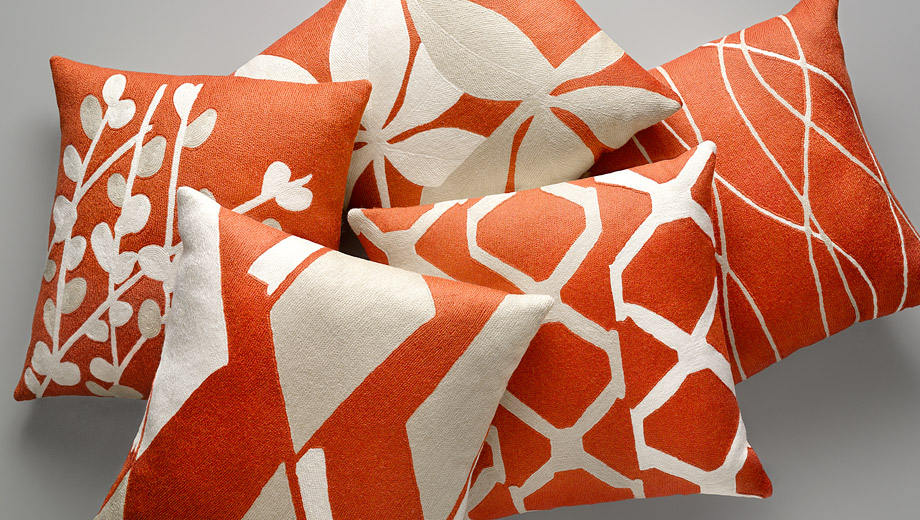
Judy Ross Textiles, a favorite pillow source, has a beautiful group of hand-emboidered pillows with the uplifting color - perfect for accessorizing
The same is true for clothing and make-up. When my husband wears his orange sweater, (instead of his usual black!) he feels lighter and brighter and the color elicits a smile from others. Expect to see more of this reddish orange in the coming year.
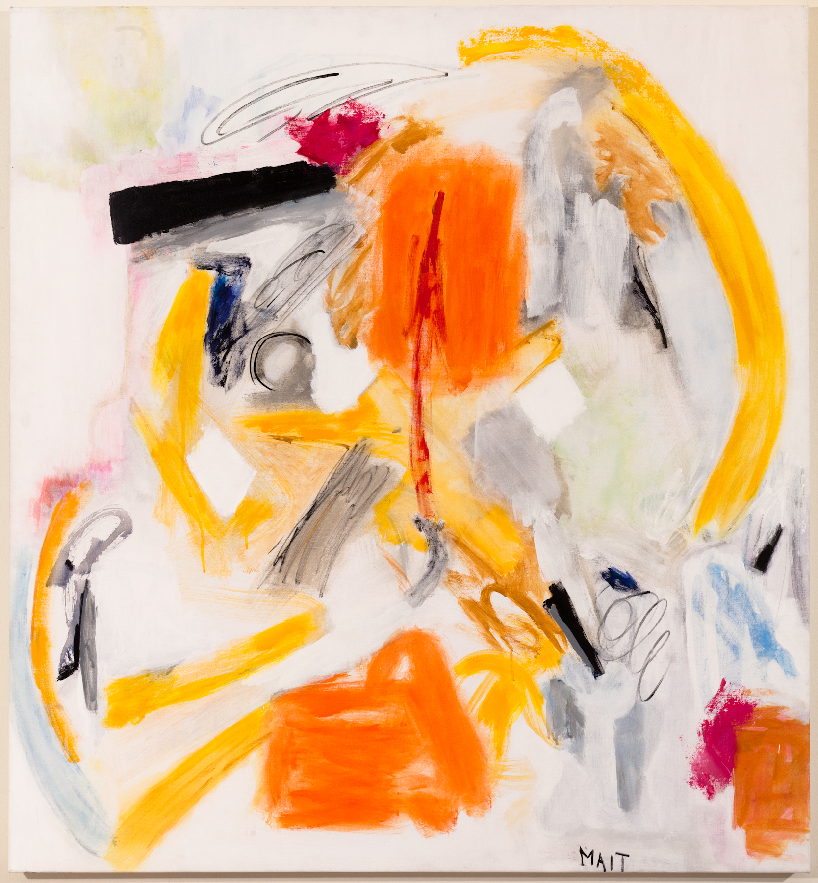
I have seen a strong and positive response to orange in artwork, from the sunsets above to the color-soaked paintings by Janet Mait and Anne Raymond below. The bold color makes an impact, and as the description of Color of the Year says, they are strong and in turn provoke an emotional response.
to the natural sky of Nightlight, by Stuart Zaro
Tangerine Tango, is an early 2012 prediction...and there will be many more in the next few weeks as the calendar rolls to the new year. Pantone Color Institute selected a color of nature that is warm and has a positive energy - as they suggest, to help recharge and propel us into 2012.


