


It's March, it’s still winter but the light has changed, and that feels good, the mornings are brighter, and the days are longer. The color white is about light, there is no absolute white, there are the many shades that reflect what is around it. This time of year, the reference to “winter white” is to a warm color, whether in fashion, or home or art, the yellow undertones feel cozy and at the same time fresh, just like the March light. Cool whites have a touch of blue, and there are many shades in between. The beauty of white is that it’s uplifting, it’s literally lighter than the heavy tones we are accustomed to all winter. The beauty of having white in artworks around you, is that it brings that lightness home...
Read MoreLiving with Art // Loving Summer Color
It's that time of year, late July, when we find ourselves commenting on how the summer is going by so quickly. We look forward to the summer months, anticipate, talk about and plan for summer - and the season itself is so fleeting. The long days, warm weather and clear skies come together to create a more carefree and easier few months. Regardless of what you enjoy for leisure, there is more time to indulge during the short summer months. There is an easy feeling amid the long days, crisper summer light, which make the colors cleaner and brighter. I love to see how artists reflect the beautiful blues and and other sun drenched colors, how the look and feel of the season infuses their artworks, and in turn, how the art enhances a room and brings the good feeling of summer home...
Read MoreLiving with Art // Loving Pinks & Reds
Valentine’s Day celebrates love. The day is closely associated with the color red, from soft pinks, rose to hot magenta to classic red. Why is that? The color red says passion, energy and love and the softer hues from pink, to rose and deeper are closely related but in a gentler way. Artworks in these ranges of colors are the same, they can provide a hint of warmth or speak loudly and carry a room. Here are some examples of how a variety of artworks in the red spectrum can have a beautiful and strong impact in interiors.
Flare Series ll, by RE artist Anne Raymond,
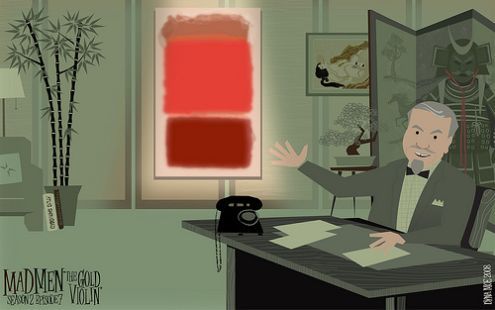
Pure red makes a big statement. I have written about the meaning of red and the energy it conveys. Abstract Expressionist Mark Rothko is identified with his many red paintings, recent sales have broken records. The TV show Mad Men is closely identified with how it represents the style and design of its period. This fun illustration places one of Rothko's iconic paintings of the 50's on the show's set.
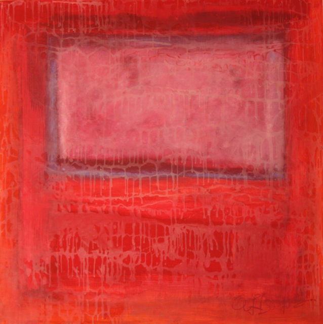
RE Artist Andrea Bonfils took her cue from these works in her layered encaustic painting, Rothko Pink Window.
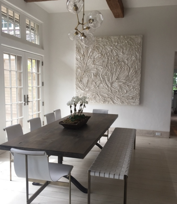
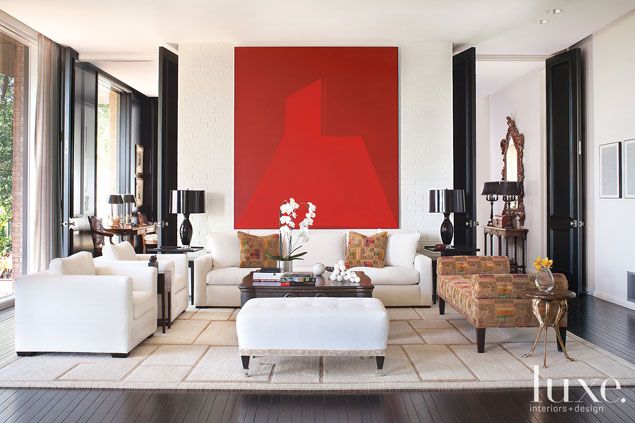
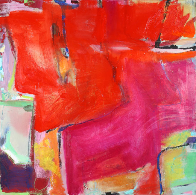
 This large scale red painting brings contrast and drama to the quiet, elegant furnishings in this Texas home, in Luxe Magazine.
 Interior designer Jennifer Post uses the painting's color and composition as a focal point in this soft blue and white modern bedroom
 Fashion designer Lisa Perry’s homes have the same 60’s vibe as her modern, pop-inspired clothing. Primary colors, an integral part of the sixties are echoed in “The Beach House", her Hamptons home. The two red paintings are by Ed Moses, along with a Damien Hirst dot painting.
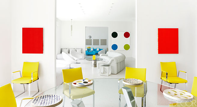 Outside Perry's home, The Rings, by Zhu Jishi, appear to be rolling around the lawn.

In these two kitchens, the red and white artworks bring pattern and warmth to the minimal interiors. Designer Joe Mimram’s NYC apt, with artwork by Ohad Memory,

and this playful abstract canvas,

RE Artist Claudia Mengel has a wonderful sensibility for color, her artworks, whether quiet or strong use unexpected color combinations that create a beautiful harmony. Red,
 RE Photographer Shelli Breidenbach contrasts strong background color with the regal portraits of her horses, Noblesse,

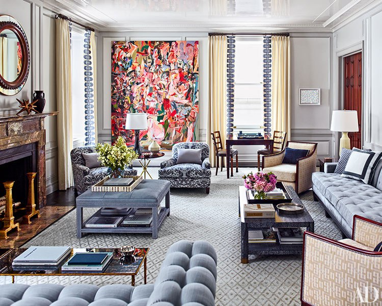
This stunning living room by Steven Gambrel was recently featured in Architectural Digest. He incorporates a stunning modern art collection into the rooms with an eclectic mx of furnishings. Cecily Brown’s large scale painting filled with pinks and reds presides over the elegant and layered grey living room.
 Another project by Gambrel uses red in an unexpected way. The hallway gallery of red frames makes a great visual statement.

Interior designer Kelly Wearstler is known for boldly mixing color and pattern in projects. In her office, she creates a strong but feminine mix with hot pink chairs and a striking large-scale painting by Lana Gomez.

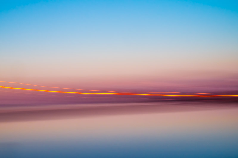
Pinks are present in RE photographer's Stefan Radtke’s new First Light Collection. The images capture the striking colors of winter's early morning light on the water.
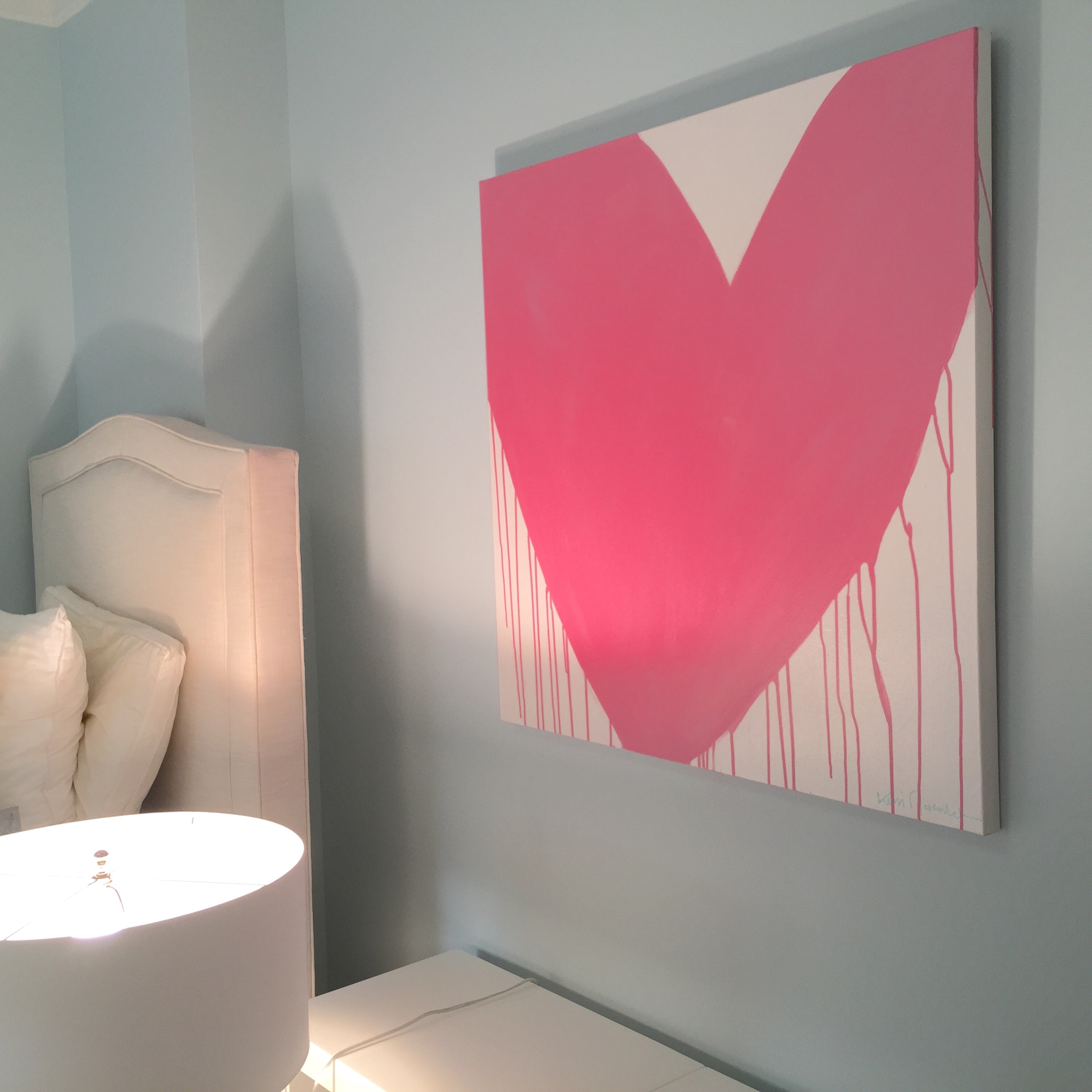
 The Drippy Heart Series by RE artist Kerri Rosenthal's has brought smiles to a number of clients. This heart installation takes on another look, sweet and youthful in ballerina pink for a young NYC girl.
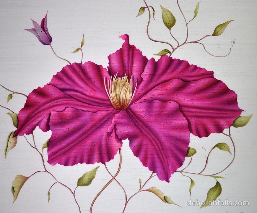
 Valentine's Day wouldn't be complete without flowers. Artists interpret them in a myriad of ways. RE artist Deborah Falls’ classic paintings on silks represent the incredible varieties and colors. The Red Clematis
The Red Tulip

"Toning down the passion of red with the purity of white results in the softer pinks that are associated with romance and the blush of a young woman’s cheeks", according to Kate Smith of Sensational Color. In addition, she notes, pink is "the color of happiness", the lighthearted color is the 'go-to' choice for flowers. RE Artist Mary Morant paints a variety of traditional and impressionistic florals. Here Pink Roses, are captured on canvas as a special memory of a bride's wedding bouquet.

From the Submerged Garden Series, by RE's Andrea Bonfils, a long-stemmed rose.

A striking installation from the same series,
An abstract floral, Suburban Jungle Pink, by RE's Kerri Rosenthal

And pop art, by Alex Katz, Red Roses with Blue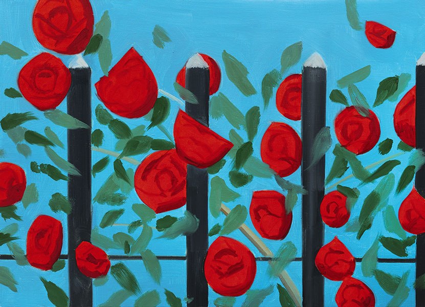
From pink to red, modern to pop, abstract to traditional, artworks in this range of colors can suit different tastes and interior styles. They can provide color, warmth, and energy. Fill your home, like your life, with artworks that bring you joy and love.
Happy Valentine's Day!!

Living with Art // The Beauty of Summer Color
It is the beginning of the end of summer. One more week, Labor Day weekend, and we officially close the doors behind us and step into our busy fall mode. Before its over, there’s still time to enjoy all that we love about the summer...the natural beauty of the long days and nights, warmth, the sun, the sky, the water, mountains, beach and how it all makes us feel.

Have you noticed how full Facebook and Instagram feeds are with our friends’ pics of their special place, in the morning when the sun comes up, during the day when they're outdoors and again at sunset? Regardless of what your “place" is, the colors and feel of summer resonate with us all. My blog series, Living with Art, started last month with Soft Summer Color. This month it’s about The Beauty of Summer, from natural colors to richer deeper tones. An insta pic from our RE feed that I took on a July night when the light was picture-perfect at the marina in Sag Harbor

I often receive positive responses to artwork that reflects the season and the lighter way that we feel. People react to the colors of nature, all shades of blue and warm natural tones. I felt fortunate in the past few months to work with clients who chose artworks that “feel like summer”. Artists’ inspiration often comes from what they see and the individual beauty comes from how they interpret it.
Visiting John Duckworth in his South Carolina studio, my friends and I were overwhelmed by the array of his Abstract Landscape collection, and the creative way he presents it.
 Each image has a story, a particular creek, a river or coastline, the time of day or the position of the moon. John captured the Super Moon, those rare nights when the moon is at it's largest, last August in Charleston. This striking image captures the light of the moon's reflection against the sky, and is perfectly suited for our friends' Kiawah beach home.

Wanting to bring the beauty of my friends' native Charleston to her NY home, the deep richer colors of the sunset at Church Creek are a stunning compliment to the light-infused blue and gold interiors.

Photographer Shelli Breidenbach also explores the abstract beauty in her natural subjects, her Abstract Seascapes and the Abstract Shell Series are inspired by time spent at her home in Sag Harbor. Abstract Shell No. 6 is one of 6 large-scale images revealing the remarkable details, shapes, curves and colors naturally found in different shells.

Printed large and mounted in acrylic, the graphic image is a great addition to this master bedroom designed by Mara Solow Interiors. The colors and depth in the photo are a beautiful compliment to the subtle color, pattern and texture in the room.

The entry to this Hamptons home lets you know that it’s time to relax, welcoming guests with the warm combination of wood and natural colors of Abstract Shell No. 5 in this large scale 50”x50” image

Photographer Stuart Zaro finds inspiration close to home. He lives in an idyllic spot on Cobamong Pond, which he photographs all year, through the seasons. This is a favorite summer image, Boat on Cobamong, to me, it is calm and quiet.

Abstract painters interpret the summer very differently. Artist Kerri Rosenthal speaks of her love of the beach and ocean and how it informs the colors in her work. The deceptively simple stripes of color, turquoise and marine blue, concisely tell her story of summer, a modern twist on nautical stripes, the canvases are fresh and fun. Stripe on Stripe No. 2

and in a pair

Kerri's time in the Hamptons a few months ago inspired a series this summer. The soft blues and browns of Sagg Main found a great home, bringing contrasting, but subtle color, to the neutral browns and golds in our clients' comfortable family room.

I love the view from the kitchen, the painting is beautifully framed within the architecture of the doorways

I recently enjoyed meeting artist Claudia Mengel at her Connecticut studio and seeing the breadth of her work. I was struck by the compositions and clean colors, especially the blues in her abstract paintings. Waterfall, 60"x30"

Mengel explained the reasons she paints in blue, “Growing up on the water of Long Island I have always been inspired by the colors of the ocean. With the changes of the seasons and time of day...by how the color blue had such range...it is very nostalgic to me, it's very present in many of my paintings. It can have a peaceful aura or it can have strength and energy. It is a color that I love to have partner with any other colors in my composition. It seems to be the color that always fits.” A recent triptych, The Seine, in Claudia's studio, illustrates this well

Summer, the beach and ocean, sand and surf are what Christine Wexler of Bramasole Photography photographs. She is often out east, on the beaches of Montauk and elsewhere through Long Island. Christine’s photos are not just for surfers, this image and many others have been installed in homes in order bring the beauty and feel of summer inside all year long.

One look at any of these artworks and you’re there, you step right into your special summer “place”.
Enjoy the rest of the summer, it’s not over yet!!

Living with Art // Summer all year long
Summer is a short season that has a big impact. From Memorial Day to Labor Day, the warm days are filled with fun, vacation, outdoor activities, spending time with friends and family. Especially in the Northeast, we wait a long time to enjoy the longer, sunny days. Soft colors and artwork can bring these warm feelings of the season indoors all year long.
 These artworks capture summer, from the subject, shells, seascapes, the beach to abstract interpretations of them. Color is a common thread when evoking summer, we associate soft sun-drenched colors with the warmest months. As I’ve written about before, the color blue is everyone’s favorite. There are many reasons, but when it’s soft, it feels like nature, like sky and water.
I stopped in to John Duckworth's Johns Island, SC studio a few months ago with some friends while we were visiting nearby. John artfully captures the colors of the SC coast in his collection of Abstract Landscapes.

Two very different installations of John's work show how the simple natural beauty of the photographic images is all that is needed to create a serene summer-like space. The images are printed on canvas, giving them a painterly quality. From a beach cottage on Sullivan's Island, SC with the image Charleston Harbor

to Long Island Creek in a crisp modern NYC apt by JSM Designs

According to color expert Kate Smith, of Sensational Color, "The color of ocean and sky, blue is perceived as a constant in our lives. As the collective color of the spirit, it invokes rest and can cause the body to produce chemicals that are calming".
The texture and layers of encaustic wax in Artist Andrea Bonfils’ Ocean Blue capture the colors in the spectrum, from ocean to sky,

The large-scale color block painting by Kerri Rosenthal also ranges from light to powder to marine blue, creating a beautiful frame over the denim blue velvet bench

A client recently requested the “color of a summer sky” for an iconic Drippy Heart painting from Kerri Rosenthal. Here is Sea of Hearts installed in the traditional entry of her Westchester home. Kerri sent the color sample, on a late winter day with a note that felt hopeful for warmer weather, “the sky on a perfect summer day”!

Artist Rosenthal brings together her love of summer in a number of paintings inspired from her winter trips to the Caribbean or summer days by the CT or Long Island beaches. The colors in her abstracts bring them all together, as in Picking Daisies from the Puzzle Moderne series

Blue and and it's compliment white, in its many variations, is classic summer. The many shades of white are captured in a fun graphic collection of sand, by photographer Barbara Erdmann. Wings is one of a few images in the series that captures it's movement and texture.

Nature shows her color in the range of whites in Shelli Breidenbach’s Abstract Shell series. Shell No. 2 is one of six large-scale graphic images that show the incredible beauty of each shell form.

White can be simple and elegant and in artwork, it can carry a space when done well. This shell collection has brought summer indoors, for many clients, from city and suburb to beach to this striking yacht with an installation of very large-scale photos


Abstract artist Anne Raymond has created many paintings inspired by the sunny colors of summer and the surroundings of her Hamptons home. You can feel the warmth of the soft yellow in Radiance Series ll, a 40"x40" oil on canvas

Moving, also by Raymond is suitably accented with turquoise accessories for summer at Nest Inspired Home in Rye, NY

Westchester photographer Stefan Radtke captures the same colors in his "atmospheric landscapes" of the LI Sound. Radtke "creates painting inspired photographs of landscapes, devoid of detail." From the more colorful Moved # 6

to the quieter Sound Portrait #2 and it's mirrored image, mounted in acrylic. This diptych is 80"x40" overall and creates a strong statement for such subtle work.

I have recently met photographer Kit Kittle and I'm enjoying showing his Bubble Collection to my clients and observing their smiling responses. Kittle takes his machine around the world and captures the reflection in the bubbles, "which is a thousandth of the thickness of human hair". The images reflect the color & light in the bubbles as well as the natural beauty surrounding them. To Kittle, "it is surprising that some things are just this simple". This image, Before the Fall was taken close to home off the LI Sound.

The sun, warmth and colors of the summer season inspires artists, they want to capture it in their respective medium. Their artwork enables us to bring the soothing enveloping warm feelings of the season indoors…why not enjoy summer all year long?
But first, enjoy it now!


Jan2014_Eblast_final - Version 2
Color // Warm Winter Blues
Blue, in all of its variations is the most embraced color. It runs from soft and powdery to rich cobalt to intense midnight. Interesting, that it conveys warmth, trust and calm and then also references the darker “winter blues”, in part due to winter’s more somber mood, shorter days with less light.
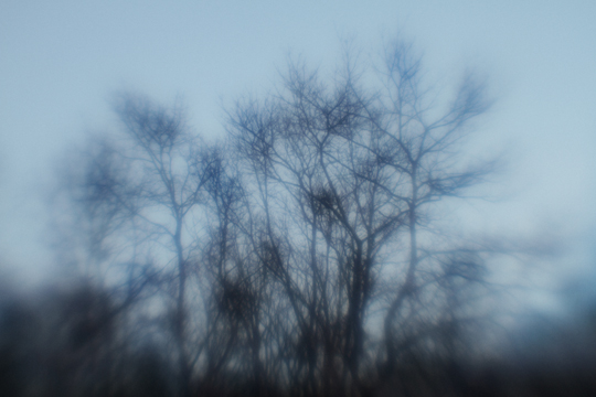
As I look outside at a late afternoon winter sky, there’s a beautiful blue mixed with rose but it’s darkened by the bare trees, similar to the sky in Elena Lyakir’s, Dream of Flying

3. dream of flying
Artists have always been inspired by nature, and attempt to capture the essence of what they see and feel from it’s colors and beauty. Claude Monet’s Water Lilies, a series of 250 paintings of his famous gardens at Giverny, is a striking artwork illustrating this. The Clouds, 1920–1926 installation at the Musee de l’Orangerie in Paris provides an all-encompassing view of the stunning blue canvases

800px-Monet_Lilies_Louvre_2

Muse_e_Orangerie_Nymphe_as_panorama_5_02_13_3_Sophie_Boegly
The blues of winter range in depth and hue. Westport, from Elisa Keogh's Horizons Series has rich red blues contrasted with a golden light.

westport,ct.54x12
Anne Raymond’sJanuary Blue Series combines similar deep blues with greener warm tones of teal. I talked recently with Anne about her inspiration, always from nature, “The refracted light of winter and the movement in the gorgeous forest where I work are both visual inspiration in this series. The branches move swiftly sealing in my memory their momentary energy.” Two paintings from the series; January Blue lV and January Blue l
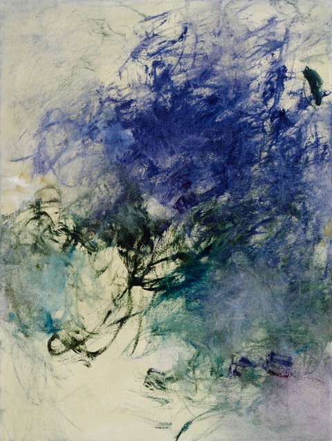
AR.January Blue IV_ 24x18 (2)
AR.January Blue l_ 24x18 (2)
I often reference Wolf Kahn, Dark and Deep is one of his beautiful works using a blue palette

Wolf Kahn.Dark and Deep
SB.blue color block.final
Blue, from the Color Block Series by Shelli Breidenbach are softer, reflecting her response to the ocean. “The Color Block Series is a … true abstract landscape photograph, inspired by the early morning hues of Sag Harbor Bay. The challenge has been to capture the integrity and tranquility of the water without compromising it … in hues that suggest simplicity, elegance, and an understated emotion."
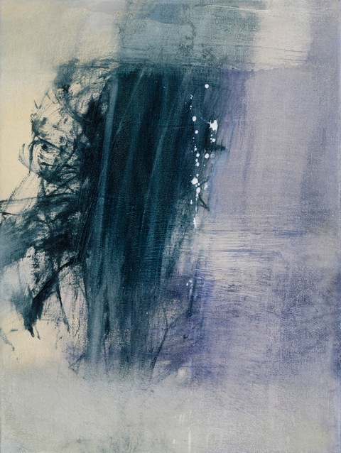
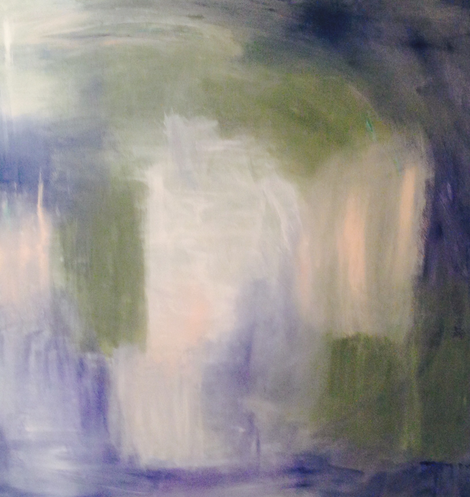
The grayer blues of Predator Views, by Andrea Bonfils, a mixed media painting captures the starkness of winter.

AB.Predator's View.oil and encaustic_72"x36":SOLD
the blues
Blue has cultural references that have to do with melancholy. One explanation for the term ‘feeling blue’ dates back to the ‘blue devil’ in the 17th century. Songwriters use this symbolism when they ‘sing the blues’. January and the cold, dark months to come are cause for the “winter blues”. The Blues, from Elena Lyakir
Interesting that even with this ‘dark’ side, blue is the most popular color. It also has it’s ‘light’ side; the sea, the sky and with it the intangible references of warmth, trust, loyalty, authority and more. I took a quick look through Pinterest at the blue boards - it seemed endless. There are pins of blue flowers, fish, food, home furnishings, fashion, a bit of everything.
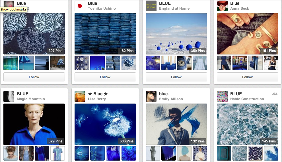
Screen Shot 2014-01-18 at 4.10.19 PM
KR.Recharge_48x48
The blues in winter are more serene, and darker. Kerri Rosenthal known for her exuberant use of color, especially bright color, also captures the more somber mood of winter, “Color is everywhere for me, but in winter I tend to see and paint in washed down tones." From her Puzzle Moderne Series, Recharge
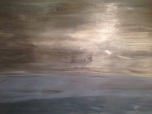
KR.Stormy Sunday No.2_40x60
"Everything seems a bit out of focus, this is reflected in my wintry paintings…muted, cold, snowy, foggy scapes.” Stormy Sunday No.2
The soft blue I saw in the late afternoon light when I started this post, has now deepened in the early evening to a rich slate blue that rivals any summer sky. The dark evening sky of Stuart Zaro's, Crescent Moon, Blue Sky from The Nighlight Series.
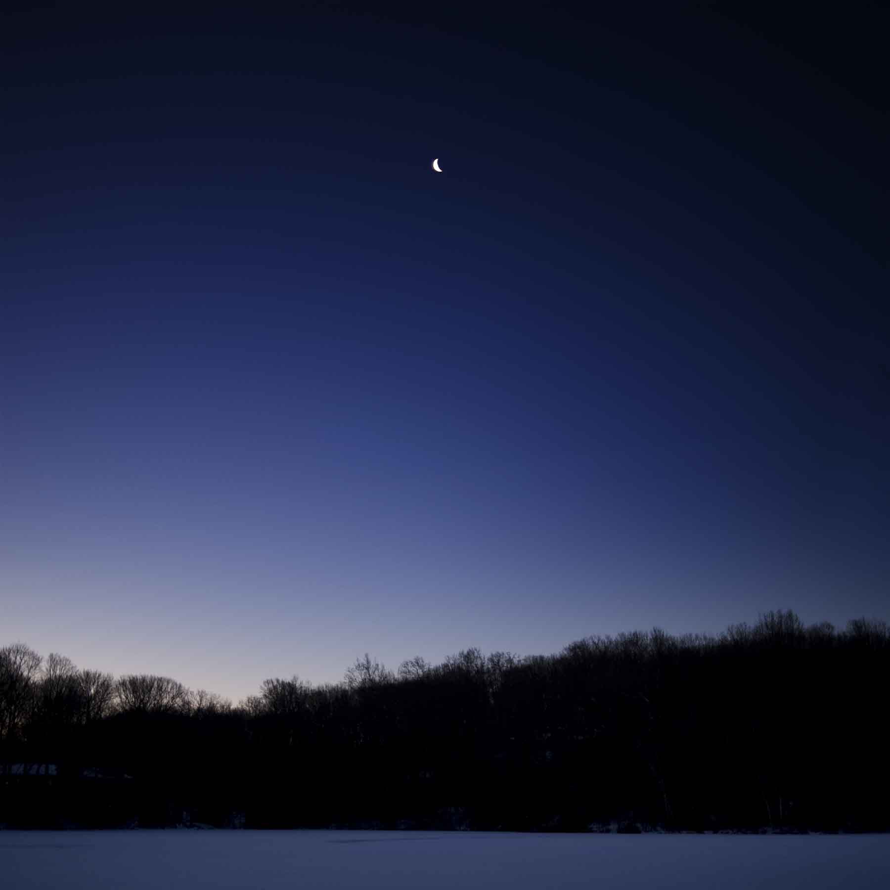
100109 Nightlight 028 v1
Winter stays around a little too long for me, but I enjoy it’s warm colors, mellower moods and the artwork it inspires while it’s here…

Microsoft Word - CAROL.Doc1.doc
Color // Cool Summer Nights
Late August, and the reality is setting in that Labor Day is around the corner. Barely two weeks left of summer and the ease we feel in the months of July and August. But, two long weekends lay ahead and time to still enjoy the long days and cooler nights before the pace picks up and the fall season begins. The cool shades of blue in these artworks speak to the start of the changing seasons.

Blue is nature’s color, from the water to the sky, it has many depths and hues, from a soft “sky blue” to an intense almost black, “midnight”. A look at the range of blues, from Pantone, an international color resource.

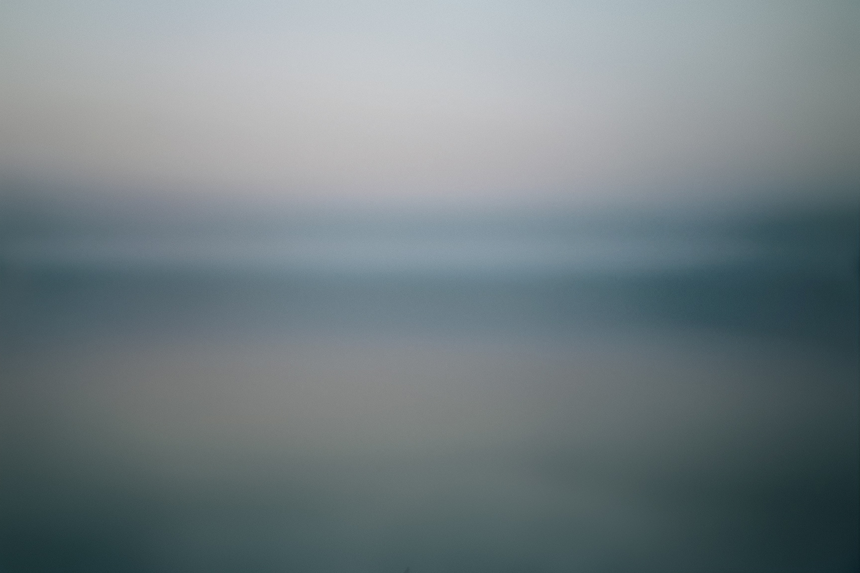
From the soft blues in Bewitched, a great name for this ethereal photo from Elena Lyakir where sky meets water and barely changes color but for a few clouds and horizon line.

To the vibrant color that Andrea Bonfils captures in the depth of the ocean’s blues, in one painting in an encaustic wax diptych, Beyond Deep.

Figurative artist Alex Katz uses broad flat colors in his portraits and landscapes. In August, 2007, he captures sky and water with a medium range of colors, in a spare yet definitive way.

Kerri Rosenthal, an artist known for her colorful work, also reflects the seasons in her paintings. She describes blue as, "Summer skies and the blue oceans, feelings of warmth and happiness." Rosenthal's expressive Monsieur Bleu,

Blue is statistically the most popular color. I have experienced this as I’ve shown and sold artwork and visited homes with varying degrees of the color. Artist Anne Raymond is strongly influenced by the natural beauty of her surroundings in the Hamptons. Blue July is one of her many stunning blue works that reflect the natural color, combined with warmer colors.

The color blue is considered cool and slow as opposed to the warmth and intensity of reds. It’s a comfort color, it takes you to a good place, to where you feel the cool water and endless sky. Photographer Elisa Keogh captures the spectrum of colors in Weston, CT (blue-green-black) from her Horizon Series.

Artists use blue pigments evolved from natural sources, dating back to the mid-1800‘s. The Impressionist painters introduced some of the blue paints, including cerulean, cobalt and ultramarine. Vincent Van Gogh famously captured the night sky in several paintings. In Starry Night Over the Rhone, painted in 1888, he described the many blues, "The dark blue sky is spotted with clouds of an even darker blue than the fundamental blue of intense cobalt, and others of a lighter blue, like the bluish white of the Milky Way ... the sea was very dark ultramarine, the shore a sort of violet and of light red as I see it, and on the dunes, a few bushes of prussian blue.”

Blue is often balanced or calmed with the contrast to white. Traditional blue and white porcelain has been made for over 2000 years from the pigment cobalt. This striking abstract blue and white painting, Passion Noted, aptly named by artist Xanda McCagg, considering the strong feelings many have for their favorite color.

and back to August, the beach and the water. These boys are looking to catch The Wave, a great way to end the summer - from Bramasole Photography by Christine Wexler.

For others, the last weeks of summer are a bit more quiet and reflective. Balance 5, by Andrea Bonfils,

For me, I plan to enjoy the last summer days and will keep wearing my white jeans on these last August nights...before it's time to transition to the blue jeans I'll wear throughout the fall!
Hoping these last days stay warm and the nights comfortably cool.
