The Art of Waiting // National Donate Life Month

Spring has been slow to arrive this year. It feels like we have been waiting a long time for the winter  to end and for warm weather to arrive.  We wait for many things, but nothing compares to the wait being endured by 122,000 people waiting for a life saving organ transplant. Being on the wait list means not knowing whether  a donated organ will be received in time.
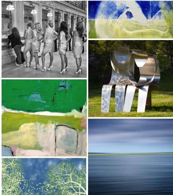
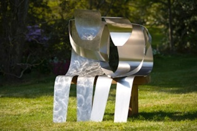
I was reminded of the issue of waiting while visiting with a sculptor in his studio a few months ago, I was moved by this piece, Waiting for News. Christopher E. Green captures what it is like for family members to wait for news while a loved one is receiving critical care. From the moment I saw it, I felt the emotion he portrays about his experience in a hospital waiting room. “We were all waiting for news of our love ones...Waiting for News attempts to convey the emotion of those that were in limbo, not knowing whether their news would be good or bad.  Not knowing which way their emotions would go.”

My family knows this experience well. My husband Howard was diagnosed with Ideopathic Pulmonary Fibrosis, an illness with no known cause and no known cure. We were told he had 5 years, at which point, he would be a candidate for a life-saving lung transplant. I wrote about this in a previous blogpost, now, I will emphasize that it is 2 1/2 years later, and we are grateful every day to his organ donor for providing him with a second chance at life. His story, and more about organ donation are on our organization’s site, Share Life.

Last spring at our Inaugural Event for Share Life, we featured the photography of Stuart Zaro, particularly this image, Waiting. This photo, taken in Grand Central Terminal, became a symbol of the long and emotional wait sick patients endure while waiting for a transplant.

When I make studio visits, I am drawn to artwork in the colors of Donate Life, the national organization that promotes the issue. April is National Donate Life Month, and groups around the country promote all things blue and green, colors that signify life and health. This Friday, April 11th is National Blue and Green Day.

Romanoff Elements, along with Share Life, supports the efforts of the New York Organ Donor Network, the New York City based Organ Procurement Organization that coordinates organ donations within New York State. Each donor can potentially save 8 lives and impact up to 50 lives with their organs and tissue. A portion of proceeds of RE sales this month will go towards the NYODN’s work. The artists I work are supportive of this issue as well. I’ve included a few blue and green artworks, prints, paintings, photographs and paintings, inspired by nature in shades of blues and greens.

Photographer Nancy Woodward captured this springtime image, First Day of May, while shooting in the woods, she looked up and “saw the canopy of skies in the afternoon sky”. The image is about light and blue and green and spring all at once!

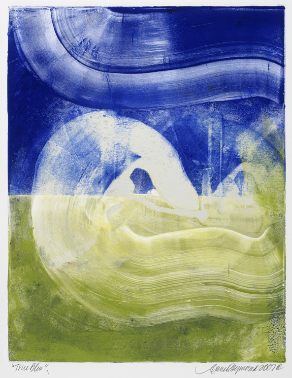
In True Blue, painter Anne Raymond's vivid colors are inspired by the beauty around her Hamptons' studio.

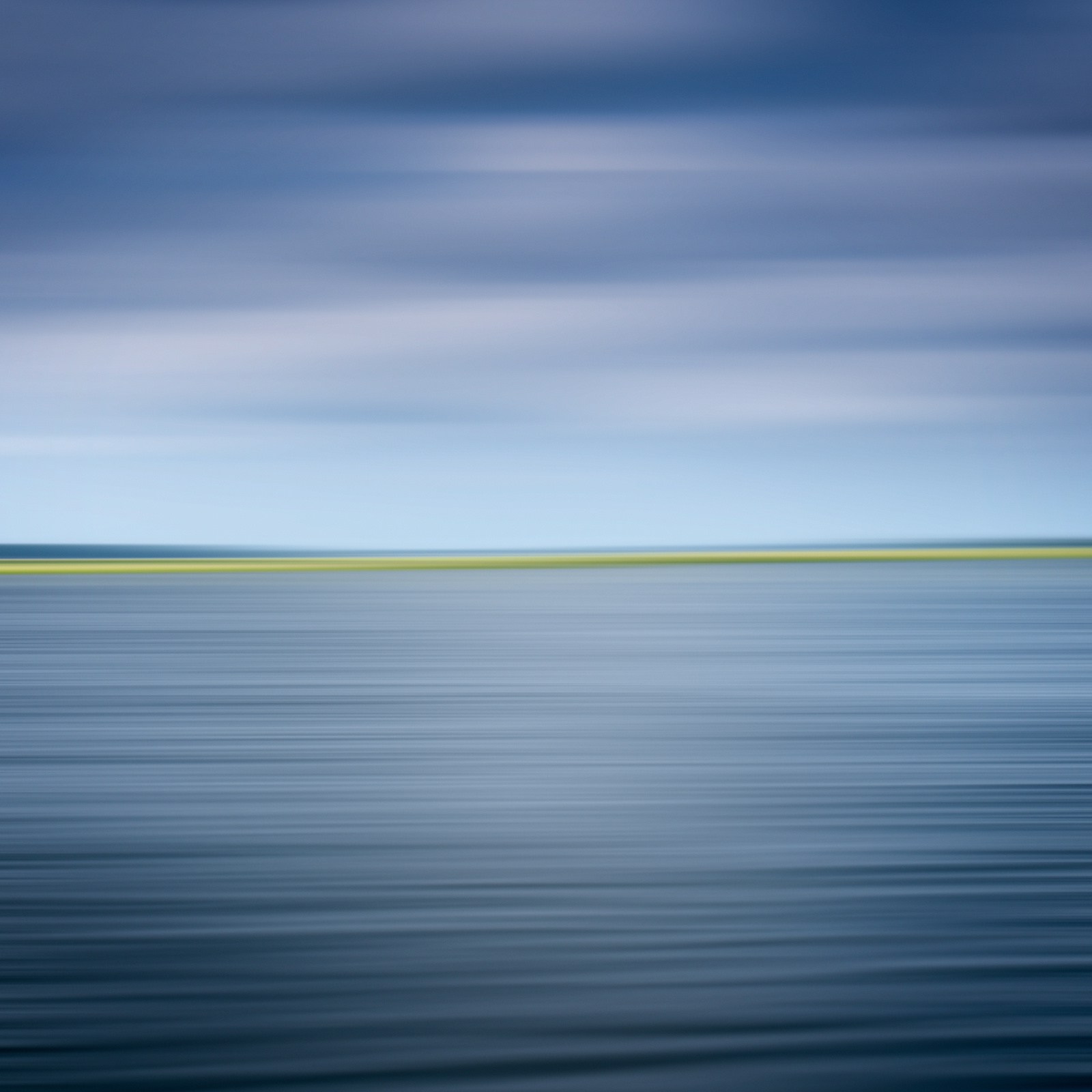
I love the blues in John Duckworth's abstract photographic landscape, Bohicket Creek. It captures the serene beauty of the South Carolina coast, the ocean, sky and horizon.

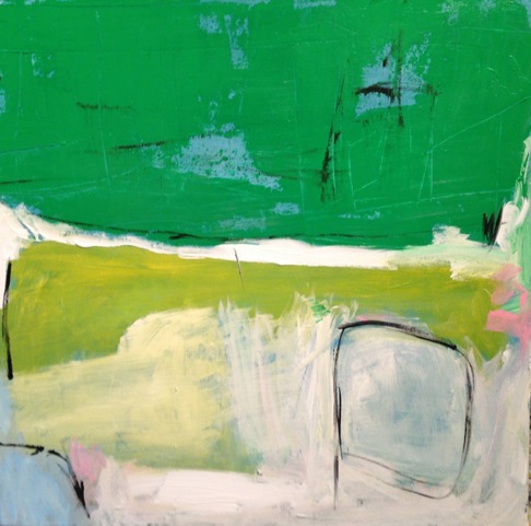
This is one of Artist Kerri Rosenthal's paintings with "happy colors", 20/20 Vision, like many of her abstract paintings are filled with exuberant colors and combinations

I extend my appreciation to each of them for allowing me to show their work. I am equally appreciative to those artists I have worked with over time, for being supportive of my family and me as we go through this journey. Please browse artwork here, on the RE site, Facebook and in our gallery. Be in touch if you have any questions.

The wait for spring seems to finally be behind us. We can personally say that my husband's wait is also over, but we think about the 122,000 in the US and over 10,000 in NYS who are waiting for life-saving transplants. If interested in more information about organ donation, or to register to be a donor, please go to ShareLifeNY.org or DonateLife.net to find your state’s registry.

Thank you!

Valentine's Day // Celebrate with heART!
February 14th celebrates love and connectedness. Like most holidays, Valentine's Day  has become an opportunity to market and sell products, but it’s hard to ignore the day and the ads, when the sentiment it’s promoting is love and friendship.  In the visual realm, the holiday is about color; reds, pinks and fuchsias, and about shape; hearts, hearts and more hearts!

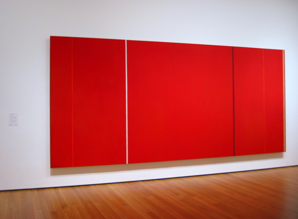
The spectrum of color symbolizes all that’s synonomous with Valentine’s Day. Red is about passion, love, desire and also energy, strength and power. Red is interesting, people love it…or they don’t. There are artists recognized for their strong use of color, particularly red. Abstract Expressionist Barnett Newman, known as a color field painter for his canvases of pure flat color that expressed his philosophies (not for this post), had numerous solid red paintings.  Vir Heroicus Sublimis, 1950-51, from his Zip Series, is in MOMA's permanent collection.

Also minimal, this photograph by Elisa Keogh captures the colors of a vibrant sunset, red contrasted with warm golds, from her Horizon series.

Anne Raymond's artwork has a strong focus on color. Clients and I  often gravitate towards her blue canvases, but for red-lovers, her paintings are very appealing. Cadmium pairs the color of the red dye itself with natural greens and golds for a strong but warm result.

Painter Xanda McCagg uses layers of color, texture and line in her work. Struck, covers this range of colors in a small canvas, 10.5"x8.5"

Shelli Breidenbach is known for her equestrian photography, which is featured in Ralph Lauren stores throughout the world. One of her series Red, is bold, she silhouettes the horses against strong colorful backgrounds to create a graphic image.

Pink, at the opposite end of the red spectrum is a softer color that also symbolizes love and romance, and in addition, caring and tenderness. Andrea Bonfils uses pinks with reds in her mixed media reference to Mark Rothko, Rothko Pink Window

The heart shape has been the symbol of love and emotion since the Middle Ages. The first recorded drawing of a heart was documented in 1250 and ever since, hearts have been and remain popular with artists and collectors. From subtle and abstract, Red February ll, in a series by  Raymond,

to fun and bold.  “Drippy Heart”, from Kerri Rosenthal, one of many in her successful heart series.

A peek at how one of Rosenthal's graphic hearts looks in a beautifully styled entry by her design firm, D2 Interieurs

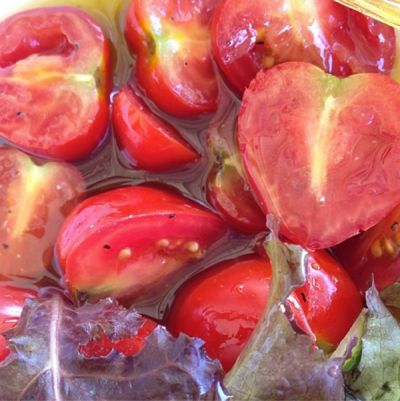
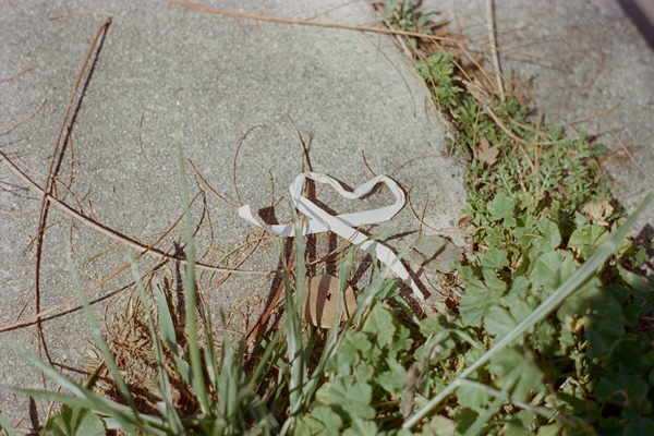
Actress Drew Barrymore recently published a photography book devoted to her heart collection. "I have always loved hearts…the way that a continuous line accomplishes the most extraordinary thing--it conveys love." Her book Find It In Everything, contains the photos of heart-shaped objects and patterns she has come across in everyday life and photographed over the past ten years, from a bowl of cut tomatoes

to a random paper on the street

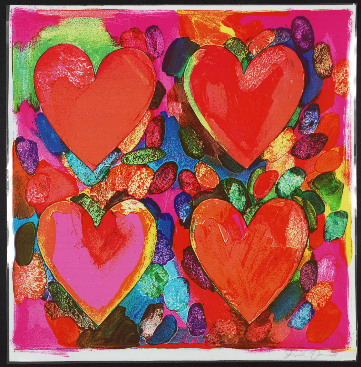
Contemporary artist, Jim Dine, is renowned for his heart-filled artwork, prints, paintings and sculptures. He combines the influence of Pop Art, with everyday objects and hearts. For Dine, the hearts function as a "sign that one can care, that there is a constant presence of feeling."  From a colorful print, Four Hearts, 1969

to the 12' Two Big Black Hearts, 1985

Valentine's Day is about feelings, and the day is drenched in warm colors; from pinks to strong reds, and visions of hearts everywhere to convey the feelings. I will overlook the ads and the commercial aspect of the holiday…because I like that it’s a day that speaks to the sentiments of friendship and love and connectedness.

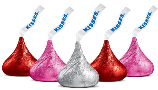
And, I'll enjoy the chocolates that seem to be everywhere…Happy Valentine's Day!

Armory Arts Week - Part 1 // The Armory Show

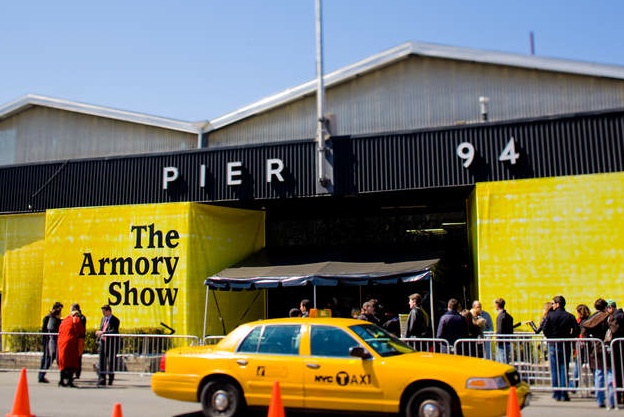
The Armory Show celebrated its 100th year this month. The first show was held in NYC at the 69th Regiment Armory on Lexington Ave. It has grown into a week-long, city-wide arts event, Armory Arts Week, with a multitude of events throughout the city. The city hosts exhibitors, galleries, art dealers and buyers from around the world.

Each Manhattan-based event has a different focus. The Park Avenue Armory exhibits "blue-chip" art, the high end of the art spectrum from exclusive dealers worldwide. Additional venues in the city host international fairs like SCOPE and VOLTA. The Armory holds the Fountain Fair, museums host events through the week, as well as neighborhood fairs, the Independent Art Fair in Chelsea and others in Brooklyn and Soho that showcase the local arts scene.

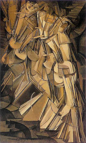
The "Armory Show" itself moved to the Piers in 2001 and the focus is on Contemporary Art by living artists and Modern Art by historically significant artists. There was a mix of genres, countries and artists of all ages.The initial show 100 years ago caused an outrage, President Teddy Roosevelt said, "That's not art!"  in response to the exhibit of works by the new Modern artists, Duchamp, Cezanne, Matisse and more.

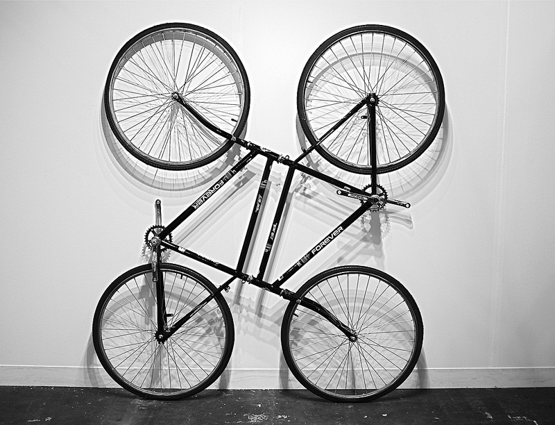
We hear the same thing  today as we walk through museums and art fairs -  especially when looking at today's newer genre, Conceptual Art. Here, one of Ai Weiwei's Bicycle sculptures.  The controversial Chinese artist's work is a commentary on the country's ubiquitous form a transportation.

Many contemporary artists are working with technology creating digital installations and video art as they explore , comment and reflect on the use and effects of technology in today's world.

NYC's Bryce Wolkowitz gallery showed South Korean artist Airan Kang’s Luminous Words. I have seen full exhibits of her terrific works, which are a continuing exploration of books as a source of knowledge in the digital age. You can select a few books to your existing bookshelf,

or choose to install a full digital library!

In "Dinner for Two", NY-based artist Rachel Lee Hovnanian is exploring “the blurring of reality and the narcissistic side of digital life”, at Leila Heller Gallery's booth. She comments on communication, and how it's changing, using video screens as a replacement for real-life interactions and communications.

There was art reflecting an interest in text and the written word. Mel Bochner  has been using text in his work since the 70’s. His well  known Blah Blah, Blah


and a grouping of smaller pieces

Another approach to the use of words as imagery is from Rob Wynne, who uses poured glass, creating wall sculptures, either graphic

or using words, often of iconic sayings

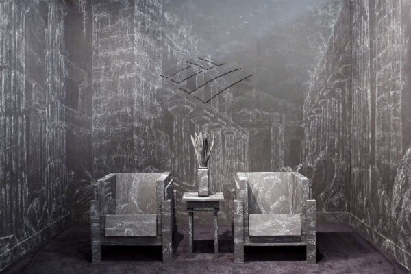
The Morgan Lehman booth was transformed by Kysa Johnson's installation. She recreated a Bank of America waiting room with blackboard paint covered in chalk drawings. At first glance the work is decorative, yet the imagery depicts the decay of Roman ruins based on an artist’s 18th century work. Johnson's work usually has either historical or scientific reference. Interior designer Bryant Keller was at the booth and told us about the smaller home installations he commissioned Johnson to do for his clients. I'm looking forward to seeing photos of the projects.

a detail of the intricate drawing

It's a busy, dizzying scene walking through the Piers - taking in the art, people watching and listening to assorted languages.

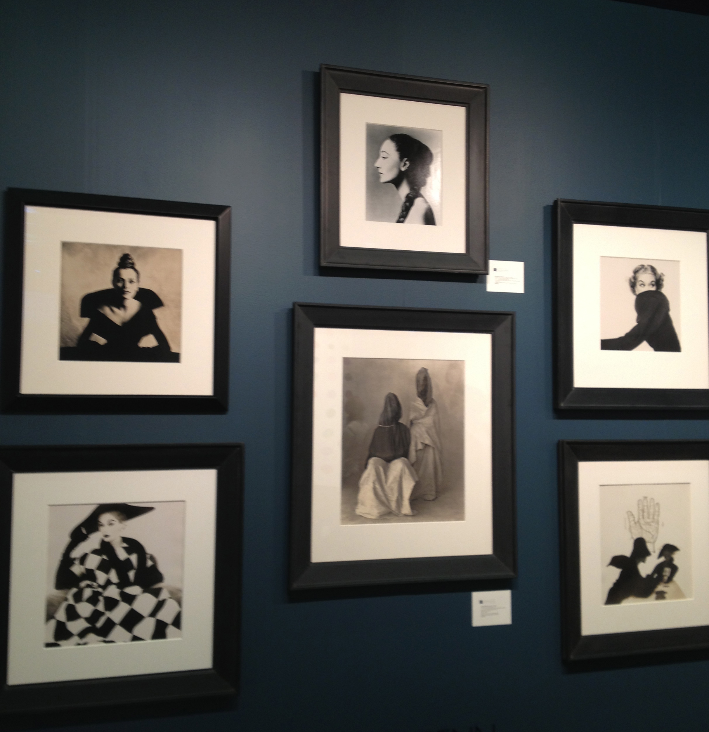
Enjoying Modern favorites, like Irving Penn's iconic fashion photographs

to seeing new artists, like South Korean artist Jung Lee , who places neon phrases within her deserted landscapes

The art fairs were well attended this year and the reviews were favorable. Each year there are more events through the city, which can be overwhelming as you try to tactically plan to take in as much as possible. I managed to visit several fairs and spent a day walking through Chelsea galleries, (more in my next post, Part 2).  A century later, as the Armory Fair is celebrating 100 years, seeing the new best thing in art is still a much-discussed, love-it or hate-it spectacle!

Color // The Power of Red

Red is an emotional color. It elicits feelings, both positive and negative, depending upon its context. Last year, I wrote a blog in February about the color red in art & design and why it has become associated with Valentine's Day. When I began thinking about it recently and if and how I might add to this, I found red was present in many places other than art. It prompted me to think about what else elicits emotion. Abstract Expressionist Mark Rothko's "No.1 (Royal Red & Blue)" sold in November 2012 for $75 million at a record-setting Sotheby's contemporary art auction. The NY Times reported that as the bidding was escalating, the dealers described this painting as having "wall power" - as in, it is large, and has presence, a result of the strong color and composition, and thus fetched a significant price.

Leatrice Eiseman, a color specialist, is an "international color guru". She works with color consultant Pantone, and with companies worldwide offering advice on how color can affect their brands. Eiseman says, "People love red".  In her book, "Colors for Your Every Mood", she writes that red evokes a physiological reaction. And since it is believed to promote passion, it's an obvious choice for the bedroom. Red is perceived as the most sensual of all colors and, as the saying goes, 'sex sells.'

Diana Vreeland, the larger than life fashion editor of Harpers Bazaar, Vogue and then Creative Consultant to the Costume Institute at the Metropolitan Museum said, "Red is the great clarifier - bright, cleansing, revealing. It makes all colors beautiful. I can't imagine being bored with it ... I wanted this apartment to be a garden - but it had to be a garden in hell."

Vreeland in her  multi-patterned living room, with layers of red,  her "garden of hell",  photographed by Horst P. Horst

Editor Pamela Fiori recently wrote in Harper's Bazaar about Richard Avedon and his muse, Audrey Hepburn. This photo was one of his many photographs during his collaboration with Vreeland.


The passion of red extends to other fields, including sports...and this was very apparent to me recently. At a Super Bowl party last week, a kitchen conversation, away from the TV's and the game, turned to politics, Michelle Obama and her fashion choices. There was a sharp divide on the subject of the Jason Wu flowing red organza gown she wore to the Inaugural Balls. Was it a good color for her, was it too strong, was it elegant, did she look better in white four years ago?  My opinion: I thought she looked beautiful and regal in red!

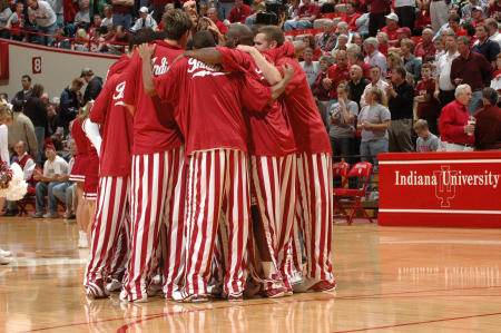
And then the sports teams themselves. This past week with football season over, my family turned its focus to Big Ten college basketball. I began to notice the red and white uniforms. First, of the Indiana Hoosiers (my son's team, so a family favorite!) then, the Wisconsin Badgers and Ohio State Buckeyes. Really, once you start looking, there's a long list of teams with red in their uniforms, from college to the pros.

National Geographic reported a study by anthropologists on the power and benefits of red in sports. It stated that, "when opponents of a game are equally matched, the team dressed in red is more likely to win."  It went on, "Across a range of sports, we find that wearing red is consistently associated with a higher probability of winning."  The feeling is that there is an intuitive, but not conscious, aspect to seeing the benefits of the strong color.

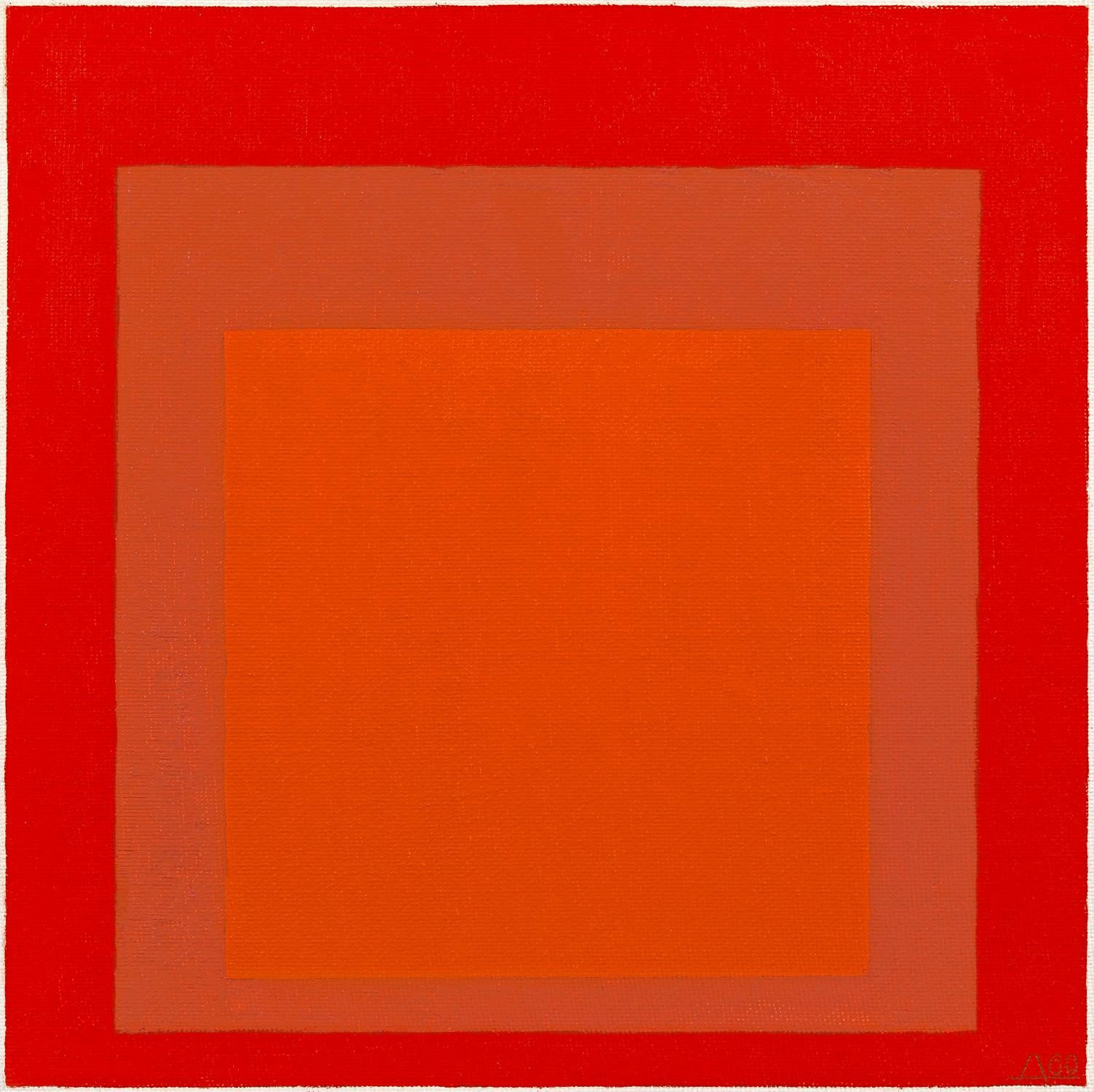
In art, color theorist Josef Albers series, Homage to the Square, he explored chromatic interaction of nesting squares. One of  his red studies

I'm a fan of the strong canvases of several artists that I work with;

Attraction, by Xanda McCagg - with an evocative name

Random Red, by  Andrea Bonfils - created with layers of encaustic wax

Cirrus Cadmium ll, by Anne Raymond - named for the red pigment

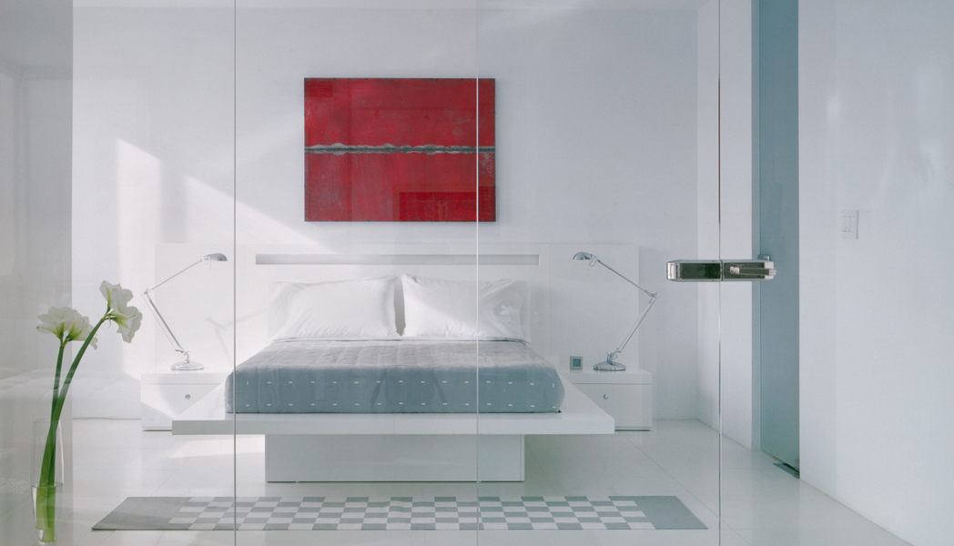
In interiors, color is used sparingly as an accent or in large doses to fill the room. Designer Jennifer Post, known for her minimalist interiors, often punctuates a space with bright color

Architectural Digest recently featured the LA home of Maroon 5's Adam Levine, beautifully filled with an art collection and mid-century furnishings. Designer Mark Haddaway used a combination of reds, from the deep rich hue of the drapes, to the pattern of the rug to accent the masculine bedroom. The oversized bright red tufted red ottoman is the visual centerpiece

Miles Redd is known for his bold use of color and often chooses red, either saturating a room in the color or in small doses of red as in this fun closet.

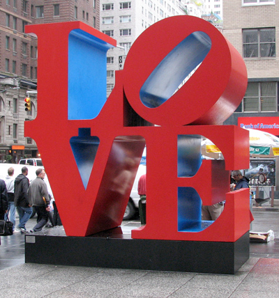
Robert Indiana's LOVE sculpture was initially created as a holiday card for the Museum of Modern Art. The design then became a sculpture exhibited at the Indiana Museum of Art.  It has since been recreated around the world, it became a postage stamp and an iconic pop art symbol.

As a color identified with emotion and love, red has long been associated with Valentine's Day. I found it so interesting when I began to focus on the color red, I realized it was all around me: from the First Lady to fashion to interior design to art, to sports uniforms. Totally different applications, but in each, the color red, elicits emotion.

Intro to LA art - Part 2 // LACMA

On Sunday afternoon in LA, the plan was to take a quick visit to The Los Angeles County Museum of Art, LACMA, with the intention of seeing the Metropolis ll installation by Chris Burden. Another day, another very different art experience than I'm accustomed to in NY. NYC weekend art viewing at a major museum is about long lines, crowds and trying hard to maneuver to actually see the art.  LA meant...sunny day, stroll among Robert Irwin's palm tree garden, seeing the outdoor exhibits and a few indoors, it was easy, no traffic and no crowds! The palms are an evolving installation, planted in a grid.

We walked around Chris Burden's, Urban Light....an installation created from a restored collection of over 200 cast-iron lampposts from throughout LA.

The outdoor courtyard takes you through and around a cafe that was quietly filled on this beautiful afternoon...I could imagine enjoying this year-round.  Different than NYC, the MOMA garden or roof of the Met are packed during the short warm weather months.

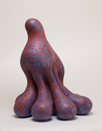
We stopped in to see the Ken Price Retrospective. An LA based sculptor, who passed away last year - he is recognized for blurring the lines between sculpture and painting. Frank Gehry, a friend of Price's designed the exhibit, an overview of his 50 years of work and contribution to the art of sculpture.

His early pieces reflects time spent in Taos, with Southwestern feel and colors. Many pieces have this sense of being exposed, one side contrasting to the rest, revealing the shape and color within.

Price's recent and more well known work, are odd, rounded shapes that are all "lump and curve". He applied many layers of paint to achieve different luminous colors and textures, and meticulously smoothed the ceramic surface.

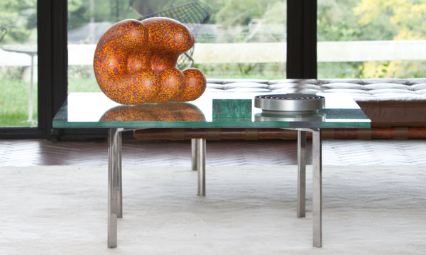
Philip Johnson's Glass House in New Canaan, CT is now exhibiting Doola, Price's last work before his death.

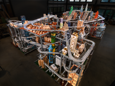
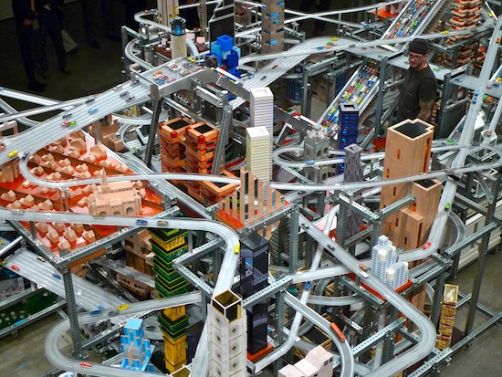
We head back across the courtyard to the timed showing of Metropolis ll...this is a pretty ambitious installation by Chris Burden. It's a kinetic sculpture that took 4 years to build, of a series of roadways, there are  100,000 cars that travel the 6-lanes on the 18 roadways

"The noise, the continuous flow of the trains, and the speeding toy cars, produces in the viewer the stress of living in a dynamic, active and bustling 21st Century city.", Burden says of his creation.

Unfortunately, our timing was off, and we didn't get to see Metropolis ll in motion, so I watched the video -

[embedplusvideo height="376" width="620" standard="http://www.youtube.com/v/llacDdn5yIE?fs=1" vars="ytid=llacDdn5yIE&width=620&height=376&start=&stop=&rs=w&hd=0&autoplay=0&react=0&chapters=&notes=" id="ep2312" /] On our way out, we saw Levitated Mass, or locally referred to as "The Rock", the infamous installation that took years from conception to installation

Michael Helzer conceived of this sculpture in 1969. Decades later he found the boulder he wanted in Riverside, CA. He then created the 456 foot long slat to support the rock above the pathway. Helzer's vision, "speaks to the expanse of art history, from ancient traditions of creating artworks from megalithic stone, to modern forms of abstract geometries and cutting-edge feats of engineering."

I heard stories of the journey of this boulder, the efforts to transport the 340-ton boulder, it travelled on a specially designed transport, over 11 days, through 22 cities, moving only at night. The planning and organization that this took....

The journey was documented and written about.

On this beautiful afternoon I enjoyed  seeing it from many angles, walking towards it, under it and contemplating the enormity of this stone and how...and why it was there.

I thoroughly enjoyed 2 days of LA art, and an intro to works by a number of diverse  local, and renowned artists.