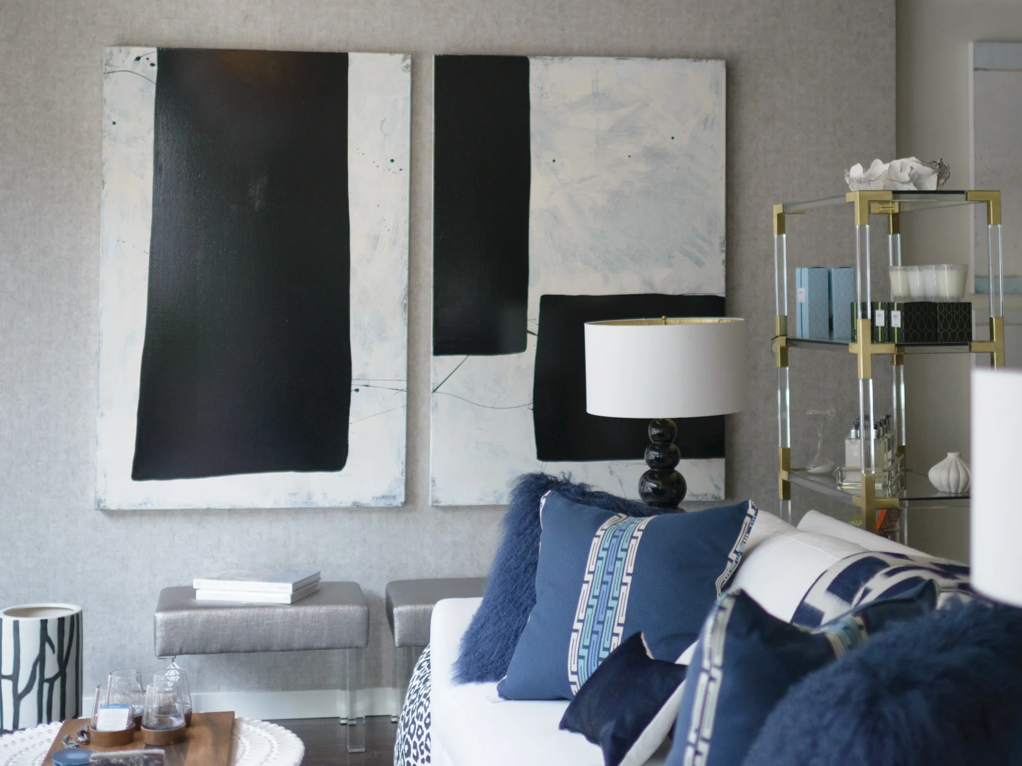
Living with Art // The Beauty of Summer Color

It is the beginning of the end of summer. One more week, Labor Day weekend, and we officially close the doors behind us and step into our busy fall mode. Before its over, there’s still time to enjoy all that we love about the summer...the natural beauty of the long days and nights, warmth, the sun, the sky, the water, mountains, beach and how it all makes us feel.

Have you noticed how full Facebook and Instagram feeds are with our friends’ pics of their special place, in the morning when the sun comes up, during the day when they're outdoors and again at sunset? Regardless of what your “place" is, the colors and feel of summer resonate with us all. My blog series, Living with Art, started last month with Soft Summer Color. This month it’s about The Beauty of Summer, from natural colors to richer deeper tones.  An insta pic from our RE feed that I took on a July night when the light was picture-perfect at the marina in Sag Harbor

I often receive positive responses to artwork that reflects the season and the lighter way that we feel. People react to the colors of nature, all shades of blue and warm natural tones. I felt fortunate in the past few months to work with clients who chose artworks that “feel like summer”. Artists’ inspiration often comes from what they see and the individual beauty comes from how they interpret it.

Visiting John Duckworth in his South Carolina studio, my friends and I were overwhelmed by the array of his Abstract Landscape collection, and the creative way he presents it.

Each image has a story, a particular creek, a river or coastline, the time of day or the position of the moon. John captured the Super Moon, those rare nights when the moon is at it's largest, last August in Charleston. This striking image captures the light of the moon's reflection against the sky, and is perfectly suited for our friends' Kiawah beach home.

Wanting to bring the beauty of my friends' native Charleston to her NY home, the deep richer colors of the sunset at Church Creek are a stunning compliment to the light-infused blue and gold interiors.

Photographer Shelli Breidenbach also explores the abstract beauty in her natural subjects, her Abstract Seascapes and the Abstract Shell Series are inspired by time spent at her home in Sag Harbor. Abstract Shell No. 6 is one of 6 large-scale images revealing the remarkable details, shapes, curves and colors naturally found in different shells.

Printed large and mounted in acrylic, the graphic image is a great addition to this master bedroom designed by Mara Solow Interiors. The colors and depth in the photo are a beautiful compliment to the subtle color, pattern and texture in the room.

The entry to this Hamptons home lets you know that it’s time to relax, welcoming guests with the warm combination of wood and natural colors of Abstract Shell No. 5 in this large scale 50”x50” image

Photographer Stuart Zaro  finds inspiration close to home. He lives in an idyllic spot on Cobamong Pond, which he photographs all year, through the seasons. This is a favorite summer image, Boat on Cobamong, to me, it is calm and quiet.

Abstract painters interpret the summer very differently. Artist Kerri Rosenthal speaks of her love of the beach and ocean and how it informs the colors in her work. The deceptively simple stripes of color, turquoise and marine blue, concisely tell her story of summer, a modern twist on nautical stripes, the canvases are fresh and fun. Stripe on Stripe No. 2

and in a pair

Kerri's time in the Hamptons a few months ago inspired a series this summer. The soft blues and browns of Sagg Main found a great home, bringing contrasting, but subtle color, to the neutral browns and golds in our clients' comfortable family room.

I love the view from the kitchen, the painting is beautifully framed within the architecture of the doorways

I recently enjoyed meeting artist Claudia Mengel at her Connecticut studio and seeing the breadth of her work. I was struck by the compositions and clean colors, especially the blues in her abstract paintings. Waterfall, 60"x30"

Mengel explained the reasons she paints in blue, “Growing up on the water of Long Island I have always been inspired by the colors of the ocean. With the changes of the seasons and time of day...by how the color blue had such range...it is very nostalgic to me, it's very present in many of my paintings. It can have a peaceful aura or it can have strength and energy. It is a color that I love to have partner with any other colors in my composition. It seems to be the color that always fits.” A recent triptych, The Seine, in Claudia's studio, illustrates this well

Summer, the beach and ocean, sand and surf are what Christine Wexler of Bramasole Photography photographs. She is often out east, on the beaches of Montauk and elsewhere through Long Island. Christine’s photos are not just for surfers, this image and many others have been installed in homes in order bring the beauty and feel of summer inside all year long.

One look at any of these artworks and you’re there, you step right into your special summer “place”.

Enjoy the rest of the summer, it’s not over yet!!

The Art of Waiting // National Donate Life Month

Spring has been slow to arrive this year. It feels like we have been waiting a long time for the winter  to end and for warm weather to arrive.  We wait for many things, but nothing compares to the wait being endured by 122,000 people waiting for a life saving organ transplant. Being on the wait list means not knowing whether  a donated organ will be received in time.

I was reminded of the issue of waiting while visiting with a sculptor in his studio a few months ago, I was moved by this piece, Waiting for News. Christopher E. Green captures what it is like for family members to wait for news while a loved one is receiving critical care. From the moment I saw it, I felt the emotion he portrays about his experience in a hospital waiting room. “We were all waiting for news of our love ones...Waiting for News attempts to convey the emotion of those that were in limbo, not knowing whether their news would be good or bad.  Not knowing which way their emotions would go.”

My family knows this experience well. My husband Howard was diagnosed with Ideopathic Pulmonary Fibrosis, an illness with no known cause and no known cure. We were told he had 5 years, at which point, he would be a candidate for a life-saving lung transplant. I wrote about this in a previous blogpost, now, I will emphasize that it is 2 1/2 years later, and we are grateful every day to his organ donor for providing him with a second chance at life. His story, and more about organ donation are on our organization’s site, Share Life.

Last spring at our Inaugural Event for Share Life, we featured the photography of Stuart Zaro, particularly this image, Waiting. This photo, taken in Grand Central Terminal, became a symbol of the long and emotional wait sick patients endure while waiting for a transplant.

When I make studio visits, I am drawn to artwork in the colors of Donate Life, the national organization that promotes the issue. April is National Donate Life Month, and groups around the country promote all things blue and green, colors that signify life and health. This Friday, April 11th is National Blue and Green Day.

Romanoff Elements, along with Share Life, supports the efforts of the New York Organ Donor Network, the New York City based Organ Procurement Organization that coordinates organ donations within New York State. Each donor can potentially save 8 lives and impact up to 50 lives with their organs and tissue. A portion of proceeds of RE sales this month will go towards the NYODN’s work. The artists I work are supportive of this issue as well. I’ve included a few blue and green artworks, prints, paintings, photographs and paintings, inspired by nature in shades of blues and greens.

Photographer Nancy Woodward captured this springtime image, First Day of May, while shooting in the woods, she looked up and “saw the canopy of skies in the afternoon sky”. The image is about light and blue and green and spring all at once!

In True Blue, painter Anne Raymond's vivid colors are inspired by the beauty around her Hamptons' studio.

I love the blues in John Duckworth's abstract photographic landscape, Bohicket Creek. It captures the serene beauty of the South Carolina coast, the ocean, sky and horizon.

This is one of Artist Kerri Rosenthal's paintings with "happy colors", 20/20 Vision, like many of her abstract paintings are filled with exuberant colors and combinations

I extend my appreciation to each of them for allowing me to show their work. I am equally appreciative to those artists I have worked with over time, for being supportive of my family and me as we go through this journey. Please browse artwork here, on the RE site, Facebook and in our gallery. Be in touch if you have any questions.

The wait for spring seems to finally be behind us. We can personally say that my husband's wait is also over, but we think about the 122,000 in the US and over 10,000 in NYS who are waiting for life-saving transplants. If interested in more information about organ donation, or to register to be a donor, please go to ShareLifeNY.org or DonateLife.net to find your state’s registry.

Thank you!