The Art of Waiting // National Donate Life Month

Spring has been slow to arrive this year. It feels like we have been waiting a long time for the winter  to end and for warm weather to arrive.  We wait for many things, but nothing compares to the wait being endured by 122,000 people waiting for a life saving organ transplant. Being on the wait list means not knowing whether  a donated organ will be received in time.

I was reminded of the issue of waiting while visiting with a sculptor in his studio a few months ago, I was moved by this piece, Waiting for News. Christopher E. Green captures what it is like for family members to wait for news while a loved one is receiving critical care. From the moment I saw it, I felt the emotion he portrays about his experience in a hospital waiting room. “We were all waiting for news of our love ones...Waiting for News attempts to convey the emotion of those that were in limbo, not knowing whether their news would be good or bad.  Not knowing which way their emotions would go.”

My family knows this experience well. My husband Howard was diagnosed with Ideopathic Pulmonary Fibrosis, an illness with no known cause and no known cure. We were told he had 5 years, at which point, he would be a candidate for a life-saving lung transplant. I wrote about this in a previous blogpost, now, I will emphasize that it is 2 1/2 years later, and we are grateful every day to his organ donor for providing him with a second chance at life. His story, and more about organ donation are on our organization’s site, Share Life.

Last spring at our Inaugural Event for Share Life, we featured the photography of Stuart Zaro, particularly this image, Waiting. This photo, taken in Grand Central Terminal, became a symbol of the long and emotional wait sick patients endure while waiting for a transplant.

When I make studio visits, I am drawn to artwork in the colors of Donate Life, the national organization that promotes the issue. April is National Donate Life Month, and groups around the country promote all things blue and green, colors that signify life and health. This Friday, April 11th is National Blue and Green Day.

Romanoff Elements, along with Share Life, supports the efforts of the New York Organ Donor Network, the New York City based Organ Procurement Organization that coordinates organ donations within New York State. Each donor can potentially save 8 lives and impact up to 50 lives with their organs and tissue. A portion of proceeds of RE sales this month will go towards the NYODN’s work. The artists I work are supportive of this issue as well. I’ve included a few blue and green artworks, prints, paintings, photographs and paintings, inspired by nature in shades of blues and greens.

Photographer Nancy Woodward captured this springtime image, First Day of May, while shooting in the woods, she looked up and “saw the canopy of skies in the afternoon sky”. The image is about light and blue and green and spring all at once!

In True Blue, painter Anne Raymond's vivid colors are inspired by the beauty around her Hamptons' studio.

I love the blues in John Duckworth's abstract photographic landscape, Bohicket Creek. It captures the serene beauty of the South Carolina coast, the ocean, sky and horizon.

This is one of Artist Kerri Rosenthal's paintings with "happy colors", 20/20 Vision, like many of her abstract paintings are filled with exuberant colors and combinations

I extend my appreciation to each of them for allowing me to show their work. I am equally appreciative to those artists I have worked with over time, for being supportive of my family and me as we go through this journey. Please browse artwork here, on the RE site, Facebook and in our gallery. Be in touch if you have any questions.

The wait for spring seems to finally be behind us. We can personally say that my husband's wait is also over, but we think about the 122,000 in the US and over 10,000 in NYS who are waiting for life-saving transplants. If interested in more information about organ donation, or to register to be a donor, please go to ShareLifeNY.org or DonateLife.net to find your state’s registry.

Thank you!

Holiday Wishes // Black & Whites with a Golden Touch

The recent snowy days inspired this black, white and neutral palette. Looking outdoors, whether at the contrast between the fresh snow, and the bare trees or the city streets and lights, this feels like winter. The artworks on our holiday card are without color, whether oil painting, mixed media or photography, they are soft shades of white or the high contrast of classic black and white, touched with golden snowflakes! Anne Raymond's paintings are usually filled with strong color. Never Late has color, but in a very subtle way. Raymond captures the various whites of winter, complimented by warm and natural colors of nature.

A quiet painting is a departure for Xanda McCagg as well. Her canvases which use line and form as an abstract expression of larger experiences are usually strong and vibrant. In Touched, the subtle monochromatic shades of grays, whites and tans, with graphite lines, are just as layered as her more colorful work.

In Lightness, Andrea Bonfils layers encaustic wax to add more depth to her gestural underwater photograph, creating a floating and ethereal effect when contrasted against the dark ground.

A client hung a triptych of Bonfils underwater series to beautifully compliment a white living room by Heiberg Cummings Design.

In Africa, Stuart Zaro captured the natural graphic beauty of these zebras. Zaro’s intertwined Zebras No.2 , from his Game Blue Collection, are a reminder of the gentle and stunning beauty of nature.

The simplicity of black and white makes a statement. Kerri Rosenthal, a painter recognized for her bold and creative use of color, also does a strong collection of black and white works.

The contrast of the opposite colors provides an appealing tension, whether it’s in a photograph, painting, a room or fabric. Take a look through my Pinterest board for more black and white inspiration.

Surfer Girl, an iconic image from Bramasole Photography, by Christine Wexler captures the beach and summer at its best. On these wintry days, I love looking at Wexler’s beach photos - they capture carefree, warm summer daysHoliday calls for some sparkle and shine! The Swarovski Snowflake, the huge twinkling crystal above Fifth Avenue and 57th St. is a sparkling ornament with a purpose, “It’s a special symbol for the world's most vulnerable children. It hangs as a reminder of UNICEF’s commitment to reach a day when zero children die from preventable causes.”

Wishing you a very happy holiday and peace and good health in the New Year!

Color First // Creative Kerri Rosenthal

I want what she’s having...and what artist Kerri Rosenthal is having is a serious dose of creative fun that’s making her and her client’s happy. While talking to Kerri about her work, her inspiration and her process, I smiled because her “happy” talk is contagious.  And her paintings exude the same positive energy that she does.

I met Kerri a bit over a year ago after we both installed artwork at Nest Inspired Home, a home furnishing retailer in Rye, NY. I realized I was familiar with her work, I had seen it at several Connecticut stores that have been steadily selling her work, work that’s defined by color and energy.

She has been painting for only 5 years, and in that time she has established a strong following in and around her local Fairfield, CT home and studio and well beyond, throughout the country. I was curious to learn how she managed to do this so quickly and beome a “go to” source for many interior designers and clients.

Kerri’s Pinterest page has over 3500 followers, that’s an impressive following for an independent artist, and she sells her paintings to fellow 'pinners'. Her presence in the design world has evolved into a thriving interior design business as well. She infuses her interiors with the same sense of color and  pattern, sometimes bold, sometimes quiet, as her canvases.

Early on, after studying fashion and merchandising at NYU, Kerri’s creative interests were focused on fashion. She spent a few impressionable years with the Oilily, a Dutch apparel company that was synonymous with exuberant color and pattern. Time spent traveling throughout Europe and in their “creative and color-infused headquarters" in the Netherlands had a lasting impact.

After a break to have her 3 children, a random dinner out provided a spark of inspiration that created a new future for Kerri. Sitting in a restaurant one night, Kerri was moved by some beautiful paintings on exhibit. The next day, she bought her first paintbrush and supplies to try to recreate what she saw. She hasn't stopped painting since! She is self-taught - something that allows her the freedom to grow as an artist, without limitations.


Inspiration comes to Kerri from a myriad of places. A serious book collector, Kerri’s many art & design books provide endless pages of ideas.


The exposure at Oilily re-surfaced along with other influences on her color and style; artists Wolf Kahn, abstract expressionists Willem deKooning, and Helen Frankenthaler, various Impressionist painters and recently artist Cecily Brown. Kerri added that it's are way more, a Vogue fashion spread, a piece of jewelry or the natural beauty of outdoors can just as easily inform the colors and direction of her work.

I asked Kerri why she thought people respond so positively and immediately to her work. Color is the basis of her paintings and interiors, “Color speaks to me, when it's right, the colors dance, they sing and give you an incredible feeling, like a feeling of first love”.  She talks about our sensory gut reactions to color, people's need for color. The color in her work comes from deep within, it makes her happy, and others in turn, tell Kerri, that her paintings make them happy.

Many of Kerri's clients have multiple pieces. The variety of her work has allowed collectors to buy from a few to up to 30 pieces!

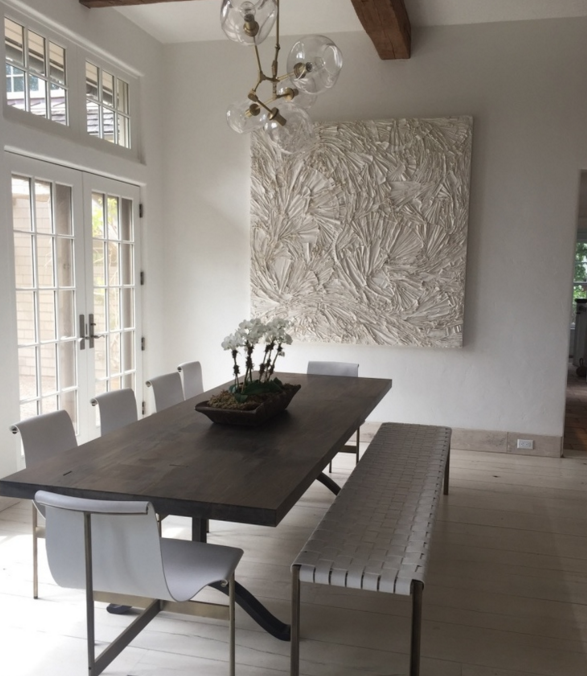
It's fascinating to me to watch people react to color, to literally see a beautiful flower, a sunset or piece of art that makes them smile. I have written in this blog about specific colors, their meaning and why and how certain colors appeal. I see it with Kerri's work, from her soft, moody landscapes with subtle color, appropriate for a candle-lit dining room or quiet corner,

to her brighter, more vibrant work, suitable for kids rooms and family-centered spaces

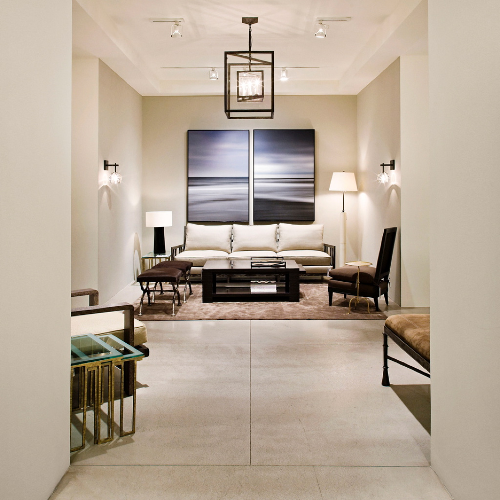
or used as an accent, in a foyer

or a beautiful vignette.

even when she paints with black, Kerri adds white for contrast to create movement and energy.

So, I’ll take what Kerri’s having...she’s energized by creating her paintings, and thrilled that her clients and collectors fill their homes with her work. She has found “it”, an elusive, and very personal factor that drives her creativity to produce work that makes people smile. Kerri calls it the “happy factor”.

Please join us this weekend for a trunk show at Spruce at Mariani Gardens in Armonk, NY, Sat and Sun 11-3. Stop in to see Kerri’s color-infused paintings firsthand!


Color // Cool Summer Nights

Late August, and the reality is setting in that Labor Day is around the corner. Barely two weeks left of summer and the ease we feel in the months of July and August. But, two long weekends lay ahead and time to still enjoy the long days and cooler nights before the pace picks up and the fall season begins. The cool shades of blue in these artworks speak to the start of the changing seasons.

Blue is nature’s color, from the water to the sky, it has many depths and hues, from a soft “sky blue” to an intense almost black, “midnight”.  A look at the range of blues, from Pantone, an international color resource.

From the soft blues in Bewitched,  a great name for this ethereal photo from Elena Lyakir where sky meets water and barely changes color but for a few clouds and horizon line.

To the vibrant color that Andrea Bonfils captures in the depth of the ocean’s blues, in one painting in an encaustic wax diptych, Beyond Deep.

Figurative artist Alex Katz uses broad flat colors in his portraits and landscapes. In August, 2007 he captures sky and water with a medium range of colors, in a spare yet definitive way.

Kerri Rosenthal, an artist known for her colorful work, also reflects the seasons in her paintings. She describes blue as, "Summer skies and the blue oceans, feelings of warmth and happiness."  Rosenthal's expressive Monsieur Bleu,

Blue is statistically the most popular color. I have experienced this as I’ve shown and sold artwork and visited homes with varying degrees of the color. Artist Anne Raymond is strongly influenced by the natural beauty of her surroundings in the Hamptons. Blue July is one of her many stunning blue works that reflect the natural color, combined with warmer colors.

The color blue is considered cool and slow as opposed to the warmth and intensity of reds. It’s a comfort color, it takes you to a good place, to where you feel the cool water and endless sky. Photographer Elisa Keogh captures the spectrum of colors in Weston, CT (blue-green-black) from her Horizon Series.

Artists use blue pigments evolved from natural sources, dating back to the mid-1800‘s. The Impressionist painters introduced some of the blue paints, including cerulean, cobalt and ultramarine. Vincent Van Gogh famously captured the night sky in several paintings. In Starry Night Over the Rhone, painted in 1888, he described the many blues, "The dark blue sky is spotted with clouds of an even darker blue than the fundamental blue of intense cobalt, and others of a lighter blue, like the bluish white of the Milky Way ... the sea was very dark ultramarine, the shore a sort of violet and of light red as I see it, and on the dunes, a few bushes of prussian blue.”

Blue is often balanced or calmed with the contrast to white. Traditional blue and white porcelain has been made for over 2000 years from the pigment cobalt. This striking abstract blue and white painting, Passion Noted, aptly named by artist Xanda McCagg, considering the strong feelings many have for their favorite color.

and back to August, the beach and the water. These boys are looking to catch The Wave, a great way to end the summer - from Bramasole Photography by Christine Wexler.

For others, the last weeks of summer are a bit more quiet and reflective. Balance 5, by Andrea Bonfils,

For me, I plan to enjoy the last summer days and will keep wearing my white jeans on these last August nights...before it's time to transition to the blue jeans I'll wear throughout the fall!

Hoping these last days stay warm and the nights comfortably cool.