


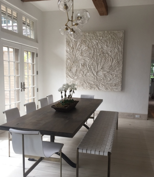


With Fathers Day this week, I took a look at the subject of men and art. As with most things, men respond differently to artwork than women do. They respond to color, shape and subject that resonate for them personally. I find it very interesting to work with women and men both separately and together as a couple. I selected a few re: artworks that speak to the bold color, graphic images and content that tend to be more man-centric. Many of the artworks combine the 6 elements that I have selected.
Read More
Oh Glow, by Allyson Monson
Celebrating Mothers Day // with ART!
It’s finally spring, it’s great to see May on the calendar! It feels like so long ago on a dreary wintry day that we planned a spring Mothers Day event at Nest Inspired Home, it’s become a tradition to welcome the warmer months with new artworks. This season we will highlight the works of photographer Allyson Monson and painter Kim Romero. Both artists share a love of texture and color, a culmination of years of experience in various forms of art and design, but their medium and artworks are very different. They are each introducing new works at Nest, here is a highlight and some ideas to bring a spring and summer freshness to any home.
Read More
re:new // New season, New site, New artworks
Romanoff Elements has been busy in the past few years. In that time we have provided artworks for many clients, we have continued to expand the artists we work with, and we seriously outgrew our website. I am thrilled that the new re: site has launched, and we can finally stop saying that it’s a “work in progress”.
Read MoreColor // Cool Summer Nights
Late August, and the reality is setting in that Labor Day is around the corner. Barely two weeks left of summer and the ease we feel in the months of July and August. But, two long weekends lay ahead and time to still enjoy the long days and cooler nights before the pace picks up and the fall season begins. The cool shades of blue in these artworks speak to the start of the changing seasons.

Blue is nature’s color, from the water to the sky, it has many depths and hues, from a soft “sky blue” to an intense almost black, “midnight”. A look at the range of blues, from Pantone, an international color resource.

From the soft blues in Bewitched, a great name for this ethereal photo from Elena Lyakir where sky meets water and barely changes color but for a few clouds and horizon line.

To the vibrant color that Andrea Bonfils captures in the depth of the ocean’s blues, in one painting in an encaustic wax diptych, Beyond Deep.

Figurative artist Alex Katz uses broad flat colors in his portraits and landscapes. In August, 2007, he captures sky and water with a medium range of colors, in a spare yet definitive way.

Kerri Rosenthal, an artist known for her colorful work, also reflects the seasons in her paintings. She describes blue as, "Summer skies and the blue oceans, feelings of warmth and happiness." Rosenthal's expressive Monsieur Bleu,

Blue is statistically the most popular color. I have experienced this as I’ve shown and sold artwork and visited homes with varying degrees of the color. Artist Anne Raymond is strongly influenced by the natural beauty of her surroundings in the Hamptons. Blue July is one of her many stunning blue works that reflect the natural color, combined with warmer colors.

The color blue is considered cool and slow as opposed to the warmth and intensity of reds. It’s a comfort color, it takes you to a good place, to where you feel the cool water and endless sky. Photographer Elisa Keogh captures the spectrum of colors in Weston, CT (blue-green-black) from her Horizon Series.

Artists use blue pigments evolved from natural sources, dating back to the mid-1800‘s. The Impressionist painters introduced some of the blue paints, including cerulean, cobalt and ultramarine. Vincent Van Gogh famously captured the night sky in several paintings. In Starry Night Over the Rhone, painted in 1888, he described the many blues, "The dark blue sky is spotted with clouds of an even darker blue than the fundamental blue of intense cobalt, and others of a lighter blue, like the bluish white of the Milky Way ... the sea was very dark ultramarine, the shore a sort of violet and of light red as I see it, and on the dunes, a few bushes of prussian blue.”

Blue is often balanced or calmed with the contrast to white. Traditional blue and white porcelain has been made for over 2000 years from the pigment cobalt. This striking abstract blue and white painting, Passion Noted, aptly named by artist Xanda McCagg, considering the strong feelings many have for their favorite color.

and back to August, the beach and the water. These boys are looking to catch The Wave, a great way to end the summer - from Bramasole Photography by Christine Wexler.

For others, the last weeks of summer are a bit more quiet and reflective. Balance 5, by Andrea Bonfils,

For me, I plan to enjoy the last summer days and will keep wearing my white jeans on these last August nights...before it's time to transition to the blue jeans I'll wear throughout the fall!
Hoping these last days stay warm and the nights comfortably cool.

Janet Mait's Recent Paintings // on exhibition in NYC
New Shoes, a collection of vibrantly colored paintings by Janet Mait is on exhibition in a striking modern office space in Manhattan. Janet's abstract work has been evolving since she debuted the collection at a Chelsea exhibition in Fall 2010. Mait describes her recent paintings as, " ... more spontaneous and the brush strokes more definite. I want an unstructured and spontaneous expression on the canvas...to reflect a sense of freedom”

The Art Student's Leaguein NYC, where Mait paints, works with corporate and community spaces throughout Manhattan interested in exhibiting artwork. The artist has an opportunity to present their work in a public space and the host has the benefit of rotating exhibitions in their hallways and offices.
Squire Sanders, a global law firm is hosting the exhibition of Mait's work. The NY experience begins at Rockefeller Center,

and continues as you enter the classic Art Deco building, 30 Rockefeller Center, which opened in 1933.

The elevator opens to the entry of the sleek and modern office space, which is a great backdrop for modern art.

Mait's work lines the office's long hallway of conference rooms.

The blue grey walls, the open space and light, all make the work stand out

The employees we spoke with enjoy having the artwork, from the halls to each of the four conference rooms.

Mait's work is about color and composition, she "thinks a lot about color combinations but so often that changes and the beginning does not dictate the end." In talking about her work and the way it has evolved, the artist likes the freedom that abstraction provides. After studying and spending time as a sculptor of bronze figures, Mait feels she can express herself in abstraction in a way that a structured composition or sculpture doesn't allow.

The exhibition will be at Squire Sanders through October 1st. It's an enjoyable walk through the classic NY architecture of Rockefeller Center, and a modern office space filled with Mait's lively abstract paintings - people tell me that Janet's color drenched paintings 'make them smile"!
