


Blue, in all of its variations is the most embraced color. It runs from soft and powdery to rich cobalt to intense midnight. Interesting, that it conveys warmth, trust and calm and then also references the darker “winter blues”, in part due to winter’s more somber mood, shorter days with less light.
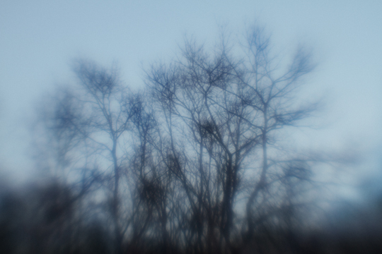
As I look outside at a late afternoon winter sky, there’s a beautiful blue mixed with rose but it’s darkened by the bare trees, similar to the sky in Elena Lyakir’s, Dream of Flying

Artists have always been inspired by nature, and attempt to capture the essence of what they see and feel from it’s colors and beauty. Claude Monet’s Water Lilies, a series of 250 paintings of his famous gardens at Giverny, is a striking artwork illustrating this. The Clouds, 1920–1926 installation at the Musee de l’Orangerie in Paris provides an all-encompassing view of the stunning blue canvases


The blues of winter range in depth and hue. Westport, from Elisa Keogh's Horizons Series has rich red blues contrasted with a golden light.

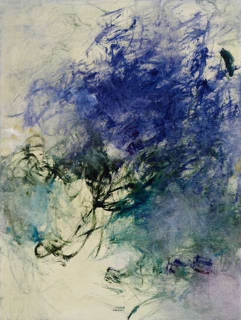
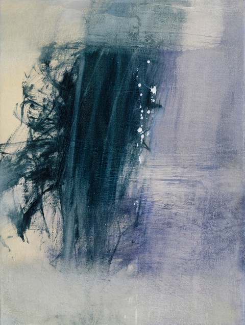
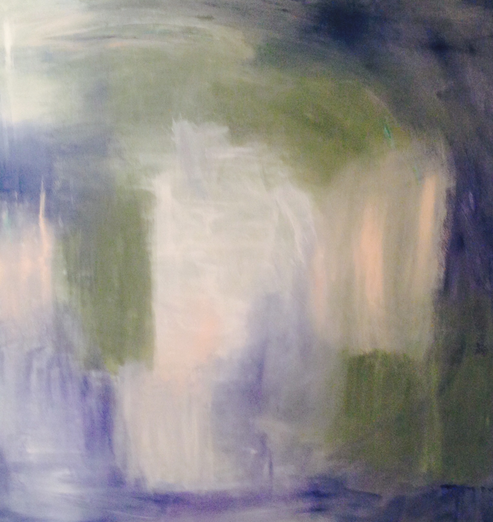
Anne Raymond’sJanuary Blue Series combines similar deep blues with greener warm tones of teal. I talked recently with Anne about her inspiration, always from nature, “The refracted light of winter and the movement in the gorgeous forest where I work are both visual inspiration in this series. The branches move swiftly sealing in my memory their momentary energy.” Two paintings from the series; January Blue lV and January Blue l
I often reference Wolf Kahn, Dark and Deep is one of his beautiful works using a blue palette

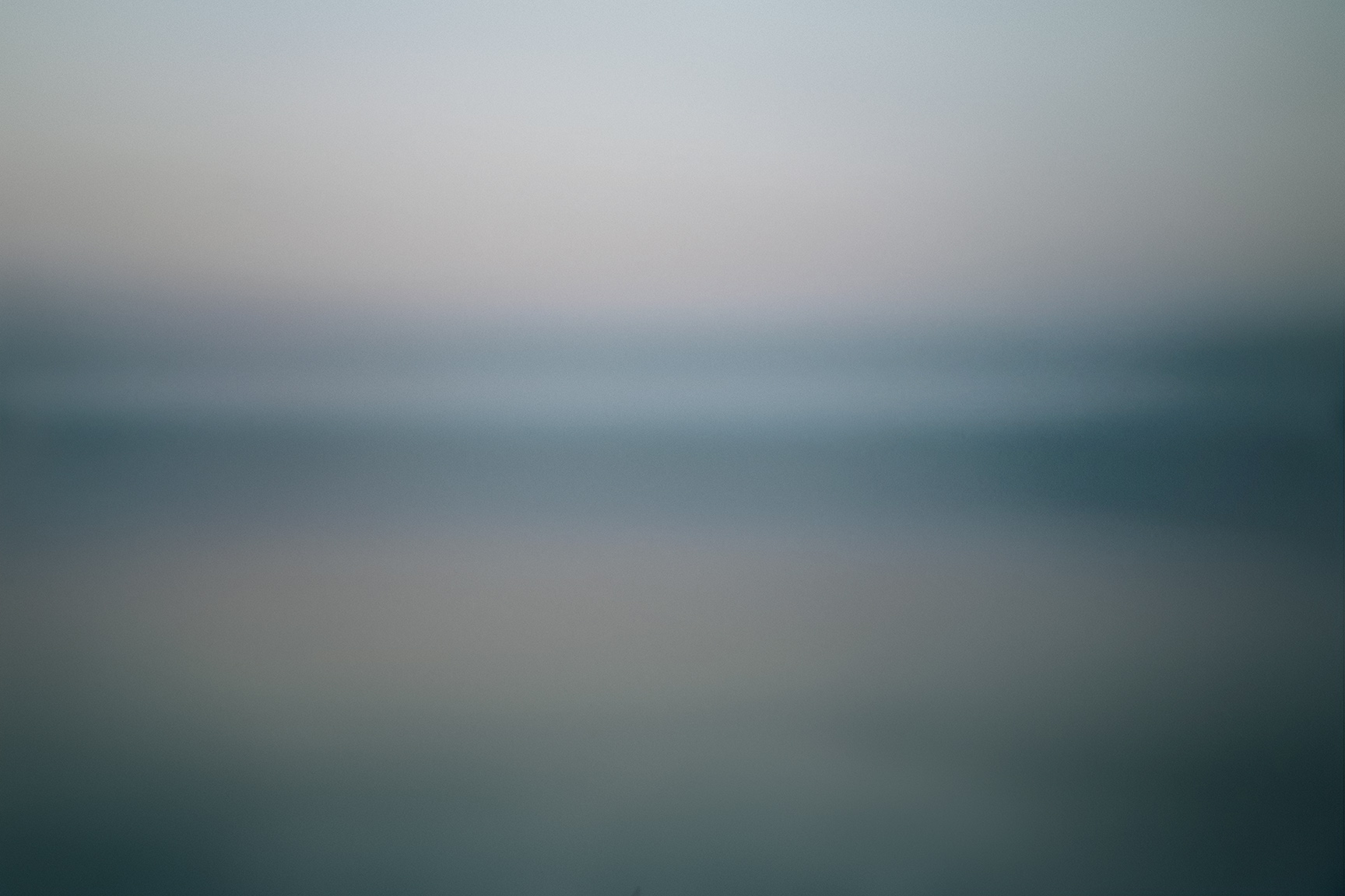
Blue, from the Color Block Series by Shelli Breidenbach are softer, reflecting her response to the ocean. “The Color Block Series is a … true abstract landscape photograph, inspired by the early morning hues of Sag Harbor Bay. The challenge has been to capture the integrity and tranquility of the water without compromising it … in hues that suggest simplicity, elegance, and an understated emotion."
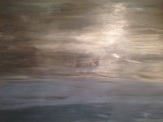
The grayer blues of Predator Views, by Andrea Bonfils, a mixed media painting captures the starkness of winter.

Blue has cultural references that have to do with melancholy. One explanation for the term ‘feeling blue’ dates back to the ‘blue devil’ in the 17th century. Songwriters use this symbolism when they ‘sing the blues’. January and the cold, dark months to come are cause for the “winter blues”. The Blues, from Elena Lyakir
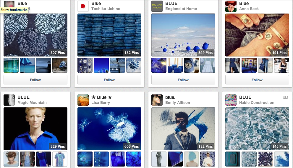
Interesting that even with this ‘dark’ side, blue is the most popular color. It also has it’s ‘light’ side; the sea, the sky and with it the intangible references of warmth, trust, loyalty, authority and more. I took a quick look through Pinterest at the blue boards - it seemed endless. There are pins of blue flowers, fish, food, home furnishings, fashion, a bit of everything.
The blues in winter are more serene, and darker. Kerri Rosenthal known for her exuberant use of color, especially bright color, also captures the more somber mood of winter, “Color is everywhere for me, but in winter I tend to see and paint in washed down tones." From her Puzzle Moderne Series, Recharge
"Everything seems a bit out of focus, this is reflected in my wintry paintings…muted, cold, snowy, foggy scapes.” Stormy Sunday No.2
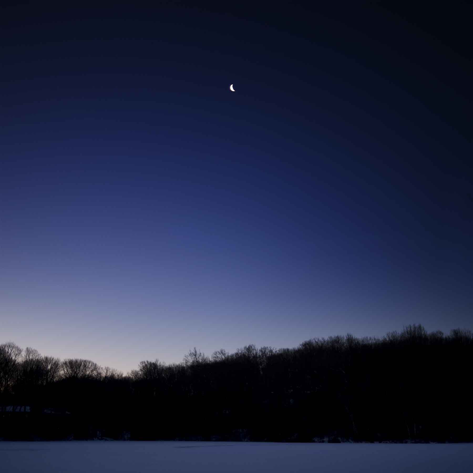
The soft blue I saw in the late afternoon light when I started this post, has now deepened in the early evening to a rich slate blue that rivals any summer sky. The dark evening sky of Stuart Zaro's, Crescent Moon, Blue Sky from The Nighlight Series.
Winter stays around a little too long for me, but I enjoy it’s warm colors, mellower moods and the artwork it inspires while it’s here…


")


")


