Red is an emotional color. It elicits feelings, both positive and negative, depending upon its context. Last year, I wrote a blog in February about the color red in art & design and why it has become associated with Valentine's Day. When I began thinking about it recently and if and how I might add to this, I found red was present in many places other than art. It prompted me to think about what else elicits emotion.
Abstract Expressionist Mark Rothko's "No.1 (Royal Red & Blue)" sold in November 2012 for $75 million at a record-setting Sotheby's contemporary art auction. The NY Times reported that as the bidding was escalating, the dealers described this painting as having "wall power" - as in, it is large, and has presence, a result of the strong color and composition, and thus fetched a significant price.

Leatrice Eiseman, a color specialist, is an "international color guru". She works with color consultant Pantone, and with companies worldwide offering advice on how color can affect their brands. Eiseman says, "People love red". In her book, "Colors for Your Every Mood", she writes that red evokes a physiological reaction. And since it is believed to promote passion, it's an obvious choice for the bedroom. Red is perceived as the most sensual of all colors and, as the saying goes, 'sex sells.'
Diana Vreeland, the larger than life fashion editor of Harpers Bazaar, Vogue and then Creative Consultant to the Costume Institute at the Metropolitan Museum said, "Red is the great clarifier - bright, cleansing, revealing. It makes all colors beautiful. I can't imagine being bored with it ... I wanted this apartment to be a garden - but it had to be a garden in hell."
Vreeland in her multi-patterned living room, with layers of red, her "garden of hell", photographed by Horst P. Horst
 Editor Pamela Fiori recently wrote in Harper's Bazaar about Richard Avedon and his muse, Audrey Hepburn. This photo was one of his many photographs during his collaboration with Vreeland.
The passion of red extends to other fields, including sports...and this was very apparent to me recently. At a Super Bowl party last week, a kitchen conversation, away from the TV's and the game, turned to politics, Michelle Obama and her fashion choices. There was a sharp divide on the subject of the Jason Wu flowing red organza gown she wore to the Inaugural Balls. Was it a good color for her, was it too strong, was it elegant, did she look better in white four years ago? My opinion: I thought she looked beautiful and regal in red!

And then the sports teams themselves. This past week with football season over, my family turned its focus to Big Ten college basketball. I began to notice the red and white uniforms. First, of the Indiana Hoosiers (my son's team, so a family favorite!) then, the Wisconsin Badgers and Ohio State Buckeyes. Really, once you start looking, there's a long list of teams with red in their uniforms, from college to the pros.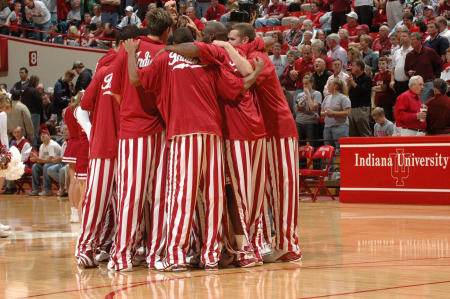
National Geographic reported a study by anthropologists on the power and benefits of red in sports. It stated that, "when opponents of a game are equally matched, the team dressed in red is more likely to win." It went on, "Across a range of sports, we find that wearing red is consistently associated with a higher probability of winning." The feeling is that there is an intuitive, but not conscious, aspect to seeing the benefits of the strong color.
In art, color theorist Josef Albers series, Homage to the Square, he explored chromatic interaction of nesting squares. One of his red studies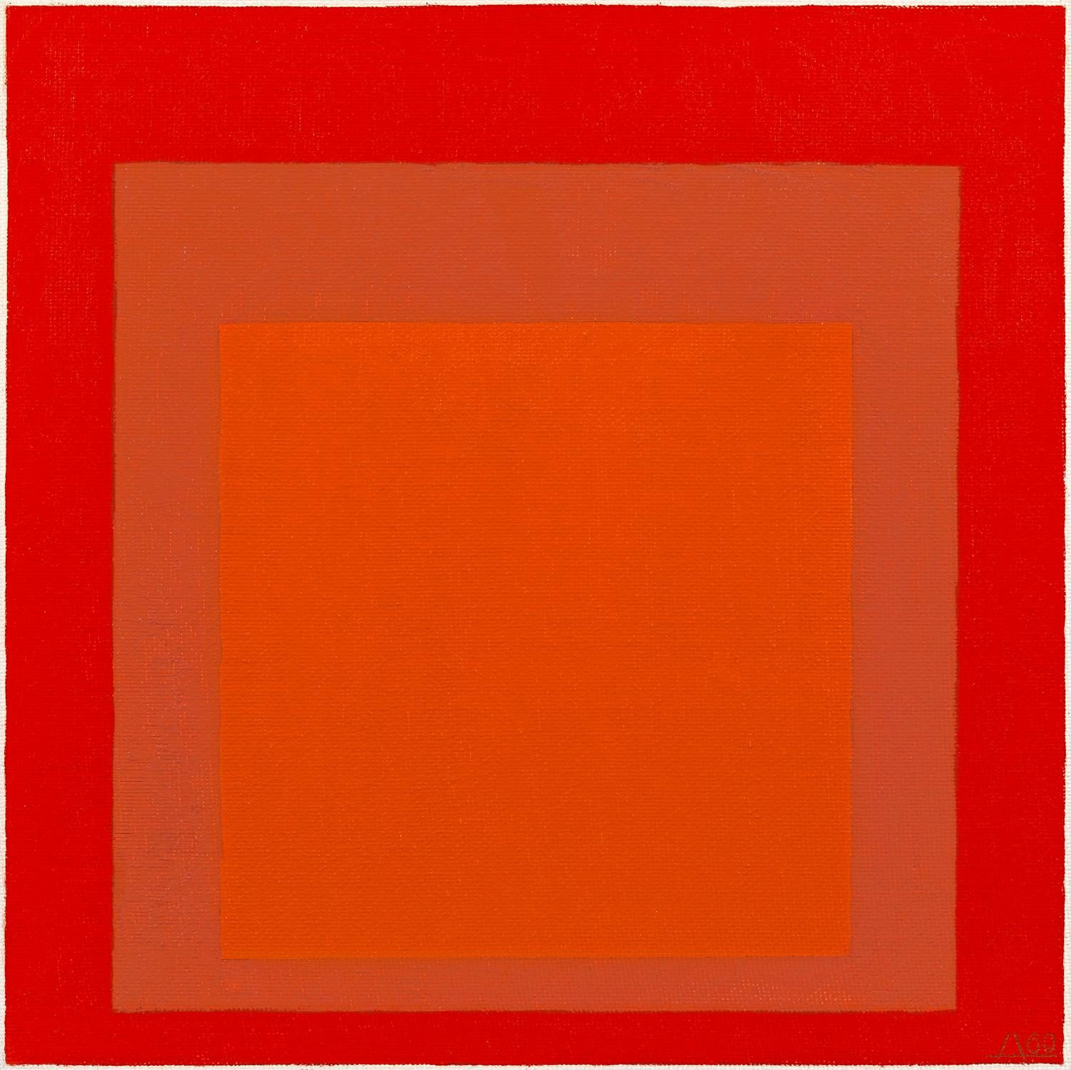
I'm a fan of the strong canvases of several artists that I work with;
Attraction, by Xanda McCagg - with an evocative name
Random Red, by Andrea Bonfils - created with layers of encaustic wax
Cirrus Cadmium ll, by Anne Raymond - named for the red pigment
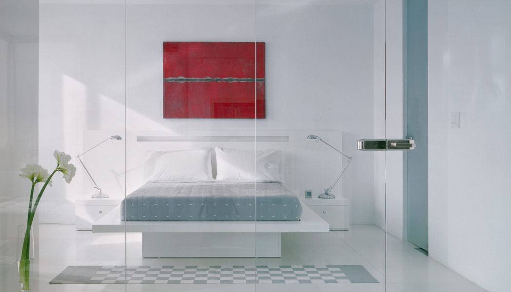
In interiors, color is used sparingly as an accent or in large doses to fill the room. Designer Jennifer Post, known for her minimalist interiors, often punctuates a space with bright color
Architectural Digest recently featured the LA home of Maroon 5's Adam Levine, beautifully filled with an art collection and mid-century furnishings. Designer Mark Haddaway used a combination of reds, from the deep rich hue of the drapes, to the pattern of the rug to accent the masculine bedroom. The oversized bright red tufted red ottoman is the visual centerpiece
Miles Redd is known for his bold use of color and often chooses red, either saturating a room in the color or in small doses of red as in this fun closet.
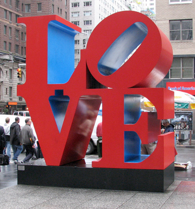
Robert Indiana's LOVE sculpture was initially created as a holiday card for the Museum of Modern Art. The design then became a sculpture exhibited at the Indiana Museum of Art. It has since been recreated around the world, it became a postage stamp and an iconic pop art symbol.
As a color identified with emotion and love, red has long been associated with Valentine's Day. I found it so interesting when I began to focus on the color red, I realized it was all around me: from the First Lady to fashion to interior design to art, to sports uniforms. Totally different applications, but in each, the color red, elicits emotion.


