


Romanoff Elements has been busy in the past few years. In that time we have provided artworks for many clients, we have continued to expand the artists we work with, and we seriously outgrew our website. I am thrilled that the new re: site has launched, and we can finally stop saying that it’s a “work in progress”.
Read MoreColor // The Power of Red
Red is an emotional color. It elicits feelings, both positive and negative, depending upon its context. Last year, I wrote a blog in February about the color red in art & design and why it has become associated with Valentine's Day. When I began thinking about it recently and if and how I might add to this, I found red was present in many places other than art. It prompted me to think about what else elicits emotion.
Abstract Expressionist Mark Rothko's "No.1 (Royal Red & Blue)" sold in November 2012 for $75 million at a record-setting Sotheby's contemporary art auction. The NY Times reported that as the bidding was escalating, the dealers described this painting as having "wall power" - as in, it is large, and has presence, a result of the strong color and composition, and thus fetched a significant price.
")
Leatrice Eiseman, a color specialist, is an "international color guru". She works with color consultant Pantone, and with companies worldwide offering advice on how color can affect their brands. Eiseman says, "People love red". In her book, "Colors for Your Every Mood", she writes that red evokes a physiological reaction. And since it is believed to promote passion, it's an obvious choice for the bedroom. Red is perceived as the most sensual of all colors and, as the saying goes, 'sex sells.'
Diana Vreeland, the larger than life fashion editor of Harpers Bazaar, Vogue and then Creative Consultant to the Costume Institute at the Metropolitan Museum said, "Red is the great clarifier - bright, cleansing, revealing. It makes all colors beautiful. I can't imagine being bored with it ... I wanted this apartment to be a garden - but it had to be a garden in hell."
Vreeland in her multi-patterned living room, with layers of red, her "garden of hell", photographed by Horst P. Horst
 Editor Pamela Fiori recently wrote in Harper's Bazaar about Richard Avedon and his muse, Audrey Hepburn. This photo was one of his many photographs during his collaboration with Vreeland.

The passion of red extends to other fields, including sports...and this was very apparent to me recently. At a Super Bowl party last week, a kitchen conversation, away from the TV's and the game, turned to politics, Michelle Obama and her fashion choices. There was a sharp divide on the subject of the Jason Wu flowing red organza gown she wore to the Inaugural Balls. Was it a good color for her, was it too strong, was it elegant, did she look better in white four years ago? My opinion: I thought she looked beautiful and regal in red!

And then the sports teams themselves. This past week with football season over, my family turned its focus to Big Ten college basketball. I began to notice the red and white uniforms. First, of the Indiana Hoosiers (my son's team, so a family favorite!) then, the Wisconsin Badgers and Ohio State Buckeyes. Really, once you start looking, there's a long list of teams with red in their uniforms, from college to the pros.
National Geographic reported a study by anthropologists on the power and benefits of red in sports. It stated that, "when opponents of a game are equally matched, the team dressed in red is more likely to win." It went on, "Across a range of sports, we find that wearing red is consistently associated with a higher probability of winning." The feeling is that there is an intuitive, but not conscious, aspect to seeing the benefits of the strong color.
In art, color theorist Josef Albers series, Homage to the Square, he explored chromatic interaction of nesting squares. One of his red studies
I'm a fan of the strong canvases of several artists that I work with;
Attraction, by Xanda McCagg - with an evocative name
Random Red, by Andrea Bonfils - created with layers of encaustic wax
Cirrus Cadmium ll, by Anne Raymond - named for the red pigment
In interiors, color is used sparingly as an accent or in large doses to fill the room. Designer Jennifer Post, known for her minimalist interiors, often punctuates a space with bright color

Architectural Digest recently featured the LA home of Maroon 5's Adam Levine, beautifully filled with an art collection and mid-century furnishings. Designer Mark Haddaway used a combination of reds, from the deep rich hue of the drapes, to the pattern of the rug to accent the masculine bedroom. The oversized bright red tufted red ottoman is the visual centerpiece

Miles Redd is known for his bold use of color and often chooses red, either saturating a room in the color or in small doses of red as in this fun closet.

Robert Indiana's LOVE sculpture was initially created as a holiday card for the Museum of Modern Art. The design then became a sculpture exhibited at the Indiana Museum of Art. It has since been recreated around the world, it became a postage stamp and an iconic pop art symbol.

As a color identified with emotion and love, red has long been associated with Valentine's Day. I found it so interesting when I began to focus on the color red, I realized it was all around me: from the First Lady to fashion to interior design to art, to sports uniforms. Totally different applications, but in each, the color red, elicits emotion.

Heiberg Cummings Design // Elegant & Koselig (Cozy) Style
I met Bernt Heiberg and Bill Cummings of Heiberg Cummings Design at an event they hosted for one of their projects in December. I quickly felt their warmth and style, both from the design partners themselves, and from their interior design work. They describe their aesthetic concept in their recently published book, White Light. It's about "koselig", which "literally translated means cozy in Norway, the word is used to describe everything from a room’s hospitable warmth to the pleasant feeling one gets in running into an old friend." Koselig, is how Bill described their Chelsea apt. in a magazine article that was featured in their book - and it's how I would describe meeting them and seeing their work.
 This is their third book,

Their interiors are comfortable, and easy
 also refined and elegant

The partnership began in 1990 in Oslo doing interiors in Europe and the US. They moved the center of their business to the NYC's West Village, but retain an office in Norway. The duo blend Bernt's Scandinavian minimalism with Bill's artistic and business background with an appreciation for traditional American design. This has come together into a modern design business with clients and residences from Manhattan, the Hamptons, throughout the Northeast, corporate projects to country homes in Norway.

The core of their philosophy and technique is Conceptual Design. Each project starts with a framework, a concept that is driven by the client and their close relationships. They want to understand what a client is looking for, how they live and how to best reflect their family and traditions. The core concept evolves and it then prevails in each space of the home providing the framework for the physical design which follows.

Each project differs in personality, but the foundation is consistent, warm neutral and natural colors and textiles, continuity throughout the project, which comes from the concept. Warm and quiet, yet a recurring description is 'tension', and it varies from project to project. The tension is a surprise, it may be accent colors, art, the antiques and accessories - and this is where each project suitably reflects its owners.


Naima Boger, a designer with the firm sought me out for artwork for a LETT, by Heiberg Cummings project in Rye, NY. LETT, Norwegian for 'Light" was introduced last year to provide another way for Heiberg Cummings to provide their design services and aesthetic to more clients. The LETT team is hired to provide interior design services on a room by room basis. They provide a beautiful boxed presentation containing customized floor plans, drawings, and tear sheets of recommended items. The client receives a shopping list to execute and manage themselves. The design firm will come in to style and accessorize when the client is ready and the furnishings are complete.

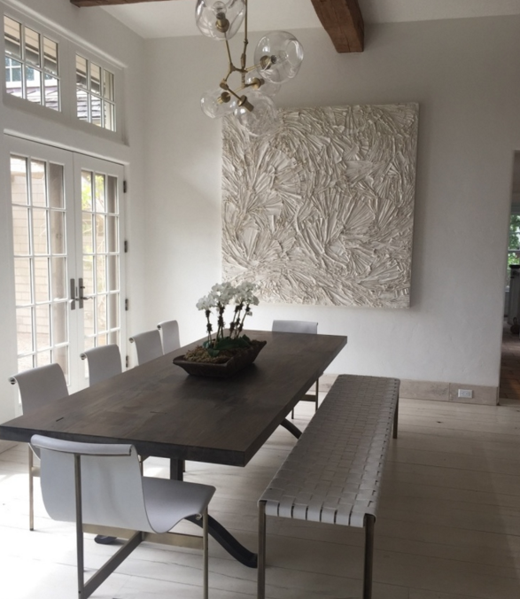
Naima worked on the Westchester project and assisted her client in sourcing artwork and accessories. When she saw Andrea Bonfils' Underwater Mixed Media artworks, she knew immediately they would provide the living room with the balance and the contrast to complete the room and compliment the photographs on the opposite wall, by Katie White Photography.

Ophelia, another Bonfils' piece is in the adjacent foyer.

Xanda McCagg's abstract Tete-a-Tete brought tension, color and contrast to the dining room. The strong modern painting is a counterpoint to the traditional furnishings, and the color balances the sofa, pillows and window coverings.


LETT is a timely and exciting new direction for Heiberg Cummings Design. It is a concept that will make their services accessible to many more people and introduce a new direction in interior design. The firm has an international reputation for the quiet, refined and personalized aesthetic they have created. They have a flair for details that reflect the homeowner, whether it's artworks, accessories or incorporating family items that are lived-in and worn. The spaces they design are contemporary - yet they're classic and comfortable, a style that creates liveable spaces that at the same time are elegant and koselig!

Lumiere by Jean de Merry // Classic & Versatile Lighting
This cover of Elle Decor caught my eye in December, I loved the eclectic mix of materials and styles. I was especially drawn to the striking black light, which I learned was the Lumiere by Jean deMerry.
 The room, designed by Ashley Stark, successfully mixes a variety of materials and periods. The organic table with "tree trunk" bases and a cement top is by Groundworks, it's paired with 18th century Italian chairs, and a Tommy Parzinger cabinet.
I had previously seen the ceiling mount version of the JDM light in gold, at the Kelly Wearstler designed restaurant at Bergdorf Goodman

While in the D&D Building a few months ago, I stopped in to the JDM showroom, and saw the beautiful range of elegant furniture, lighting and acceessories. I learned the Lumiere is available in a choice of metal finishes, powder colors, and the size can be customized.
Lighting, a great chandelier, whether casual, formal or in between, can be a focal point of a room. I have come across the Lumiere used in a variety of beautifully designed spaces. My Pinterest lighting board has many of them. It is a relatively new piece, introduced in 2008 - that’s classic and verstatile. It works in modern, tradional, transitional and eclectic settings.
In Emily Sommer's elegant dining room in her 60's modern Palm Springs home featured recently in Architectural Digest, it is beautifully paired with Jean Risom chairs and a Karl Springer sideboard.

a black version in this warm dining room with a mix of natural elements

in this bright white kitchen, with a bold use of blue chars, the black JDM light is striking above a lucite table

in a library, the contrast of dark walls and a lucite desk

and as the focal point of an airy living room, by Kara Mann

to compliment the success of the hanging light, JDM recently introduced a sconce to the collection

The LA based Jean de Merry started in 2000, with a line of artisanally made chairs and have since developed a line of furnishings and lighting, of beautiful and quality design and workmanship. The Jean de Merry site explains that the collection, “... merges neo-classical design with 1940’s French sophistication in their timeless...line. Each piece...transitions into both traditional and modern interiors and naturally becomes the stand-out piece of any room.”
Interesting, how when you come upon something that really catches your eye, you notice it again and again. I gravitate towards well-designed pieces that are timeless and verstatile, the Lumiere is just that.
