Living with Art // Loving Pinks & Reds

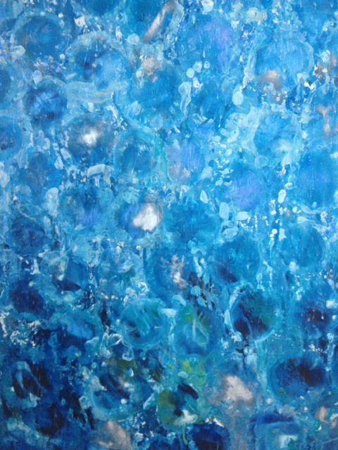
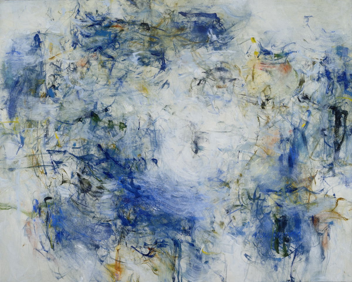
Valentine’s Day celebrates love. The day is closely associated with the color red, from soft pinks, rose to hot magenta to classic red. Why is that? The color red says passion, energy and love and the softer hues from pink, to rose and deeper are closely related but in a gentler way. Artworks in these ranges of colors are the same, they can provide a hint of warmth or speak loudly and carry a room. Here are some examples of how a variety of artworks in the red spectrum can have a beautiful and strong impact in interiors. Flare Series ll, by RE artist Anne Raymond,Flare Series II 14 x 11 sm


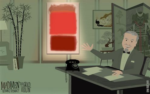
Pure red makes a big statement. I have written about the meaning of red and the energy it conveys. Abstract Expressionist Mark Rothko is identified with his many red paintings, recent sales have broken records. The TV show Mad Men is closely identified with how it represents the style and design of its period. This fun illustration places one of Rothko's iconic paintings of the 50's on the show's set.

Rothko on mad men

RE Artist Andrea Bonfils took her cue from these works in her layered encaustic painting, Rothko Pink Window.
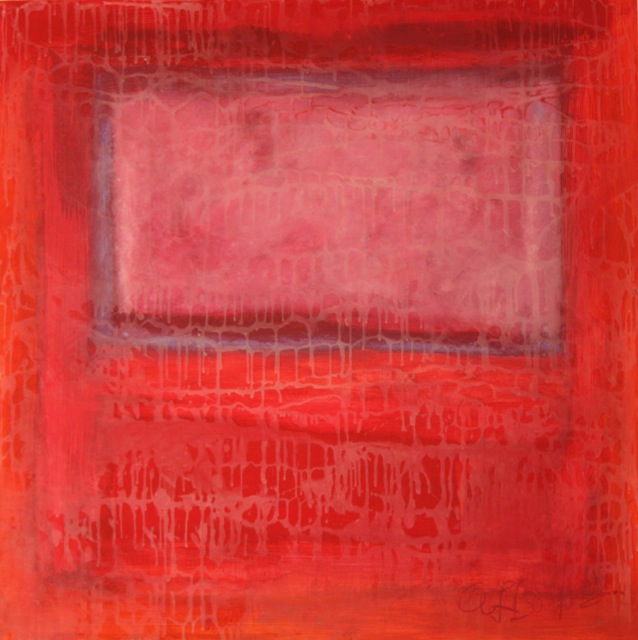
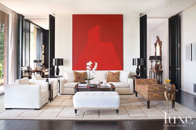
AB.Rothko Pink Window.oil and encaustic_30x30This large scale red painting brings contrast and drama to the quiet, elegant furnishings in this Texas home, in Luxe Magazine.
large scale red paintingInterior designer Jennifer Post uses the painting's color and composition as a focal point in this soft blue and white modern bedroom

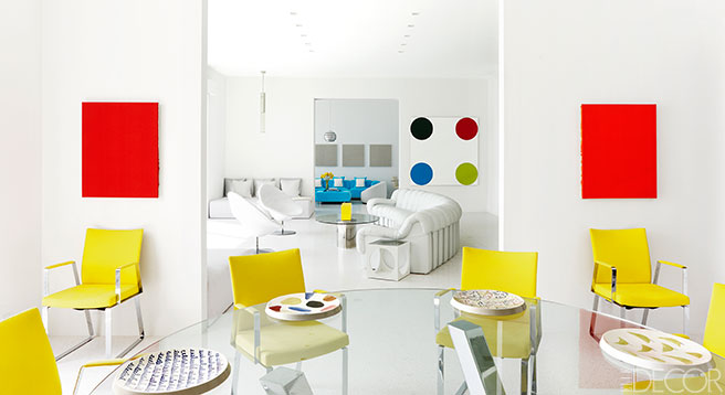
red painting.Jennifer PostFashion designer Lisa Perry’s homes have the same 60’s vibe as her modern, pop-inspired clothing. Primary colors, an integral part of the sixties are echoed in “The Beach House",  her Hamptons home. The two red paintings are by Ed Moses, along with a Damien Hirst dot painting.Lisa Perry-red paintingsOutside Perry's home, The Rings, by Zhu Jishi, appear to be rolling around the lawn.
The Rings.Lisa Perry

In these two kitchens, the red and white artworks bring pattern and warmth to the minimal interiors. Designer Joe Mimram’s NYC apt, with artwork by Ohad Memory,

red circles

and this playful abstract canvas,

red&white in kitchen

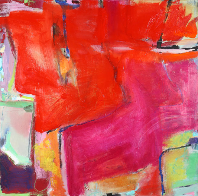
RE Artist Claudia Mengel has a wonderful sensibility for color, her artworks, whether quiet or strong use unexpected color combinations that create a beautiful harmony. Red,
CM.RedRE Photographer Shelli Breidenbach contrasts strong background color with the regal portraits of her horses, Noblesse,

SB.Noblesse

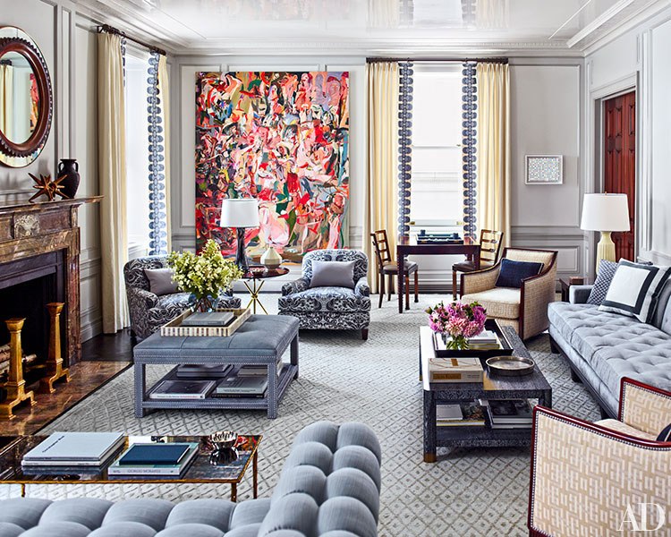
This stunning living room by Steven Gambrel was recently featured in Architectural Digest. He incorporates a stunning modern art collection into the rooms with an eclectic mx of furnishings. Cecily Brown’s large scale painting filled with pinks and reds presides over the elegant and layered grey living room.
AD.steven gambrel Another project by Gambrel uses red in an unexpected way. The hallway gallery of red frames makes a great visual statement.

red frames, steven gambrel

Interior designer Kelly Wearstler is known for boldly mixing color and pattern in projects. In her office, she creates a strong but feminine mix with hot pink chairs and a striking large-scale painting by Lana Gomez.

Lana Gomez.Kelly Wearstler

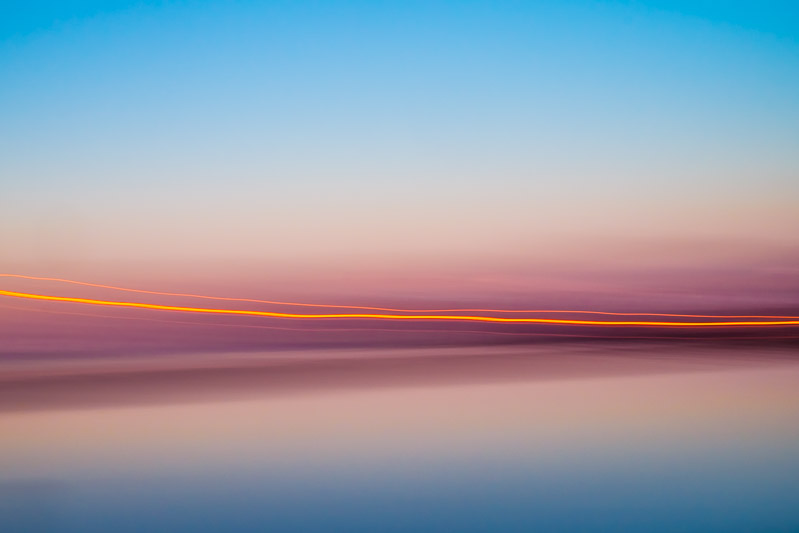
Pinks are present in RE photographer's Stefan Radtke’s new First Light Collection. The images capture the striking colors of winter's early morning light on the water.
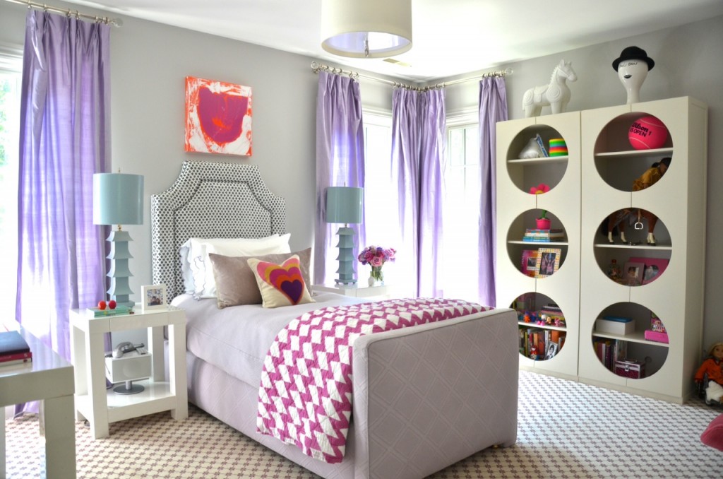
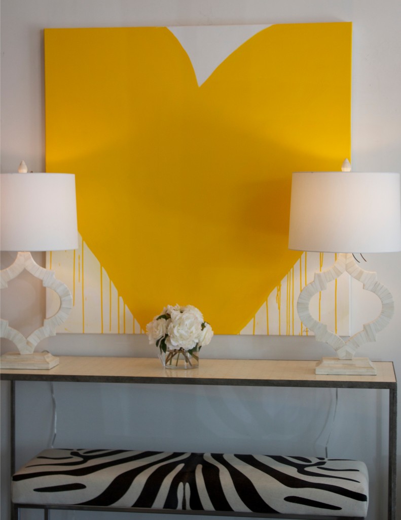
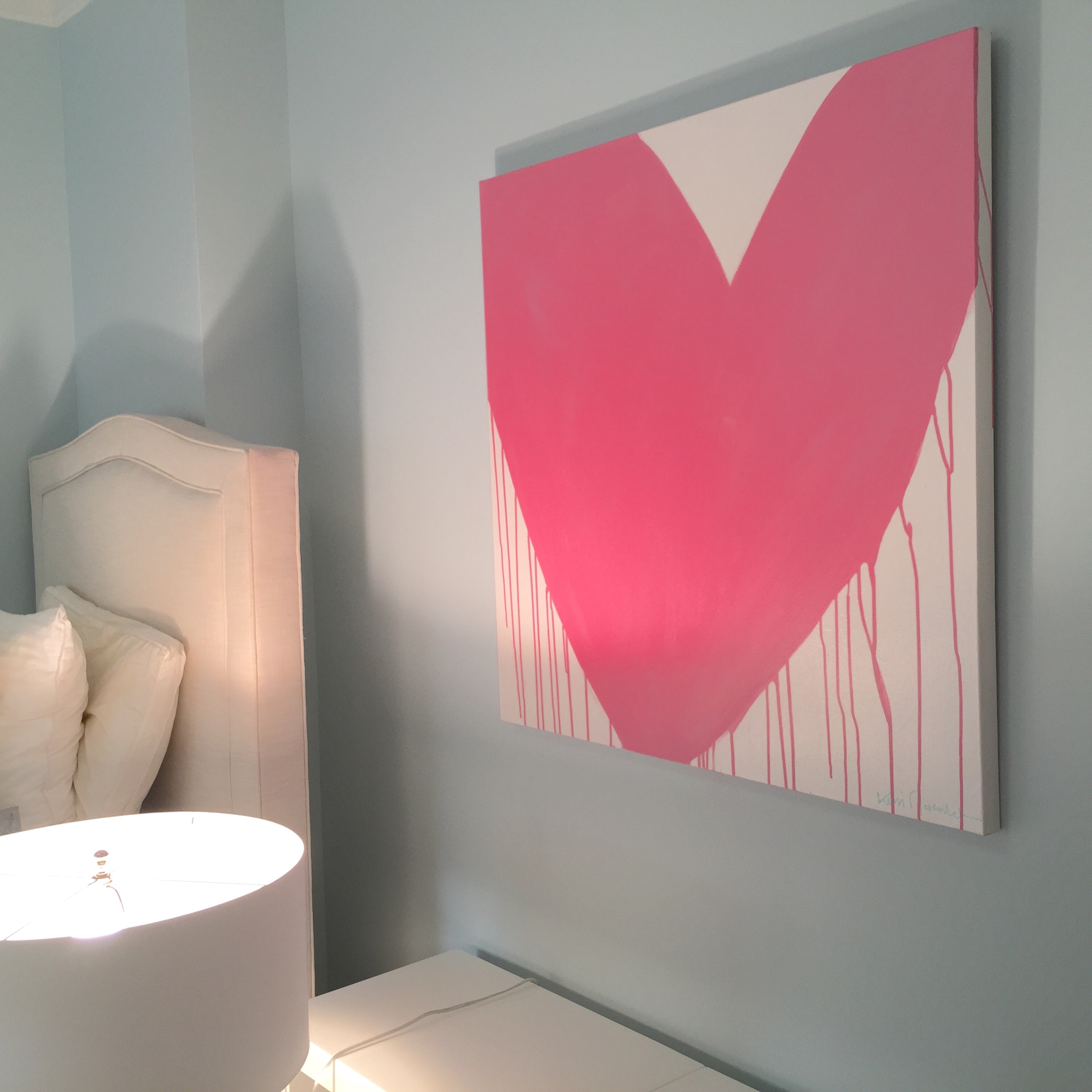
SR.FIRSTLIGHT11The Drippy Heart Series by RE artist Kerri Rosenthal's has brought smiles to a number of clients. This heart installation takes on another look, sweet and youthful in ballerina pink for a young NYC girl.
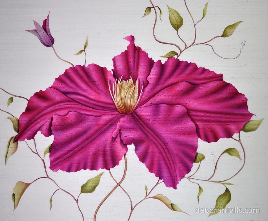
KR.Pink HeartValentine's Day wouldn't be complete without flowers. Artists interpret them in a myriad of ways. RE artist Deborah Falls’ classic paintings on silks represent the incredible varieties and colors. The Red Clematis

DF.Red Clematis1

The Red Tulip

DF.Red tulip

"Toning down the passion of red with the purity of white results in the softer pinks that are associated with romance and the blush of a young woman’s cheeks", according to Kate Smith of Sensational Color. In addition, she notes, pink is "the color of happiness", the lighthearted color is the 'go-to' choice for flowers. RE Artist Mary Morant paints a variety of traditional and impressionistic florals. Here Pink Roses, are captured on canvas as a special memory of a bride's wedding bouquet.

MM.Flynn's Wedding_20x24

From the Submerged Garden Series, by RE's Andrea Bonfils, a long-stemmed rose.

IMG_6788 2

A striking installation from the same series,

IMG_4104

An abstract floral, Suburban Jungle Pink, by RE's Kerri Rosenthal

KR.Suburban JUngle Pink_30x30

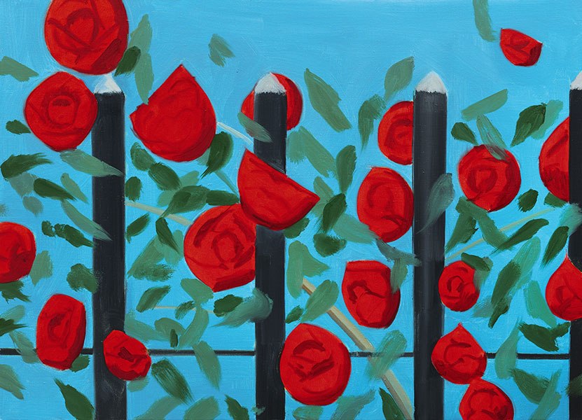
And pop art, by Alex Katz, Red Roses with BlueRed Roses with Blue, Alex katz, 2011
From pink to red, modern to pop, abstract to traditional, artworks in this range of colors can suit different tastes and interior styles. They can provide color, warmth, and energy. Fill your home, like your life, with artworks that bring you joy and love.

Happy Valentine's Day!!

Microsoft Word - CAROL.Doc1.doc

Living with Art // The Beauty of Black & White

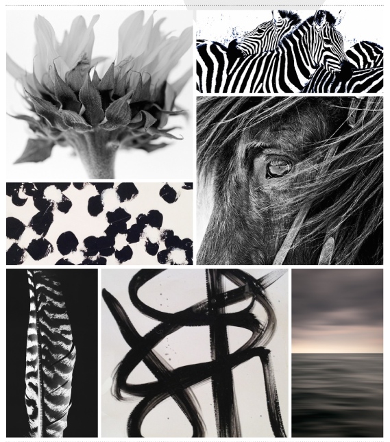
Black and white speaks strongly to me, I have always been a fan of the contrasting beauty of the opposite colors. In artwork, black and white starts with simple line drawings, and progresses to photography and on to stark and high impact abstract paintings. Depending upon the genre, and the use of grey, which softens the contrast, the beauty of black and white artwork is that it suits all types of interiors, from traditional to the most modern, from serious to playful. I feel the same about using black and white in other ways, from clothing to accessories, the use of black and white is timeless and works with all styles.  

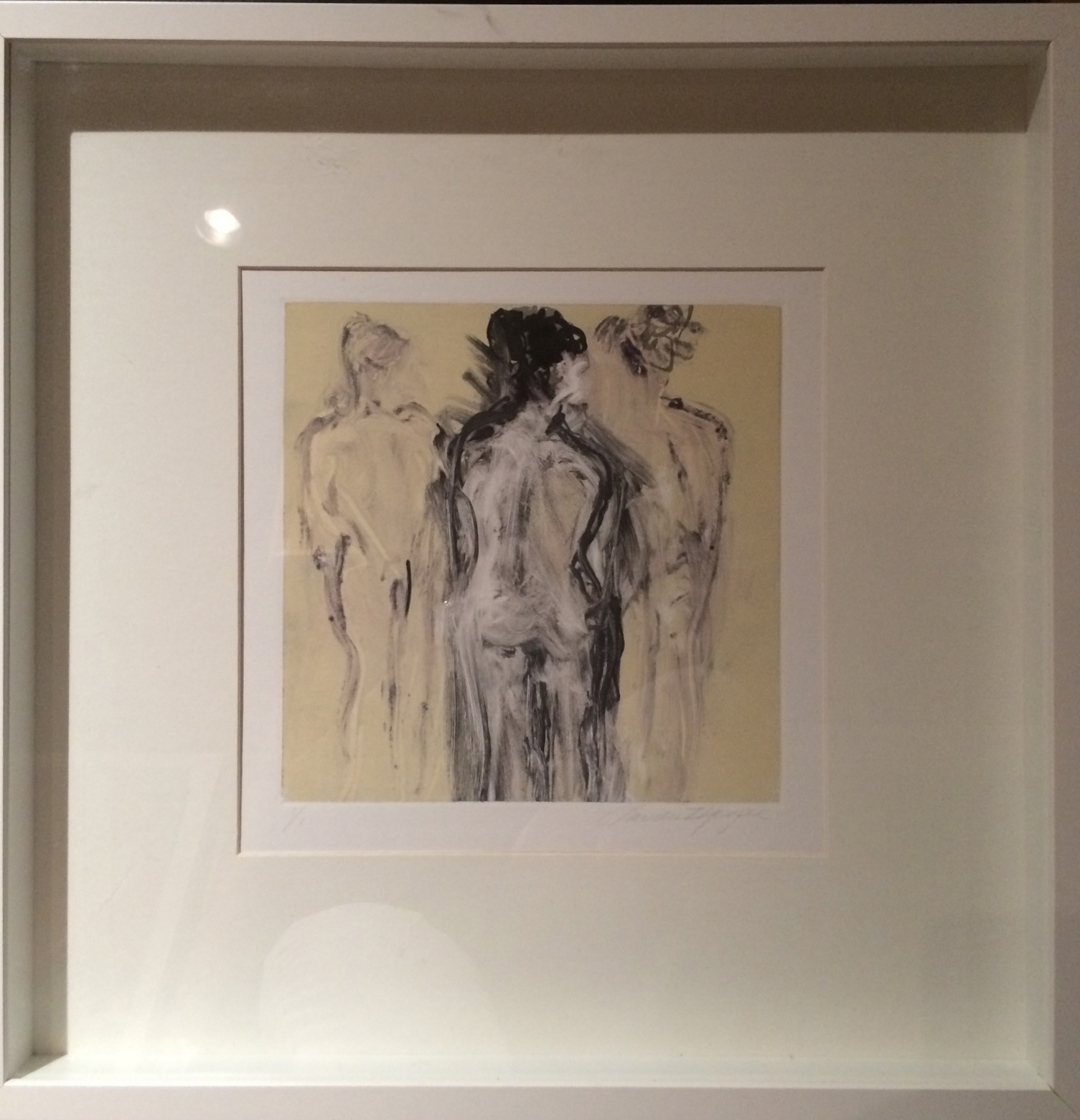
Charcoal, a natural material was the first medium to be used in art. An artist’s training begins with pencil and charcoal, learning to draw. The classic beauty of a line drawing, a portrait, or a nude, stands alone as an artwork or is great to pair with other types of art. It can live comfortably in all types of interiors. Artist Claudia Mengel creates beautiful color-drenched paintings, but I am drawn to her classic figure drawings, Conversations ll,

and also large brushstroke paintings on paper

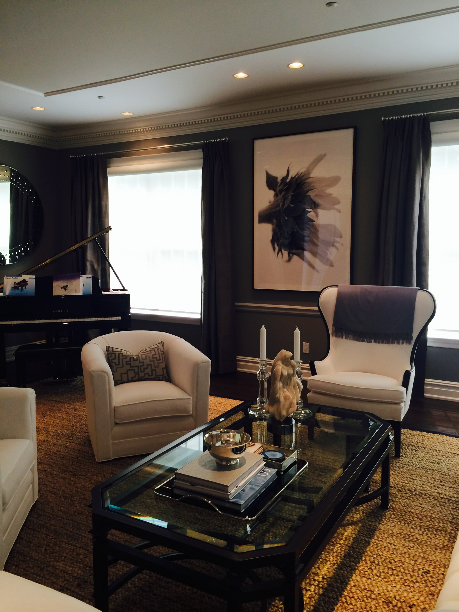
Black and white photography is always classic and timeless. Through the lens, the photographer is capturing an image, a form, that has clarity in black, white and the spectrum of greys in between. The use of grey softens the contrast of black and white. In this traditional home, Connecticut designer David Hammond used a tonal palette of soft greys and whites. Our client selected Michael Anderson's large scale black and white sunflower which adds a modern touch, due to its size and sideways orientation.

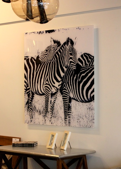
We see color based on light absorption. Black absorbs all light, whereas white reflects it. When together, there is graphic impact created by being opposites of the spectrum of light. Zebras are a natural example. In interiors and clothing, animal prints are often used as an accessory, the touch of nature's patterns, compliment traditional to modern decor and dress. Photographer Stuart Zaro's Two Zebras, framed in plexi is at once modern, natural and classic. Shown here in Nest Inspired Home in Rye

Horses are a much-loved subject of photographers and as a choice for interiors. The incredible physical beauty of horses is best captured in black and white, like this intimate portrait from the St Moritz Series by Shelli Breidenbach

There is much symbolism associated with the dualism of black and white. In Eastern culture, “The black and white halves of the Yin-Yang symbol are similar to the two sides of a coin. They are different, and distinct, yet one could not exist without the other.”  In Western culture, they depict opposites, good and evil, light and dark, white hat and black hat.

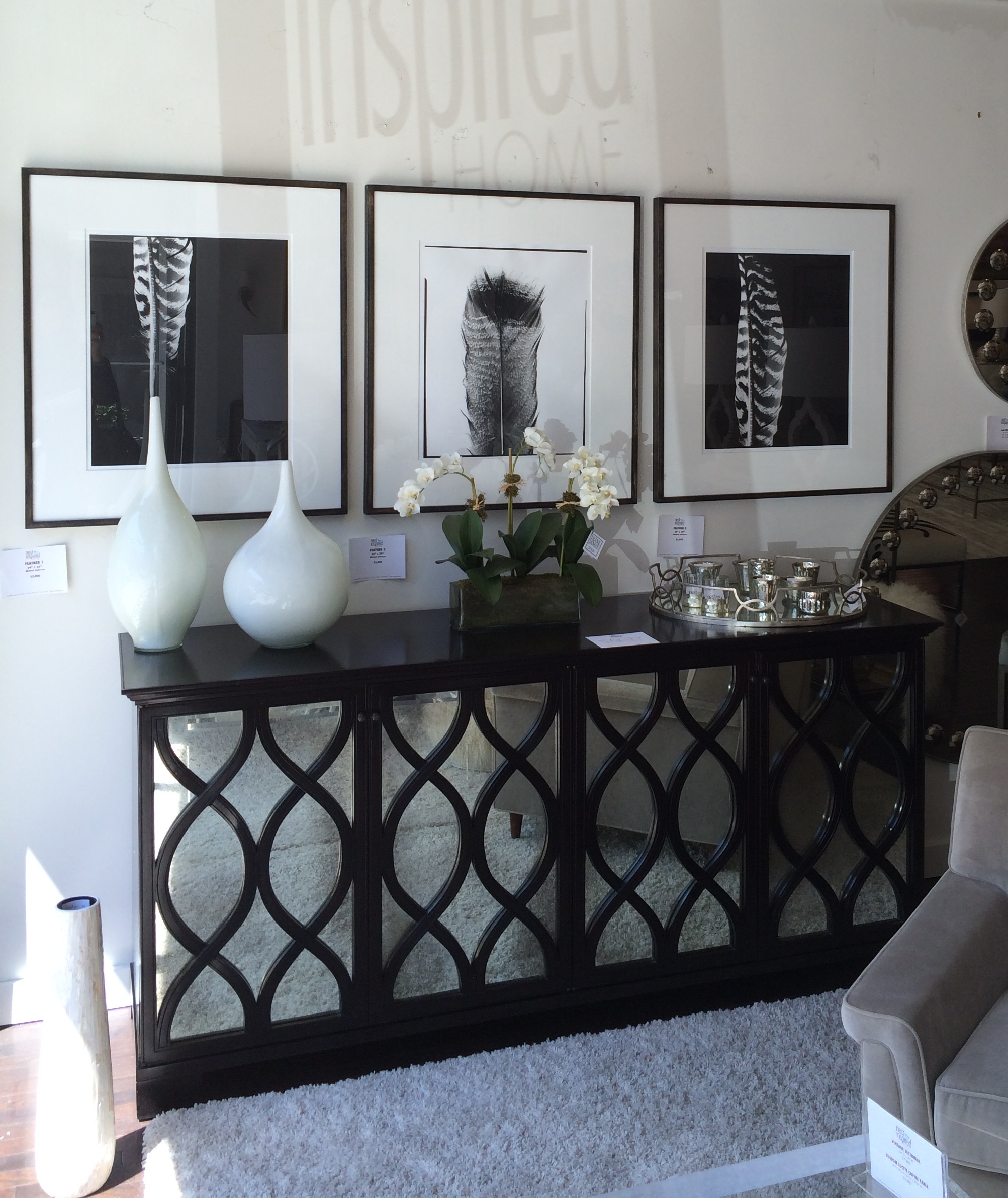
This series of feathers, by Michael Anderson, shown in reverse, black on white, white on black, plays on this dualism.

Artist Andrea Bonfils' work is influenced by her love of nature. In her new print collection, she created variations of a favorite subject, Aspen trees. A black and white version, printed on handmade artisanal paper accentuates the abstracted form of the trees.

Kerri Rosenthal, known for her colorful paintings, always has black and whites works in her collection. She “enjoys painting in black and white because it its the most extreme of contrast… they may just be the best two colors as they allow all the other colors of the room to shine....the most neutral of color combo’s, the Switzerland of colors, and can help with layering in homes - usually they go with any other paintings in the room,  no matter what the color scheme or the design plan.” From small paintings on paper, as this one recently featured in the NYTimes Home section, (thanks to the framing of Simply Framed!). The crisp artwork looks great contrasted to the mix of materials and color on the natural wood desk.

to large bold canvases, like Timeless, which displays the influence of Abstract Expressionist painters. The painting brings this room together, the large sale balances the natural stone and the details of the Missoni chevron fabrics within the large space.

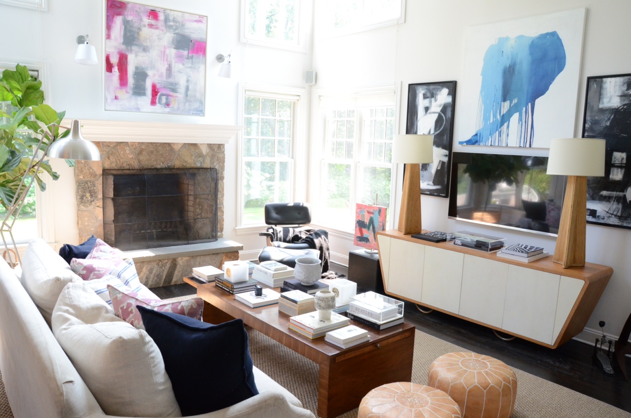
The clean look of black and white works beautifully alone, but it's also a great choice to among other elements, it can compliment a colorful wall, artwork or fabric. It doesn't mean the absence of color, but rather used to calm and balance a colorful palette. Our client was looking for something to work with Chelsea Bubble by photographer Kit Kittle and the natural textures and colors in her living room,  designed by Mara Solow Interiors. Kerri’s small black and white painting, framed in an elegant metallic frame is a visual counterpoint to the larger colorful photo and the furnishings.

This fun installation by Kerri, an abstract wall painting makes a bold statement in an otherwise quiet white bedroom

Bold, fun, stark & serious, all describe different black and white artworks and their accompanying interiors. There is a quieter side, when grey is used to soften the extremes. Artist Xanda McCagg takes a break from her usual colorful works to do studies in black, white and grey

Photographer John Duckworth creates abstracted landscapes of his local South Carolina coastline. I first saw his work at a Holly Hunt showroom. Here are two different grey to black vertical pieces hanging side by side, the effect is dramatic but subtle.

Whether using the contrast of black and white alone, or softened with greys, artwork in the black-white spectrum is appealing and comfortable to live with. There is something easy about the choice, calming and classic, but not boring. It is natural, crisp and a timeless choice when selecting artwork.


Choose Color // In Art & Interiors

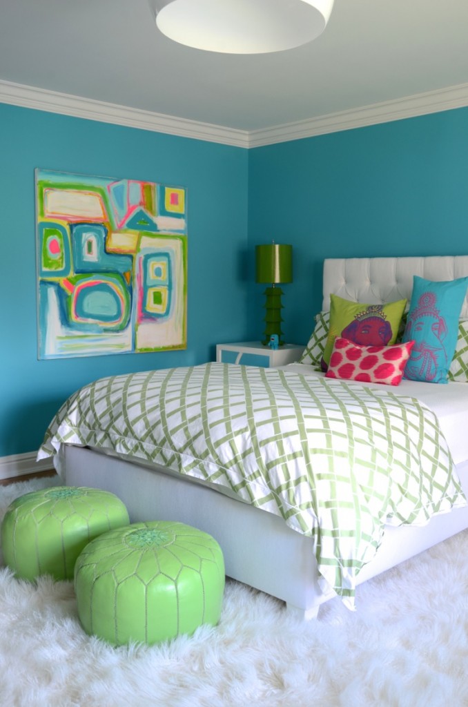
Color theory and studies provide a myriad of reasons why and how individuals respond differently to color. Color response is sensory, it’s literally the first thing we respond to, it can affect our moods, cause physiological reactions, and affect our decision-making. Artist Kerri Rosenthal has clearly made the decision to Choose Color! She wants her art to make people happy, and her use of color does just that. "I love that my paintings bring color into my client's homes - Although at times I paint in soft tonal hues, for the most part, my comfort zone is painting in color, and what I think it does to the homes they end up in- is take clients out of their comfort zone allowing them to bring bright happy colors into their home, they might normally not gravitate to".

I have written about Kerri's artwork before, but seeing how the paintings look in various interiors, is about how the colors in art can contribute to a different and personal feel.  "All of these homes embrace color, some more dramatically than others but there is a definite underlying common denominator… Happy Art = Happy Home…"

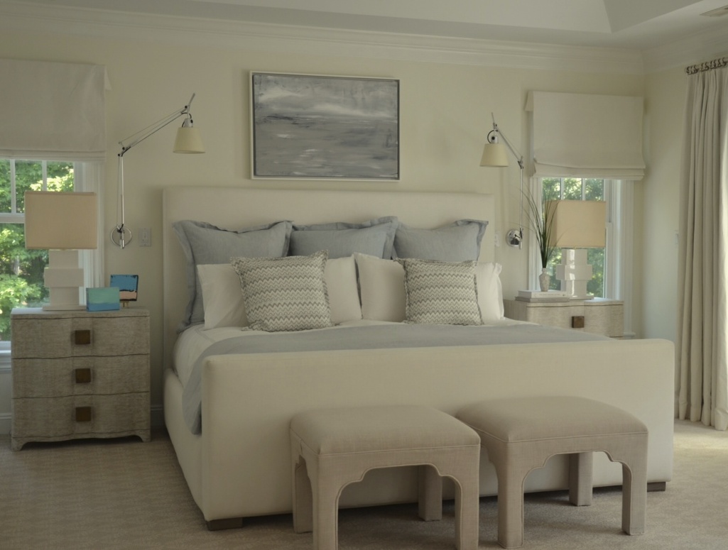
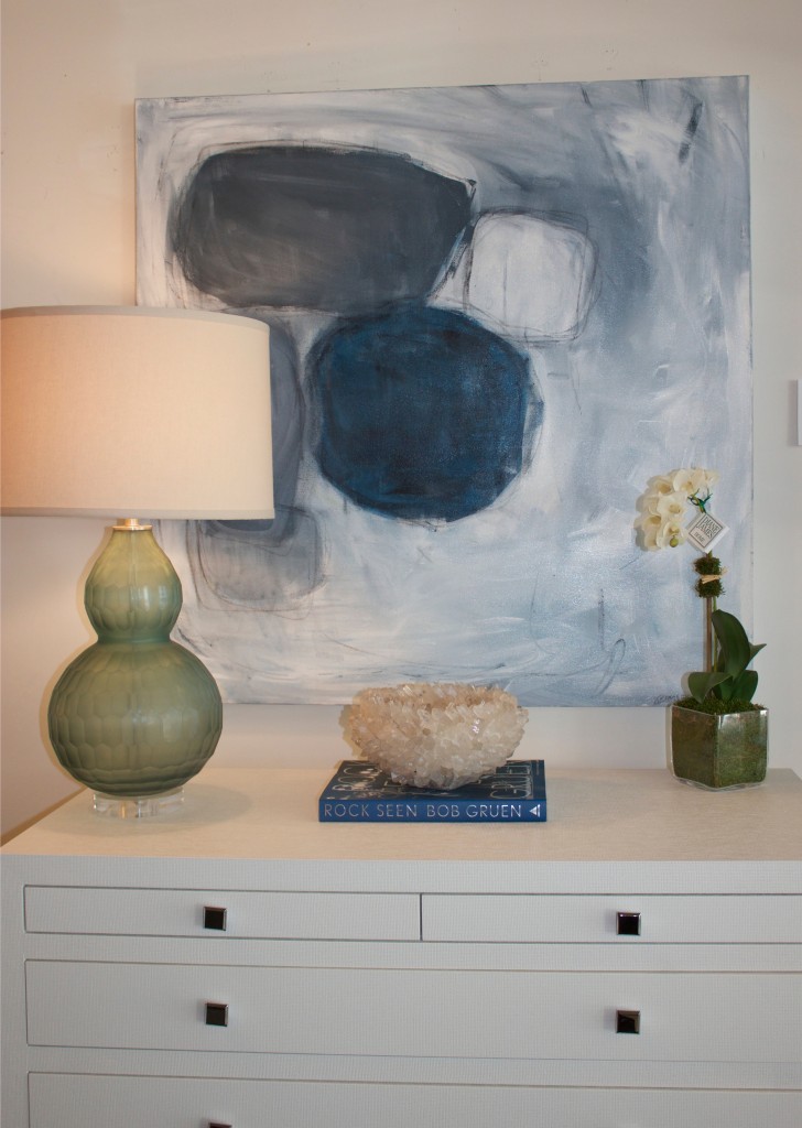
As Kerri says, her work is not all about brights, many of her works  are quiet, more subtle. These paintings tend to have a lot of layers and depth. This is one of a series of abstract landscapes, more Impressionist in feel. As color consultant Kate Smith says about creating a calm environment, “Being surrounded by a peaceful, calming color…could certainly make you feel that life is more under control and you are a little more serene". As in this bedroom

or this tonal abstract that beautifully blends and compliments the sofa

Kerri is influenced by various artists and periods, from the Impressionist type landscapes to the Pop Art-like Hearts and Flower Bomb Series. The Drippy Heart Series is pop-inspired, she uses flat planes of solid energetic color, in a large scale interpretation of an everyday object. Kerri creates a painting from this icon of love, with “drippy’s” spilling out of the giant heart, that make you smile. Sunny yellowor sky blue, the bold paintings look beautiful in these sophisticated interiors.

Bright color, bold images lighten the mood, Kerri’s encourages people to have some fun in their rooms. I like this from Sensational Color,  Smith's color advisory service , “Bright colors are the calling card of a joyful space”.

Sensational Color advises its readers and clients to “create a mood that highlights your personality by using color…to build a fun and whimsical mood…Indulge in your inner Peter Pan or Alice in Wonderland…create a playful room—the kind you’ll love to live in". Be playful as Kerri's client did with her bold mix of unexpected color and pattern.

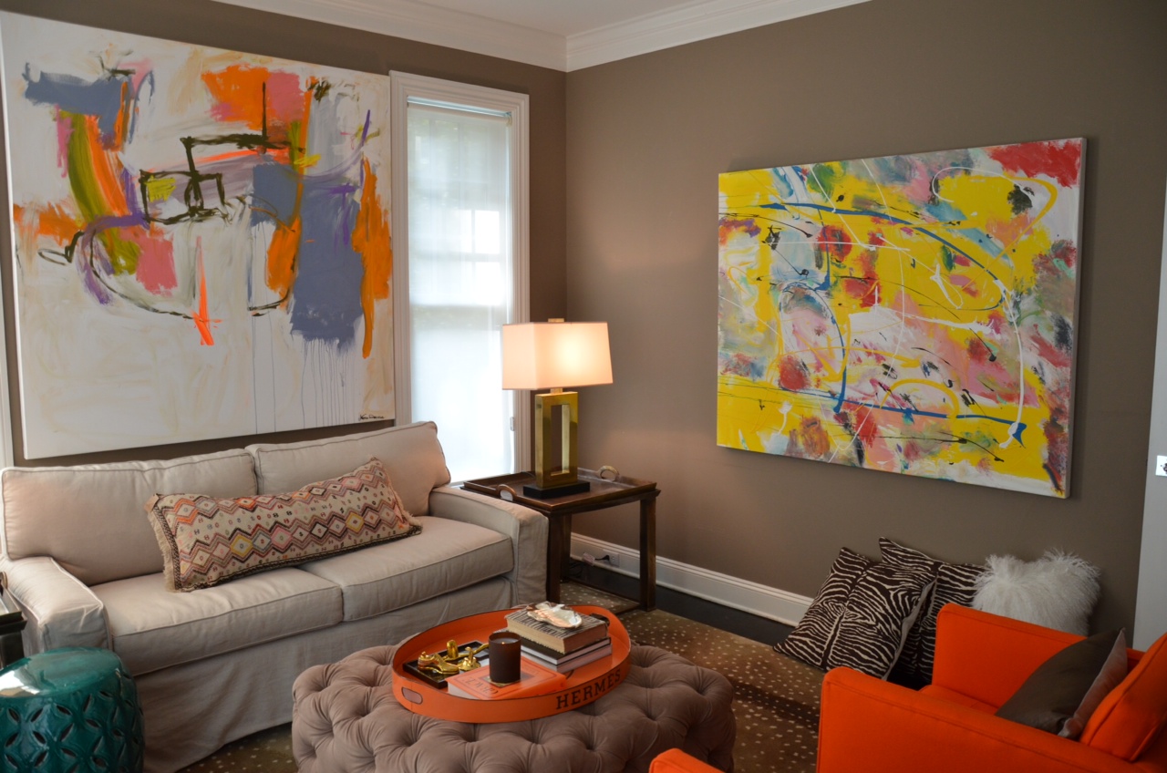
Or rely on art to brighten a neutral space with color. Many choose to decorate their homes in quieter colors. This provides a great backdrop to accent a color you love in the art you select. The art becomes a focal point.

It takes confidence to follow your instincts, decorate and buy art that’s filled with colors you love. Kerri has encouraged others to do that. It's been fun to watch clients respond to her work, usually with a smile!!

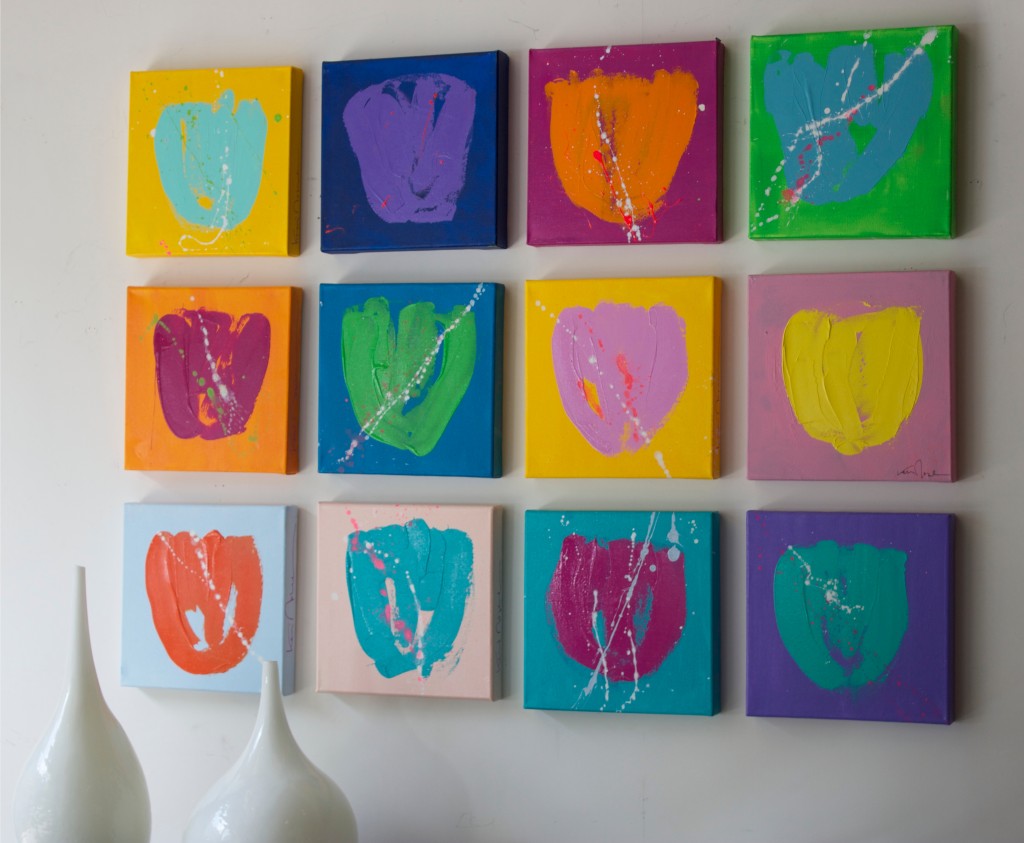
Aly Drew and Bets Miller, owners of Nest Inspired Home have been selling Kerri’s artwork in their chic home decor and gift shop. This is the second spring that they have a window filled with Tulips Pure, a limited edition of mini 12" square paintings

The tulips are fun with a dozen…or just one!

The Rye, NY store is filled with a variety of paintings, all artfully arranged in vignettes among their merchandise.

Customers can easily create joyful spaces in their homes with art, furnishings and accessories from Nest.

Color can create the mood you want in your home. The color in art can be a big part of that, by either being the main focus in a neutral room, as part of an overall color scheme or it can be part of the mix in a more exuberant and colorful space. Kerri Rosenthal chooses to create joyful artworks with her fun mix of color that can work to create any one of these moods.

Choose Color… and enjoy it!
Valentine's Day // Celebrate with heART!

February 14th celebrates love and connectedness. Like most holidays, Valentine's Day  has become an opportunity to market and sell products, but it’s hard to ignore the day and the ads, when the sentiment it’s promoting is love and friendship.  In the visual realm, the holiday is about color; reds, pinks and fuchsias, and about shape; hearts, hearts and more hearts!

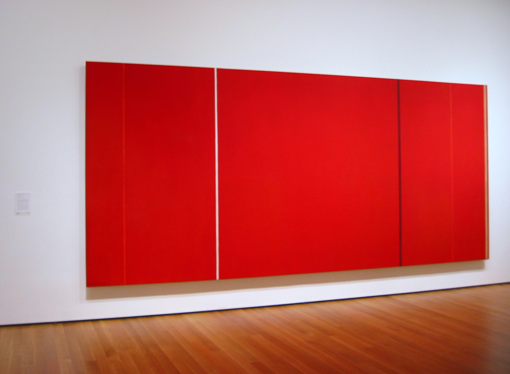
The spectrum of color symbolizes all that’s synonomous with Valentine’s Day. Red is about passion, love, desire and also energy, strength and power. Red is interesting, people love it…or they don’t. There are artists recognized for their strong use of color, particularly red. Abstract Expressionist Barnett Newman, known as a color field painter for his canvases of pure flat color that expressed his philosophies (not for this post), had numerous solid red paintings.  Vir Heroicus Sublimis, 1950-51, from his Zip Series, is in MOMA's permanent collection.

Also minimal, this photograph by Elisa Keogh captures the colors of a vibrant sunset, red contrasted with warm golds, from her Horizon series.

Anne Raymond's artwork has a strong focus on color. Clients and I  often gravitate towards her blue canvases, but for red-lovers, her paintings are very appealing. Cadmium pairs the color of the red dye itself with natural greens and golds for a strong but warm result.

Painter Xanda McCagg uses layers of color, texture and line in her work. Struck, covers this range of colors in a small canvas, 10.5"x8.5"

Shelli Breidenbach is known for her equestrian photography, which is featured in Ralph Lauren stores throughout the world. One of her series Red, is bold, she silhouettes the horses against strong colorful backgrounds to create a graphic image.

Pink, at the opposite end of the red spectrum is a softer color that also symbolizes love and romance, and in addition, caring and tenderness. Andrea Bonfils uses pinks with reds in her mixed media reference to Mark Rothko, Rothko Pink Window

The heart shape has been the symbol of love and emotion since the Middle Ages. The first recorded drawing of a heart was documented in 1250 and ever since, hearts have been and remain popular with artists and collectors. From subtle and abstract, Red February ll, in a series by  Raymond,

to fun and bold.  “Drippy Heart”, from Kerri Rosenthal, one of many in her successful heart series.

A peek at how one of Rosenthal's graphic hearts looks in a beautifully styled entry by her design firm, D2 Interieurs

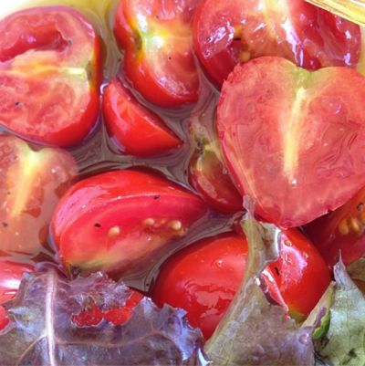
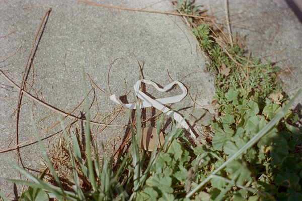
Actress Drew Barrymore recently published a photography book devoted to her heart collection. "I have always loved hearts…the way that a continuous line accomplishes the most extraordinary thing--it conveys love." Her book Find It In Everything, contains the photos of heart-shaped objects and patterns she has come across in everyday life and photographed over the past ten years, from a bowl of cut tomatoes

to a random paper on the street

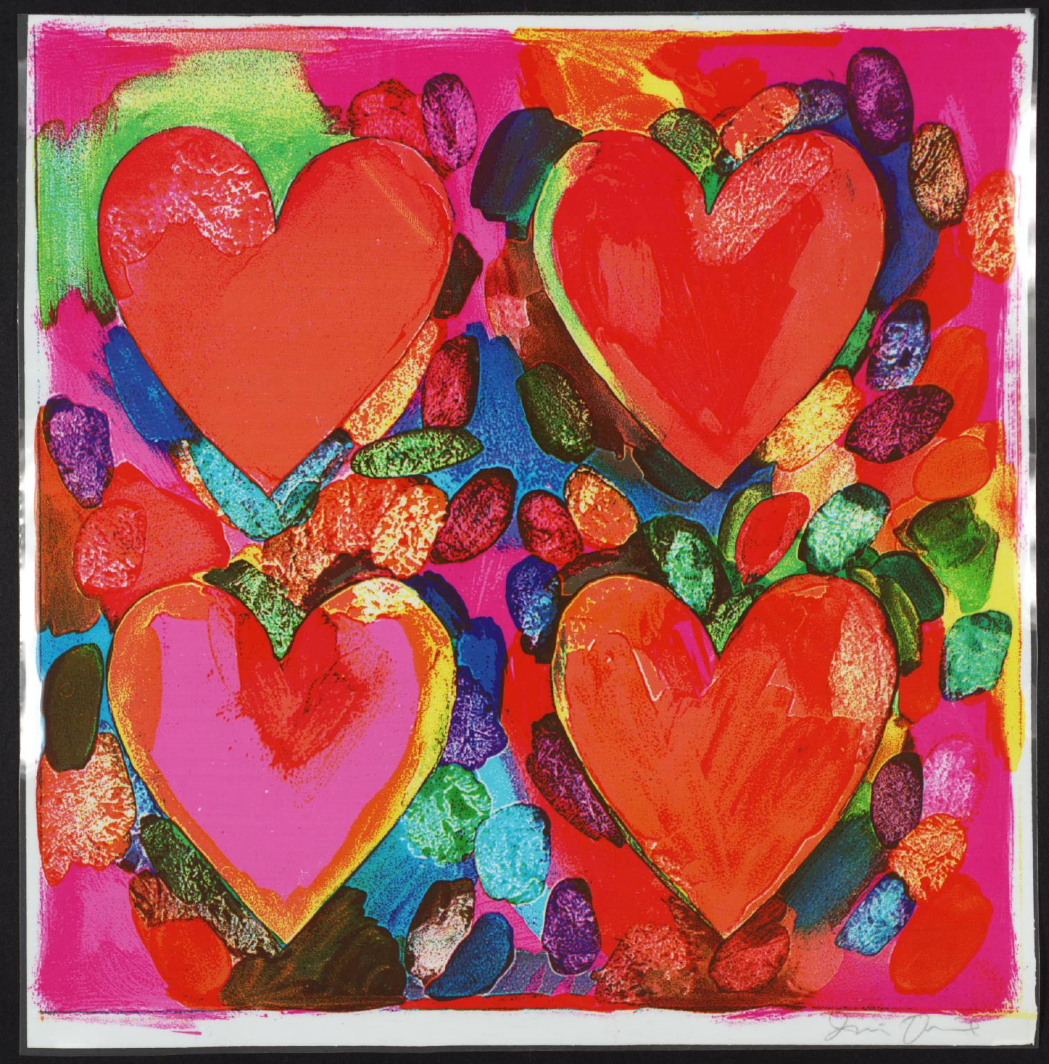
Contemporary artist, Jim Dine, is renowned for his heart-filled artwork, prints, paintings and sculptures. He combines the influence of Pop Art, with everyday objects and hearts. For Dine, the hearts function as a "sign that one can care, that there is a constant presence of feeling."  From a colorful print, Four Hearts, 1969

to the 12' Two Big Black Hearts, 1985

Valentine's Day is about feelings, and the day is drenched in warm colors; from pinks to strong reds, and visions of hearts everywhere to convey the feelings. I will overlook the ads and the commercial aspect of the holiday…because I like that it’s a day that speaks to the sentiments of friendship and love and connectedness.

And, I'll enjoy the chocolates that seem to be everywhere…Happy Valentine's Day!

Orange // & the Natural Beauty of Fall

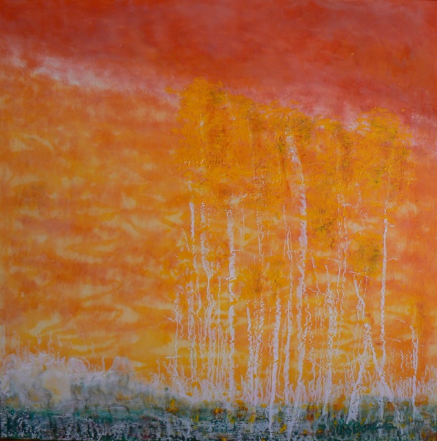
It's been a spectacular fall, the weather and the colors of this season seem far more intense than in recent years. The natural beauty has been the topic of many conversations, Instagram pics and Facebook posts recently, so before it’s gone, I want to share some thoughts on the colors, and the beauty of autumn. Artist Andrea Bonfils captures the season's colors and texture in a combination of oil and encaustic wax. Falling Leaves, from her Nature in Wax Collection,

Orange is the color mostly associated with fall, mixed with the many hues of yellows, to golds to browns. A recent Sunday morning walk revealed all of these colors, contrasted with the incredible rich colors and reflections in the lake at a friend’s picturesque Northern Westchester home

Artists have always been inspired to capture this natural beauty.  I love how Wolf Kahn expresses nature in his work, Orchard Patch is his view of fall,

Orange is named for the fruit, but has come to mean many things, different in various cultures. In a recent yoga class, my yogi talked about the 2nd chakra, as the source of creativity. In another breath, she, like so many of my friends referenced the incredible colors around her during her morning walk, "there is orange everywhere -- like the trees are on fire"


Many Masters have been known for their use of orange, among them Gaugin, van Gogh and here is Venice Twilight, by Monet

Octave is one of  Anne Raymond's orange canvases, inspired by the natural colors near her Hamptons home,

Color consultant and Executive Director of the Pantone Color Institute, Leatrice Eiseman, explained the choice of orange last year as Pantone’s Color of the Year 2012, as “a spirited reddish orange...continues to provide the energy boost we need to recharge and move forward.” Orange feels that way, it has energy.

I have described Kerri Rosenthal's color-filled paintings as happy and full of life  - an example is Nice 2

It's a classic color, it works as a beautiful contrast to quieter shades. Orange has become syononomous with the luxury retailer, Hermes.

A search of "Hermes Orange" brought up 62,110 posts on the home decoration and renovation site Houzz!


Orange as a fashion statement  has found its way into popular culture this season. The name of the new series, “Orange is the New Black”  has started a marketing trend, being used as a reference in interior design and fashion and I imagine in other fields as well.

In the NYTimes Style section last month, Bill Cunningham captured Le Grande Orange

Elle Decor referenced it recently, about the a pair of vintage Italian armchairs upholstered in pumpkin orange leather, in designer Cynthia Frank's Southampton home

And of course, this week is Halloween...a celebration of fun and scary things, all in orange and black. Feng Shui, attributes orange and black used together for the holiday because they are on the opposite ends of the energy spectrum. “Orange is a very lively and happy color, the color of fall bounty and the warmth of fire, it is often called the ‘social color’. Whereas black reflects mystery and void, the color of a space with no beginning and no end, filled with mystery, it holds the energy of power and protection.”

Photographer Elisa Keogh captures this contrast in Norwalk, CT orange-black,

and how fun is Tiffany’s "Spooktacular" wink in this past Sunday's NYTimes?

The leaves are starting to fall, it ‘s time, it was a beautiful and long fall season, I hope you enjoyed it as much as I did...

Happy Halloween!

Color // Cool Summer Nights

Late August, and the reality is setting in that Labor Day is around the corner. Barely two weeks left of summer and the ease we feel in the months of July and August. But, two long weekends lay ahead and time to still enjoy the long days and cooler nights before the pace picks up and the fall season begins. The cool shades of blue in these artworks speak to the start of the changing seasons.

Blue is nature’s color, from the water to the sky, it has many depths and hues, from a soft “sky blue” to an intense almost black, “midnight”.  A look at the range of blues, from Pantone, an international color resource.

From the soft blues in Bewitched,  a great name for this ethereal photo from Elena Lyakir where sky meets water and barely changes color but for a few clouds and horizon line.

To the vibrant color that Andrea Bonfils captures in the depth of the ocean’s blues, in one painting in an encaustic wax diptych, Beyond Deep.

Figurative artist Alex Katz uses broad flat colors in his portraits and landscapes. In August, 2007 he captures sky and water with a medium range of colors, in a spare yet definitive way.

Kerri Rosenthal, an artist known for her colorful work, also reflects the seasons in her paintings. She describes blue as, "Summer skies and the blue oceans, feelings of warmth and happiness."  Rosenthal's expressive Monsieur Bleu,

Blue is statistically the most popular color. I have experienced this as I’ve shown and sold artwork and visited homes with varying degrees of the color. Artist Anne Raymond is strongly influenced by the natural beauty of her surroundings in the Hamptons. Blue July is one of her many stunning blue works that reflect the natural color, combined with warmer colors.

The color blue is considered cool and slow as opposed to the warmth and intensity of reds. It’s a comfort color, it takes you to a good place, to where you feel the cool water and endless sky. Photographer Elisa Keogh captures the spectrum of colors in Weston, CT (blue-green-black) from her Horizon Series.

Artists use blue pigments evolved from natural sources, dating back to the mid-1800‘s. The Impressionist painters introduced some of the blue paints, including cerulean, cobalt and ultramarine. Vincent Van Gogh famously captured the night sky in several paintings. In Starry Night Over the Rhone, painted in 1888, he described the many blues, "The dark blue sky is spotted with clouds of an even darker blue than the fundamental blue of intense cobalt, and others of a lighter blue, like the bluish white of the Milky Way ... the sea was very dark ultramarine, the shore a sort of violet and of light red as I see it, and on the dunes, a few bushes of prussian blue.”

Blue is often balanced or calmed with the contrast to white. Traditional blue and white porcelain has been made for over 2000 years from the pigment cobalt. This striking abstract blue and white painting, Passion Noted, aptly named by artist Xanda McCagg, considering the strong feelings many have for their favorite color.

and back to August, the beach and the water. These boys are looking to catch The Wave, a great way to end the summer - from Bramasole Photography by Christine Wexler.

For others, the last weeks of summer are a bit more quiet and reflective. Balance 5, by Andrea Bonfils,

For me, I plan to enjoy the last summer days and will keep wearing my white jeans on these last August nights...before it's time to transition to the blue jeans I'll wear throughout the fall!

Hoping these last days stay warm and the nights comfortably cool.