Living with Art // Summer all year long

Summer is a short season that has a big impact. From Memorial Day to Labor Day, the warm days are filled with fun, vacation, outdoor activities, spending time with friends and family. Especially in the Northeast, we wait a long time to enjoy the longer, sunny days. Soft colors and artwork can bring these warm feelings of the season indoors all year long. These artworks capture summer, from the subject, shells, seascapes, the beach to abstract interpretations of them. Color is a common thread when evoking summer, we associate soft sun-drenched colors with the warmest months. As I’ve written about before, the color blue is everyone’s favorite. There are many reasons, but when it’s soft, it feels like nature, like sky and water.

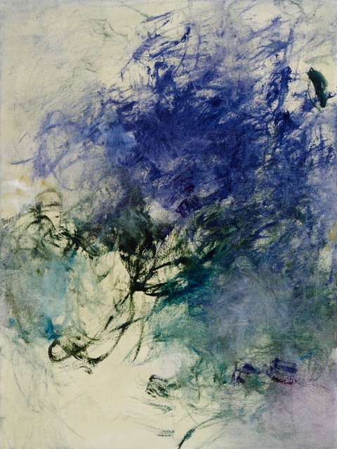
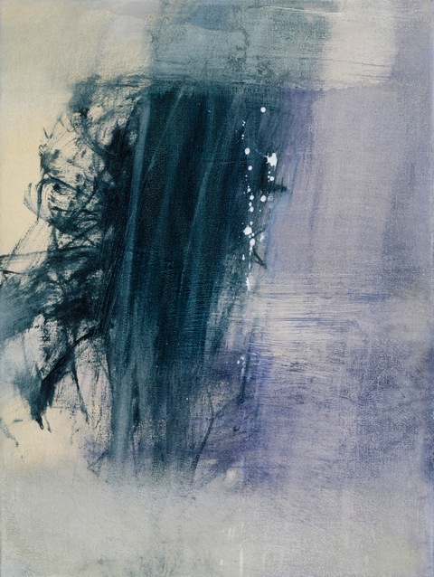
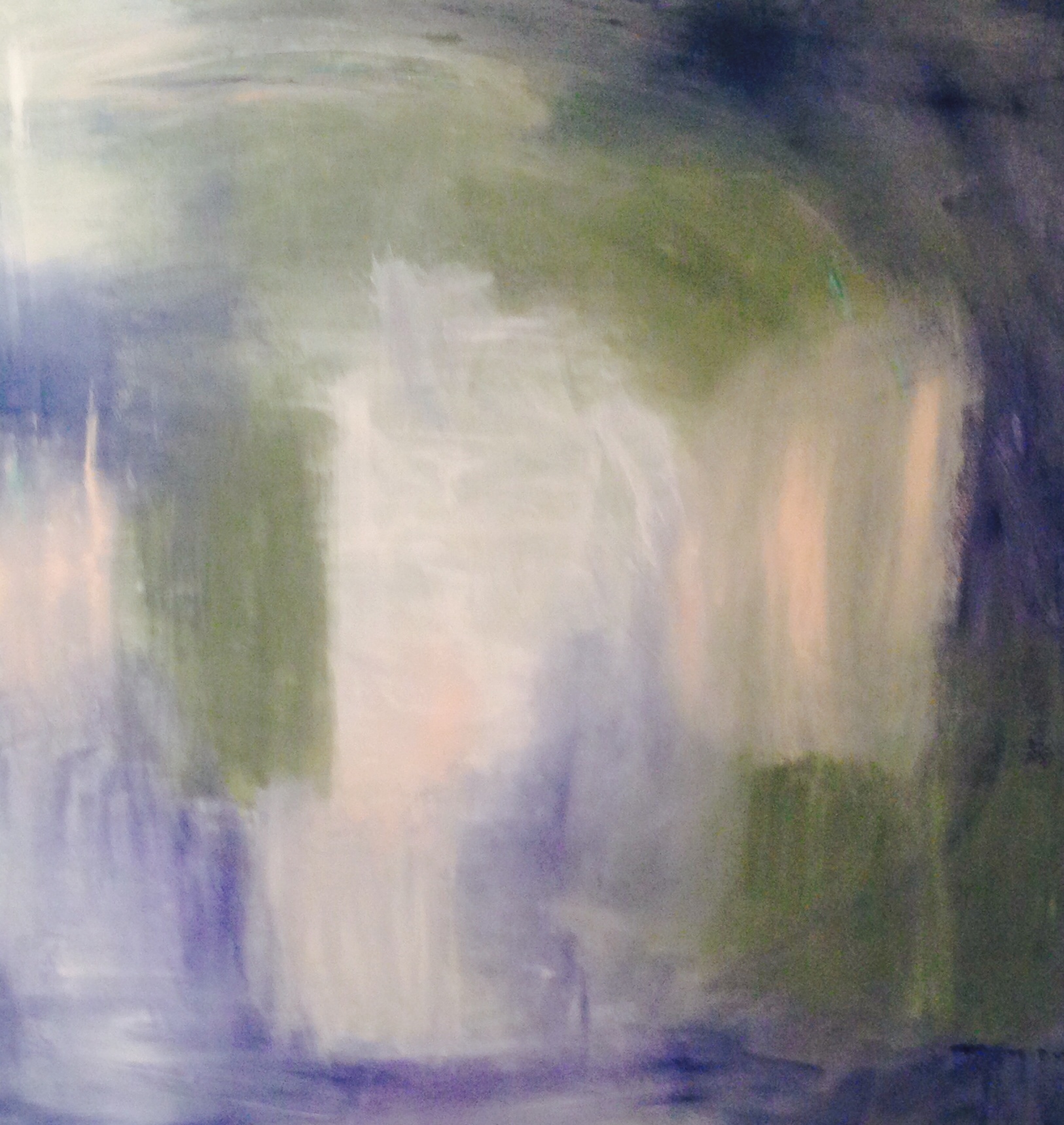
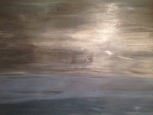
I stopped in to John Duckworth's Johns Island, SC studio a few months ago with some friends while we were visiting nearby. John artfully captures the colors of the SC coast in his collection of Abstract Landscapes.

Two very different installations of John's work show how the simple natural beauty of the photographic images is all that is needed to create a serene summer-like  space. The images are printed on canvas, giving them a painterly quality.  From a beach cottage on Sullivan's Island, SC with the image Charleston Harbor

to Long Island Creek in a crisp modern NYC apt by JSM Designs

According to color expert Kate Smith, of Sensational Color, "The color of ocean and sky, blue is perceived as a constant in our lives. As the collective color of the spirit, it invokes rest and can cause the body to produce chemicals that are calming".

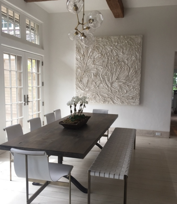
The texture and layers of encaustic wax in Artist Andrea Bonfils’ Ocean Blue capture the colors in the spectrum, from ocean to sky,

The large-scale color block painting by Kerri Rosenthal also ranges from light to powder to marine blue, creating a beautiful frame over the denim blue velvet bench

A client recently requested the “color of a summer sky” for an iconic Drippy Heart painting from Kerri Rosenthal. Here is Sea of Hearts installed in the traditional entry of her Westchester home. Kerri sent the color sample, on a late winter day with a note that felt hopeful for warmer weather, “the sky on a perfect summer day”!

Artist Rosenthal brings together her love of summer in a number of paintings inspired from her winter trips to the Caribbean or summer days by the CT or Long Island beaches. The colors in her abstracts bring them all together, as in Picking Daisies from the Puzzle Moderne series

Blue and and it's compliment white, in its many variations, is classic summer. The many shades of white are captured in a fun graphic collection of sand, by photographer Barbara Erdmann. Wings is one of a few images in the series that captures it's movement and texture.

Nature shows her color in the range of whites in Shelli Breidenbach’s Abstract Shell series. Shell No. 2 is one of six large-scale graphic images that show the incredible beauty of each shell form.

White can be simple and elegant and in artwork, it can carry a space when done well. This shell collection has brought summer indoors, for many clients, from city and suburb to beach to this striking yacht with an installation of very large-scale photos

Abstract artist Anne Raymond  has created many paintings inspired by the sunny colors of summer and the surroundings of  her Hamptons home. You can feel the warmth of the soft yellow in Radiance Series ll, a 40"x40" oil on canvas

Moving, also by Raymond is suitably accented with turquoise accessories for summer at Nest Inspired Home in Rye, NY

Westchester photographer Stefan Radtke captures the same colors in his "atmospheric landscapes" of the LI Sound. Radtke "creates painting inspired photographs of landscapes, devoid of detail." From the more colorful Moved # 6 

to the quieter Sound Portrait #2 and it's mirrored image, mounted in acrylic. This diptych is 80"x40" overall and creates a strong statement for such subtle work.

I have recently met photographer Kit Kittle and I'm enjoying showing his Bubble Collection to my clients and observing their smiling responses. Kittle takes his machine around the world and captures the reflection in the bubbles, "which is a thousandth of the thickness of human hair". The images reflect the color & light in the bubbles as well as the natural beauty surrounding them. To Kittle, "it is surprising that some things are just this simple". This image, Before the Fall was taken close to home off the LI Sound.

The sun, warmth and colors of the summer season inspires artists, they want to capture it in their respective medium. Their artwork enables us to bring the soothing enveloping warm feelings of the season indoors…why not enjoy summer all year long?

But first, enjoy it now!

House Tour // Spring into Summer Entertaining

The good weather brings many activities, places to go, people to see, activities that the long winter and spring didn't allow. A rite of spring into summer are house tours, a fun way to fundraise, by bringing community together, coordinating efforts of designers, friends and local businesses. I was thrilled when interior designers Danielle Palmadessa-Lynch and Phyllis Freed asked if I would get involved with the home they were creating for the Upper Saddle River House Tour on June 5th.

The homeowners of this particular house graciously loaned their sprawling home for the kitchen tour. Since the home was fairly empty, Danielle and Phyllis decided that the main floor, leading towards the kitchen should be furnished, staged and accessorized as well, making the walk to the kitchen a tour of its own.The entry, was not finished as we were installing on Monday, but Architectural Garden, an encaustic wax and oil by Andrea Bonfils compliments the plan, lots of turquoise and summer color.Friends and colleagues, the two women have way too much fun to call this just business. With separate design businesses, DRP Interiors and Freed & Company, in Bergen County, after this successful collaboration, the two are now planning joint business and projects together.

The dining room was updated with new lighting and rug. While waiting for the rest of the accessories, we placed Xanda McCagg’s abstract painting, Tete a Tete, above the buffet, a focal point both in the room and as you enter the house.

The designers have a similar creative aesthetic, comfortably bouncing furnishing ideas off each other and laughing how after weeks together, "they are finishing each others sentences". I listened to them talk back and forth planning and plotting as I joined them for part of the installation. This vignette tells their color story. The color, texture and depth of Beyond Blue Diptych, another encaustic painting by Andrea Bonfils feels right at home.

Timeless, the classic black and white abstract by Kerri Rosenthal, compliments the detail on the sofa arm and grounds the large colorful room.

The women sent me images, colors and fabrics as they conceptualized the house. The plan was to make the house ready for summer entertaining, indoors and out. They asked us to provide artwork from Romanoff Elements artists to work with their fun colorful palette, turquoise, pink, lime green.

A framed pair of mono prints, Flare Series, by Anne Raymond provides color along the long wall of windows and brings the eye around the room. The designers created several seating areas and tied it together with color, creating a warm and inviting space.

Spending time with them as they moved quickly and filled the house and backyard with furnishings this week felt like being on a TV set. Actually, there was a film crew there with Backyard Living, an outdoor furnishing company that provided plenty of deck and poolside furnishings to accommodate a pretty big outdoor party. They filmed the installation, indoors and out.
The sunny breakfast nook overlooks the pool and entertaining area. The black and white horse photographs by Barbara Erdmann, Fringe and Attachment, compliment the zebra print dining chairs, without distracting from the colorful table settings and outdoor view.
   The kitchen counters are set and ready…
There are 9 kitchens on the tour, this was the only house that was fully staged. The community is raising money to go towards a new ambulance for the USREMS. Danielle and Phyllis are selling most of the furnishings in the home, which was provided by many local businesses. A portion of all sales of furnishings and art will be donated to help purchase the much needed ambulance.
There are a number of organizations in the community that have joined efforts, time and resources to make the house and kitchen tour possible. It was a fun project to work on and collaborate with the designers. How nice that the good weather has brought us all out of our homes for different community activities.

It’s always great to see how artwork can compliment and enhance different spaces. Thanks for taking the virtual tour and browsing the photos!

Choose Color // In Art & Interiors

Color theory and studies provide a myriad of reasons why and how individuals respond differently to color. Color response is sensory, it’s literally the first thing we respond to, it can affect our moods, cause physiological reactions, and affect our decision-making. Artist Kerri Rosenthal has clearly made the decision to Choose Color! She wants her art to make people happy, and her use of color does just that. "I love that my paintings bring color into my client's homes - Although at times I paint in soft tonal hues, for the most part, my comfort zone is painting in color, and what I think it does to the homes they end up in- is take clients out of their comfort zone allowing them to bring bright happy colors into their home, they might normally not gravitate to".

I have written about Kerri's artwork before, but seeing how the paintings look in various interiors, is about how the colors in art can contribute to a different and personal feel.  "All of these homes embrace color, some more dramatically than others but there is a definite underlying common denominator… Happy Art = Happy Home…"

As Kerri says, her work is not all about brights, many of her works  are quiet, more subtle. These paintings tend to have a lot of layers and depth. This is one of a series of abstract landscapes, more Impressionist in feel. As color consultant Kate Smith says about creating a calm environment, “Being surrounded by a peaceful, calming color…could certainly make you feel that life is more under control and you are a little more serene". As in this bedroom

or this tonal abstract that beautifully blends and compliments the sofa

Kerri is influenced by various artists and periods, from the Impressionist type landscapes to the Pop Art-like Hearts and Flower Bomb Series. The Drippy Heart Series is pop-inspired, she uses flat planes of solid energetic color, in a large scale interpretation of an everyday object. Kerri creates a painting from this icon of love, with “drippy’s” spilling out of the giant heart, that make you smile. Sunny yellowor sky blue, the bold paintings look beautiful in these sophisticated interiors.

Bright color, bold images lighten the mood, Kerri’s encourages people to have some fun in their rooms. I like this from Sensational Color,  Smith's color advisory service , “Bright colors are the calling card of a joyful space”.

Sensational Color advises its readers and clients to “create a mood that highlights your personality by using color…to build a fun and whimsical mood…Indulge in your inner Peter Pan or Alice in Wonderland…create a playful room—the kind you’ll love to live in". Be playful as Kerri's client did with her bold mix of unexpected color and pattern.

Or rely on art to brighten a neutral space with color. Many choose to decorate their homes in quieter colors. This provides a great backdrop to accent a color you love in the art you select. The art becomes a focal point.

It takes confidence to follow your instincts, decorate and buy art that’s filled with colors you love. Kerri has encouraged others to do that. It's been fun to watch clients respond to her work, usually with a smile!!

Aly Drew and Bets Miller, owners of Nest Inspired Home have been selling Kerri’s artwork in their chic home decor and gift shop. This is the second spring that they have a window filled with Tulips Pure, a limited edition of mini 12" square paintings

The tulips are fun with a dozen…or just one!

The Rye, NY store is filled with a variety of paintings, all artfully arranged in vignettes among their merchandise.

Customers can easily create joyful spaces in their homes with art, furnishings and accessories from Nest.

Color can create the mood you want in your home. The color in art can be a big part of that, by either being the main focus in a neutral room, as part of an overall color scheme or it can be part of the mix in a more exuberant and colorful space. Kerri Rosenthal chooses to create joyful artworks with her fun mix of color that can work to create any one of these moods.

Choose Color… and enjoy it!

Celebrate Mothers! // Flowers are Blooming

Mother’s Day was initially called the “Second Sunday of May” in 1908. One woman decided that mothers should be celebrated and “honored for the sacrifices they made for their children”.  Anna Jarvis spent several years campaigning for this, and in 1914, President Woodrow Wilson made it official.  

Anna gained early financial support for her idea from retailer John Wanamaker and the first official celebration was at Wanamaker’s Dept. Store in Philadelphia. He cleverly saw the potential. According to a recent Forbes article, 19 billion dollars will be spent this year, but at the top of the list (after cards) are flowers, 85% of women will receive them!

Violet Fuchsia, by Deborah Falls

Exactly a century later, Mother’s Day is now celebrated throughout the world. Since it is spring, the day is synonymous with flowers. For me, that relates to the varied and individual ways that artists interpret the natural beauty of flowers, their shapes and colors.

I recently met Vermont based artist Deborah Falls. Deborah has created a process using dyes to paint on silk, “to capture and portray the sense of beauty and wonder” that she experiences in her garden.

The Emerging Bee Balm

Nancy Woodward has developed another individualized approach to capturing what she sees in nature. She combines traditional photography methods to create an image and then uses the digital darkroom to “alter the color palettes and bring new realms in to view."

Branch Sprites on Coral and Gathering,

Artist Christine Triebert uses an unusual technique in her Cameraless Series. I have admired her work at the Architectural Digest Home Show for several years and we recently spoke about her botanical images, photographs made without a camera. These minimal black and white Shadowgraphs are created by capturing the shadows of the objects on paper negatives in the darkroom.

a grouping exhibited (and my poor photograph) at the AD Show

Painter Kerri Rosenthal, with her spirited approach to color, is recognized for her pop-art  inspired Flower Bomb Series, filled with fun colors and combinations. As I wrote in a previous post, Kerri’s work comes from deep within, she has an innate sense of color and appeals to her clients’ desire for work that makes them smile.

Spring in My Step, from the Flower Bomb Series

A group of Tulips Pure, 12" square paintings, just completed for an installation at Nest Inspired Home in Rye, NY

Sunflowers don’t bloom in the Northeast until summer, but are now available in markets most of the year. Regardless of the time of year, it always feels warm when you bring in these happy flowers, with their bright yellow petals contrasted against the dark center and green leaf. Michael E. Anderson, uses traditional large format photography techiniques to capture the flower’s detailed form in black and white. Even without color, the image expresses the flower’s form and beauty, making a statement as a single flower,

or as a pair, even more striking when hung sideways

Wendy Shalen is an artist who works in many mediums and adds to her watercolor series, “Working Women” each summer. The colorful paintings capture the “hard-working women gardeners in Martha’s Vineyard who each summer plant, harvest and collect spectacular flowers which they use to create gorgeous bouquets.” Wendy’s expressive work captures these women, their work ethic and the beauty of the flowers.

Vineyard Flower Girls and Vineyard Flower Girl lll

Anne Raymond is another artist influenced by nature, who expresses herself in abstraction. The Flare Series, is a group of paintings on paper with vibrant color and composition. These prints, or monotypes, are one of a kind. When I first saw these, I loved the bold combination of fuchsia, orange & red softened with a bit of white...a strong composition, with a feminine feel.

These two paintings from the Flare Series look great placed in the just opened chic design studio, Get A Room, in Armonk, NY. Interior designer Laura Michaels, created the white shop to be a background for the colorful art and beautiful mix of home accessories and furnishings.

Anna Jarvis initially, “conceived of Mother’s Day as a day of personal celebration between mothers and families. Her version of the day involved wearing a white carnation as a badge.”  I think she chose early spring as it is a beautiful time of year, flowers are blooming and life begins anew.

I hope you enjoy Mother’s Day!

The Art of Waiting // National Donate Life Month

Spring has been slow to arrive this year. It feels like we have been waiting a long time for the winter  to end and for warm weather to arrive.  We wait for many things, but nothing compares to the wait being endured by 122,000 people waiting for a life saving organ transplant. Being on the wait list means not knowing whether  a donated organ will be received in time.

I was reminded of the issue of waiting while visiting with a sculptor in his studio a few months ago, I was moved by this piece, Waiting for News. Christopher E. Green captures what it is like for family members to wait for news while a loved one is receiving critical care. From the moment I saw it, I felt the emotion he portrays about his experience in a hospital waiting room. “We were all waiting for news of our love ones...Waiting for News attempts to convey the emotion of those that were in limbo, not knowing whether their news would be good or bad.  Not knowing which way their emotions would go.”

My family knows this experience well. My husband Howard was diagnosed with Ideopathic Pulmonary Fibrosis, an illness with no known cause and no known cure. We were told he had 5 years, at which point, he would be a candidate for a life-saving lung transplant. I wrote about this in a previous blogpost, now, I will emphasize that it is 2 1/2 years later, and we are grateful every day to his organ donor for providing him with a second chance at life. His story, and more about organ donation are on our organization’s site, Share Life.

Last spring at our Inaugural Event for Share Life, we featured the photography of Stuart Zaro, particularly this image, Waiting. This photo, taken in Grand Central Terminal, became a symbol of the long and emotional wait sick patients endure while waiting for a transplant.

When I make studio visits, I am drawn to artwork in the colors of Donate Life, the national organization that promotes the issue. April is National Donate Life Month, and groups around the country promote all things blue and green, colors that signify life and health. This Friday, April 11th is National Blue and Green Day.

Romanoff Elements, along with Share Life, supports the efforts of the New York Organ Donor Network, the New York City based Organ Procurement Organization that coordinates organ donations within New York State. Each donor can potentially save 8 lives and impact up to 50 lives with their organs and tissue. A portion of proceeds of RE sales this month will go towards the NYODN’s work. The artists I work are supportive of this issue as well. I’ve included a few blue and green artworks, prints, paintings, photographs and paintings, inspired by nature in shades of blues and greens.

Photographer Nancy Woodward captured this springtime image, First Day of May, while shooting in the woods, she looked up and “saw the canopy of skies in the afternoon sky”. The image is about light and blue and green and spring all at once!

In True Blue, painter Anne Raymond's vivid colors are inspired by the beauty around her Hamptons' studio.

I love the blues in John Duckworth's abstract photographic landscape, Bohicket Creek. It captures the serene beauty of the South Carolina coast, the ocean, sky and horizon.

This is one of Artist Kerri Rosenthal's paintings with "happy colors", 20/20 Vision, like many of her abstract paintings are filled with exuberant colors and combinations

I extend my appreciation to each of them for allowing me to show their work. I am equally appreciative to those artists I have worked with over time, for being supportive of my family and me as we go through this journey. Please browse artwork here, on the RE site, Facebook and in our gallery. Be in touch if you have any questions.

The wait for spring seems to finally be behind us. We can personally say that my husband's wait is also over, but we think about the 122,000 in the US and over 10,000 in NYS who are waiting for life-saving transplants. If interested in more information about organ donation, or to register to be a donor, please go to ShareLifeNY.org or DonateLife.net to find your state’s registry.

Thank you!

Valentine's Day // Celebrate with heART!

February 14th celebrates love and connectedness. Like most holidays, Valentine's Day  has become an opportunity to market and sell products, but it’s hard to ignore the day and the ads, when the sentiment it’s promoting is love and friendship.  In the visual realm, the holiday is about color; reds, pinks and fuchsias, and about shape; hearts, hearts and more hearts!

The spectrum of color symbolizes all that’s synonomous with Valentine’s Day. Red is about passion, love, desire and also energy, strength and power. Red is interesting, people love it…or they don’t. There are artists recognized for their strong use of color, particularly red. Abstract Expressionist Barnett Newman, known as a color field painter for his canvases of pure flat color that expressed his philosophies (not for this post), had numerous solid red paintings.  Vir Heroicus Sublimis, 1950-51, from his Zip Series, is in MOMA's permanent collection.

Also minimal, this photograph by Elisa Keogh captures the colors of a vibrant sunset, red contrasted with warm golds, from her Horizon series.

Anne Raymond's artwork has a strong focus on color. Clients and I  often gravitate towards her blue canvases, but for red-lovers, her paintings are very appealing. Cadmium pairs the color of the red dye itself with natural greens and golds for a strong but warm result.

Painter Xanda McCagg uses layers of color, texture and line in her work. Struck, covers this range of colors in a small canvas, 10.5"x8.5"

Shelli Breidenbach is known for her equestrian photography, which is featured in Ralph Lauren stores throughout the world. One of her series Red, is bold, she silhouettes the horses against strong colorful backgrounds to create a graphic image.

Pink, at the opposite end of the red spectrum is a softer color that also symbolizes love and romance, and in addition, caring and tenderness. Andrea Bonfils uses pinks with reds in her mixed media reference to Mark Rothko, Rothko Pink Window

The heart shape has been the symbol of love and emotion since the Middle Ages. The first recorded drawing of a heart was documented in 1250 and ever since, hearts have been and remain popular with artists and collectors. From subtle and abstract, Red February ll, in a series by  Raymond,

to fun and bold.  “Drippy Heart”, from Kerri Rosenthal, one of many in her successful heart series.

A peek at how one of Rosenthal's graphic hearts looks in a beautifully styled entry by her design firm, D2 Interieurs

Actress Drew Barrymore recently published a photography book devoted to her heart collection. "I have always loved hearts…the way that a continuous line accomplishes the most extraordinary thing--it conveys love." Her book Find It In Everything, contains the photos of heart-shaped objects and patterns she has come across in everyday life and photographed over the past ten years, from a bowl of cut tomatoes

to a random paper on the street

Contemporary artist, Jim Dine, is renowned for his heart-filled artwork, prints, paintings and sculptures. He combines the influence of Pop Art, with everyday objects and hearts. For Dine, the hearts function as a "sign that one can care, that there is a constant presence of feeling."  From a colorful print, Four Hearts, 1969

to the 12' Two Big Black Hearts, 1985

Valentine's Day is about feelings, and the day is drenched in warm colors; from pinks to strong reds, and visions of hearts everywhere to convey the feelings. I will overlook the ads and the commercial aspect of the holiday…because I like that it’s a day that speaks to the sentiments of friendship and love and connectedness.

And, I'll enjoy the chocolates that seem to be everywhere…Happy Valentine's Day!